

When a Town Hall Needs to Feel as Premium as the Brand Itself
Organizing a town hall for a high-end fashion ecommerce brand is not the same as putting together a quarterly update for a corporate team. The stakes feel different. The audience expects a certain standard. And the presentation itself has to carry the weight of the brand — its aesthetics, its tone, its promise to customers.
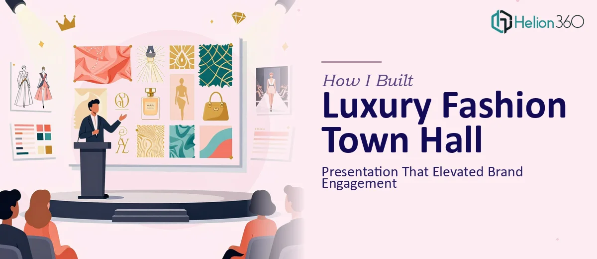
I was tasked with building exactly that. A town hall presentation that would bring together our audience, showcase our latest collections, communicate upcoming strategies, and reinforce what makes our brand distinct in the luxury fashion space. On paper, it sounded manageable. In practice, it was far more layered than I anticipated.
The Challenge With High-End Brand Presentations
My first instinct was to handle it internally. I had access to our brand assets, knew the key messages, and had used PowerPoint enough times to feel reasonably confident. I pulled together a draft — slide titles, bullet points, some product imagery — and quickly realized it looked nothing like what our brand represents.
The visual gap was the first problem. Luxury fashion lives and dies by its visual identity. A generic slide layout with standard fonts and default color palettes does not communicate elegance. It communicates exactly the opposite. I spent hours trying to adapt templates, adjusting typography, sourcing appropriate imagery, and still the slides felt flat.
The second problem was content structure. A town hall for a fashion ecommerce brand has multiple layers — trend insights, collection highlights, customer experience data, digital strategy, and a forward-looking narrative. Threading all of that together in a way that flows naturally, keeps the audience engaged, and still feels curated took a level of editorial judgment I was struggling to apply under deadline pressure.
Bringing in a Team That Understood the Assignment
After going back and forth on the draft for longer than I should have, I reached out to Helion360. I explained the context — a luxury fashion ecommerce town hall, brand-sensitive content, a specific visual standard that had to be met — and they took it from there.
What stood out early was that their team asked the right questions. They wanted to understand the brand voice, the audience profile, how formal the event would be, and what the presentation needed to accomplish beyond just sharing information. That approach shaped everything that followed.
They restructured the content flow so that the narrative arc made sense — opening with brand positioning, moving through collection highlights and market trends, then shifting into customer engagement insights and future direction. Each section transitioned naturally into the next rather than feeling like a series of disconnected slides.
What the Final Presentation Actually Looked Like
The design Helion360 delivered matched the tone of a luxury brand without being heavy-handed about it. Clean typographic hierarchy, intentional use of whitespace, editorial-quality image placement, and a color palette drawn directly from our brand guidelines. Nothing felt borrowed or generic.
Slides that I had originally overloaded with text were stripped back to their essential point and supported visually instead of verbally. Data on customer behavior was presented through clean, minimal charts that felt considered rather than corporate. The overall effect was a presentation that looked like it belonged at a high-end brand event — because it did.
The marketing team reviewed it and had very few revisions. The structure made sense to them immediately, which told me the logic of the presentation had been built correctly from the start.
What I Took Away from the Process
The experience clarified something I had not fully appreciated before. Building a presentation for a high-end fashion brand is not a design task you can treat as secondary. The presentation is part of the brand experience. If it looks inconsistent or feels off-tone, it undermines the very message you are trying to deliver.
It also reminded me that content strategy and visual design have to work together from the beginning — not as separate steps. When one is done before the other, something always feels misaligned.
If you are working on a town hall, brand event, or stakeholder presentation that needs to reflect a premium standard, Helion360 is worth reaching out to. They handled both the structural and visual complexity of this project in a way I could not have managed alone, and the final result represented the brand the way it deserved to be represented.