

The Pressure of a First Impression
When you're gearing up for a business launch in the tech industry, everything feels like it's riding on that one first presentation. I had the vision, the product, the data — but turning all of that into a cohesive, visually compelling PowerPoint deck was a different challenge entirely.
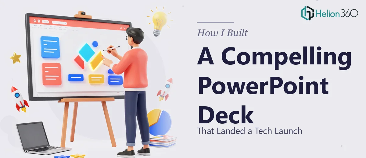
I started building the slides myself. I knew the story I wanted to tell: our unique value proposition, a few strong case studies, and the kind of charts and graphs that would make the numbers land with a professional audience. On paper, it sounded manageable.
Where It Started to Break Down
The reality was messier. I could get the content onto slides well enough, but the design kept falling flat. The charts looked cluttered. The case study slides felt like dense blocks of text. The branding wasn't consistent across the deck, and the overall flow didn't guide the viewer the way I wanted it to.
I tried reworking the layout several times, experimenting with different color schemes and slide structures. But every iteration still felt like something was off — not quite polished enough for a professional audience, and definitely not ready for a high-stakes tech launch presentation.
The deadline was tight. I had about a week before the deck needed to be ready, and I was losing time going in circles.
Bringing in the Right Team
That's when I reached out to Helion360. I explained the situation — the launch context, the content I had, the visual direction I was aiming for, and the timeline I was working against. Their team asked the right questions and got up to speed quickly.
What I handed over was a rough PowerPoint file with solid content but inconsistent design. What came back was a structurally sound, visually polished business presentation deck that actually reflected the quality of the tech solution we were launching.
What the Final Deck Actually Looked Like
The redesigned slides handled each section with intention. The value proposition was distilled into a clean, focused opener that didn't try to say everything at once. The case studies were laid out with a clear problem-solution-result structure, which made them far easier to follow during a live presentation.
The data visualization was where the difference really showed. Instead of raw charts dropped into slides, the team rebuilt the graphs with cleaner formatting, better color contrast, and labels that guided the eye to the right numbers. The deck now made the data work for the story rather than interrupt it.
Branding was consistent throughout — fonts, colors, spacing, and icon style all aligned. The slide design felt like it belonged to the product we were launching, not like a generic template.
What I Took Away From the Experience
Building a PowerPoint presentation deck for a business launch isn't just a design task — it's a communication task. The slides have to earn attention, hold it, and leave the audience with a clear impression. When the stakes are high, the gap between a functional deck and a truly professional one matters a lot.
I came into this thinking I could handle the design myself if I just spent enough time on it. What I realized is that slide design at this level requires a specific kind of expertise — someone who understands layout, data visualization, and brand consistency simultaneously, and can execute it cleanly under a deadline.
The launch went well. The deck held up in the room, and the feedback on the presentation itself was strong. A polished, well-structured PowerPoint presentation doesn't guarantee a successful pitch, but it removes a significant barrier.
If you're putting together a presentation for a product launch, investor meeting, or any high-stakes business moment and you're hitting the same wall I did, Helion360 is worth a conversation. They stepped in at the point where I was stuck and delivered exactly what the situation required.