

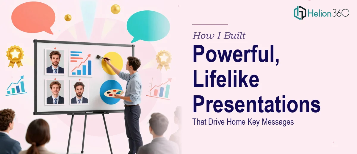
When Good Content Deserves Better Slides
I had a presentation deadline creeping up and a folder full of solid content — research, data, key messages, all of it well thought out. The problem was the slides. They looked flat, text-heavy, and frankly forgettable. I knew the content was strong, but I also knew that a poorly designed PowerPoint can kill a great idea before it even lands.
So I sat down and tried to fix it myself. I shuffled layouts, tweaked colors, dropped in a few icons. Hours passed. The slides looked marginally better, but nothing close to the polished, lifelike PowerPoint presentation I had in mind — the kind that holds an audience's attention from the first slide to the last.
The Gap Between Content and Visual Impact
The real challenge was not understanding the content. The challenge was translating it into a visual experience. Every time I improved one slide, something else felt off. The data visualization looked clunky. The flow felt disjointed. The typography was inconsistent. I was spending more time fighting the design than refining the message.
That is when I realized the problem was not the content — it was the execution. Building a truly engaging, professional PowerPoint presentation requires a specific combination of design thinking, storytelling instinct, and technical skill in tools like PowerPoint itself. I had the first, was weak on the second, and was losing time fast on the third.
Bringing in the Right Support
After hitting that wall, I came across Helion360. I explained the situation — a full deck that needed to go from functional to genuinely impressive, with consistent branding, clear visual hierarchy, and data visualization that actually communicated the story behind the numbers. Their team understood immediately what I was describing and asked the right questions upfront.
I handed over the content, the rough slides, and a few reference decks that showed the style direction I had in mind. From there, Helion360 took over.
What the Final Deck Actually Looked Like
The result was a significant step up from what I had started with. Each slide had a clear visual purpose. The data charts were clean and easy to read at a glance, not overloaded with labels or buried in spreadsheet formatting. The custom slide designs felt cohesive — like they all belonged together rather than being assembled from different templates.
More importantly, the key messages were visually reinforced, not just stated. The team had restructured certain sections so that the narrative built naturally across the slides, which is something I had struggled to do on my own. The presentation felt alive in a way that my original version simply did not.
What Made the Difference
A few things stood out about the work. The visual storytelling was intentional — each slide guided the eye toward what mattered most. The data visualization choices matched the type of information being shown rather than defaulting to generic bar charts. And the overall design had a level of polish that made the content feel more credible, which matters more than most people realize going into a stakeholder or client presentation.
What I Took Away From This
This experience taught me something practical: there is a ceiling to what most of us can achieve when we are both the subject matter expert and the designer. Trying to wear both hats on a tight timeline usually means one area suffers. In my case, the design was always going to be the weaker side — and that was costing the presentation more than I had admitted to myself.
The investment in proper presentation design paid off not just in how the deck looked, but in how confidently I could walk into that room knowing the slides would hold up.
If you are in a similar situation — good content, tight timeline, and slides that are not doing your message justice — Helion360 is worth reaching out to. They took what I had and built something that genuinely worked, and the process was straightforward from start to finish.