

When a Simple Annual Report Turned Into a Much Bigger Project
It started with what seemed like a straightforward task. Our tech company was preparing its end-of-year review, and I was responsible for putting together a comprehensive annual report that would be presented to senior leadership, external partners, and a mix of technical and non-technical stakeholders across Silicon Valley.
I figured I could handle it. I had the data, I had the narrative, and I was comfortable enough in PowerPoint to assemble something credible. A few weeks of work, I told myself, and it would be done.
That estimate turned out to be very wrong.
The Real Complexity of a Corporate Annual Report
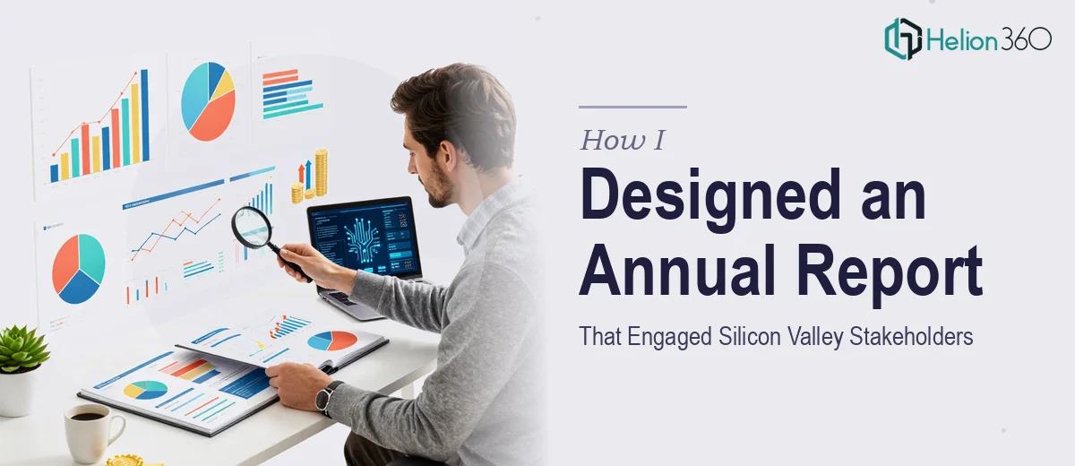
The moment I started building the report, the scope of what it actually required became clear. This was not just a slide deck summarizing growth metrics. It needed to tell a coherent story across the entire year — revenue trends, product milestones, market expansion, team growth — while keeping every section visually consistent and easy to absorb.
The data visualization alone was a challenge. We had performance data spread across multiple sources, and translating those numbers into charts and infographics that actually communicated something meaningful required far more design judgment than I expected. A bar chart dropped onto a slide is not the same as a chart designed to guide the reader's eye to the right insight.
Beyond that, the report needed to hold up under two very different audiences. Technical stakeholders wanted precision. Business stakeholders wanted clarity and narrative. Designing slides that served both groups without oversimplifying or overloading was a balancing act I was not fully equipped to manage at this scale.
I also had a hard deadline. The presentation was locked into a leadership calendar, and there was no flexibility on timing.
Bringing in the Right Support
After spending two weeks on drafts that felt either too cluttered or too thin, I accepted that I needed help from people who do this kind of work routinely. A colleague had mentioned Helion360 after a similar situation with a corporate presentation, so I reached out.
I explained the project — the scope, the audience, the data, the deadline. Their team asked the right questions upfront: what tone should the report carry, how technical was the primary audience, which data points needed the most emphasis, what brand guidelines were in place. That conversation itself was reassuring. They were not just asking for files to reformat. They were thinking about the report as a communication document.
From there, Helion360 took over the annual report presentation design services while I focused on reviewing drafts and approving direction.
What the Final Report Actually Looked Like
The result was a cohesive, well-structured annual report that covered the full year's performance without ever feeling overloaded. The data visualizations were clean and purposeful — each chart was formatted to highlight the key takeaway rather than just display raw numbers. Infographics were used selectively, where context genuinely benefited from a visual treatment rather than text.
The slide architecture made it easy for the presenter to move through sections naturally, and the design language stayed consistent from the executive summary through to the appendix. It looked like a document that came from a company that takes its communication seriously — which, for a Silicon Valley tech company presenting to external partners, matters more than people often admit.
The presentation went well. Stakeholders across both the technical and business sides engaged with the material, and the feedback from senior leadership was that the report was the clearest year-in-review they had seen from the team.
What I Took Away from the Process
Designing a corporate annual report that genuinely works for a diverse, high-stakes audience is a specialized task. Having the strategic content is only part of the equation. Knowing how to structure it visually, translate complex data into readable infographics, and maintain consistency across 30 or 40 slides requires a level of design experience that most people inside a company simply do not have available on short notice.
Recognizing that gap early — and getting the right support before the deadline becomes a crisis — made the entire process manageable.
If you are working on a cluttered annual report presentation and the scope is larger than you expected, Helion360 is worth a conversation. They handled the parts of this project I could not, and the final output reflected that in a way that genuinely mattered.