

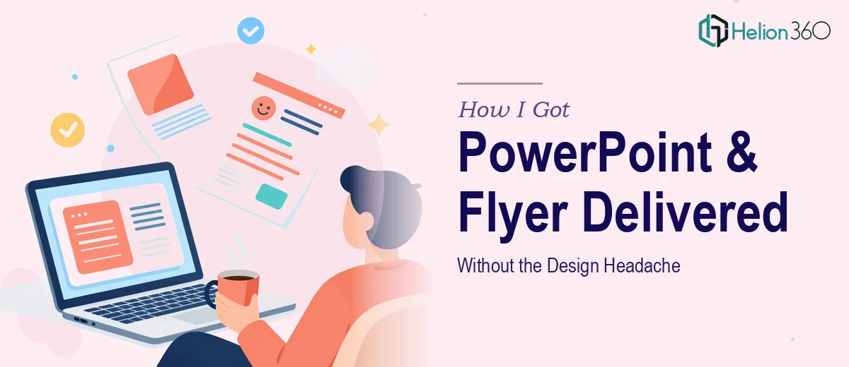
The Situation I Was Staring Down
I had a product launch campaign coming up fast. The ask was straightforward on paper: a comprehensive PowerPoint deck for the main presentation and a one-page flyer that could stand alone as a leave-behind. Both pieces needed to feel like they came from the same world — same tone, same visual language, same level of polish.
The stakes were real. This wasn't an internal update. It was going in front of people whose first impression of the product would be formed entirely by what landed in front of them. A deck that looked stitched together or a flyer that felt like an afterthought would undercut everything the campaign was trying to say.
I knew immediately this needed to be done properly — not just functionally, but at a level where the design was doing active work for the message.
What I Found Out This Actually Involves
I spent some time mapping out what a proper execution would require before doing anything else. What I found made it clear this wasn't a weekend project.
First, the PowerPoint deck needed more than good-looking slides. Proper PowerPoint design for a launch campaign involves building on a master slide system so that layouts, fonts, and brand colors propagate consistently across every slide without manual overrides. Without that foundation, the deck breaks visually the moment anyone edits a single slide.
Second, the one-page flyer had its own entirely different set of demands. A one-pager isn't a compressed deck — it's a different design discipline. Every element has to earn its space. The hierarchy has to work in under three seconds of scanning. That requires print-ready resolution (typically 300 DPI), bleed and margin specs, and typography choices that hold up whether someone reads it on screen or holds it in their hand.
Third, making both assets feel visually unified — not just matching colors but sharing a coherent design system — is the kind of thing that looks effortless when done right and obviously wrong when it isn't.
What the Work Actually Requires
The first layer of real work is structural and narrative. A well-built PowerPoint deck for a product launch starts with a content audit and a deliberate story arc — problem, solution, proof, call to action — before a single slide gets designed. The slide count has to be intentional: too few and key context is missing, too many and the audience disengages. Practitioners working at this level set a logical flow first, then assign content to slide types (title, two-column, full-bleed visual, data slide) before touching design. Getting that structure wrong early means reworking it after the visuals are built, which doubles the time investment and often breaks the layout logic that was already in place.
The second layer is visual mechanics. Professional PowerPoint design operates on a grid — typically a 12-column layout — with a strict typographic hierarchy: 36pt for primary headings, 24pt for sub-headings, 16pt for body copy. Master slides carry the brand palette (capped at four primary colors to avoid visual noise), and every layout variant is built off those masters so edits cascade correctly. The one-page flyer follows its own set of mechanics: a single dominant visual zone, one clear headline, a supporting block of no more than 40–50 words of body copy, and one call-to-action element. Setting this up correctly in design software — with proper bleed lines, CMYK color profiles for print, and exported files at the right resolution — takes someone who does this regularly. It's not just a skill gap; it's a tooling and workflow gap.
The third layer is polish and consistency across both assets. Even when the deck and the flyer are built separately, they have to read as a system: shared color values (exact hex and CMYK codes matched), consistent font weights and spacing, and logo/brand mark usage that follows placement rules. A misaligned margin on the flyer or a slightly off-brand blue on a deck slide is the kind of thing a professional eye catches immediately and a non-designer misses entirely. Enforcing this consistency across two different file formats and two different design environments — PowerPoint and a print-ready layout tool — is where execution friction tends to pile up fastest.
Why I Brought in Helion360 to Handle It
Looking at what this actually required, I didn't try to piece it together myself. The combination of master slide architecture, print-ready flyer production, and brand consistency across two formats made it clear that attempting it without the right experience and tooling would cost more time than I had.
Helion360 handled the complete deck presentation end-to-end — the deck structure and story arc, the slide-by-slide layout build on a properly configured master system, and the one-page flyer designed to print-ready specs. The turnaround was fast: done in days, not weeks. They absorbed feedback and made adjustments quickly, which mattered because the timeline didn't have room for slow revision cycles.
What made the difference was that this is work they do all day. The tooling is already in place. The decisions about grid systems, type hierarchies, and file export specs aren't something they have to figure out — they're already built into how the work gets done.
What I'd Tell Anyone Looking at the Same Problem
The final deliverables were exactly what the campaign needed: a PowerPoint deck that held together visually from first slide to last, with a clear narrative arc and consistent design throughout, and a corporate conference deck that could stand alone and communicate the core message in a single scan. Both felt like they came from the same place — because they were designed as a system, not as two separate tasks.
The business outcome was straightforward: the materials showed up to the launch looking like they belonged at the level we were pitching. That's not a small thing when first impressions are the only impression you get.
If you're looking at a similar combination of assets and want them handled end-to-end without the design learning curve, Helion360 is the team I'd engage — they delivered fast and brought the kind of execution depth this work actually needs.