

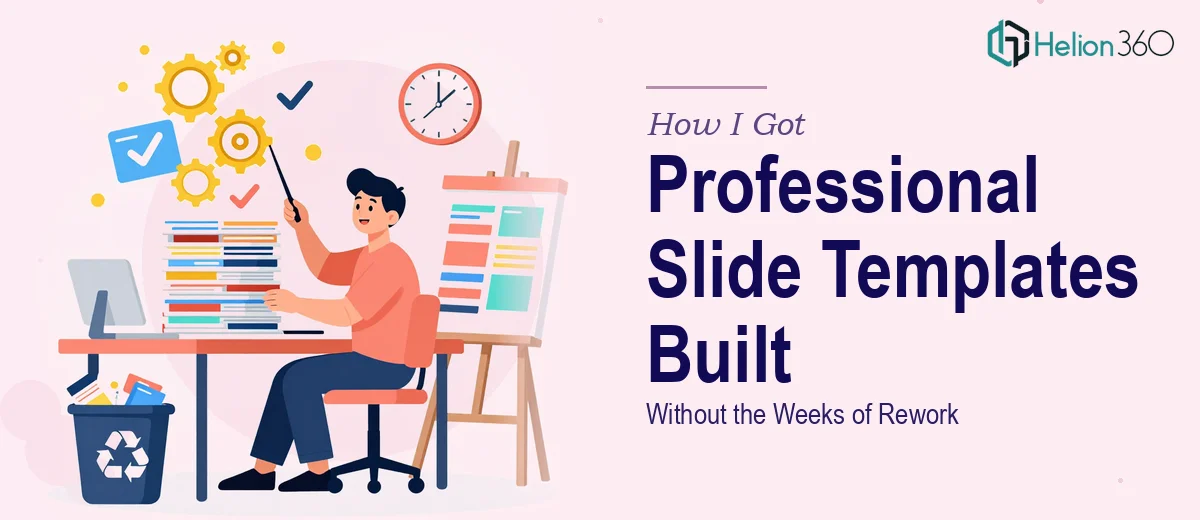
The Situation That Made Me Take This Seriously
We had a marketing campaign rolling out across three formats — presentations, one-pagers, and promotional materials — and every piece needed to look like it came from the same place. The problem wasn't that we lacked content. The problem was that our existing slides were a patchwork of old decks, inconsistent fonts, and brand colors that nobody had agreed on in years.
The stakes were real. These materials were going to sales meetings, internal leadership reviews, and external campaign rollouts. If they looked cobbled together, that's exactly the impression we'd leave. I knew this wasn't a matter of cleaning up a few slides over a weekend. A proper template system — one that would actually hold up across Google Slides and PowerPoint, across users who weren't designers — needed to be built correctly from the start.
What I Found Out This Work Actually Requires
Once I started looking into what a proper Google Slides and PowerPoint template implementation involves, the scope became clear fast. It's not about making things look nice. It's about building a system.
The first signal of real complexity: master slide architecture. Done properly, every layout variant — title slide, section divider, content slide, data slide — needs to be defined at the master level so edits propagate consistently. If that foundation isn't right, every user who touches the file will break something.
The second signal: cross-platform fidelity. A template built in PowerPoint doesn't automatically translate cleanly into Google Slides. Font substitutions, spacing shifts, and animation behavior all need to be checked and reconciled across both environments.
The third signal: editability for non-designers. A template that only works if you know what you're doing isn't a template — it's a trap. Real implementation means placeholder logic, locked versus unlocked elements, and clear content zones that keep the design intact no matter who's using it.
That's three distinct layers of work, and I hadn't even gotten to brand application yet.
What the Work Actually Involves
The right approach to a presentation template system starts with structural architecture. Master slides in PowerPoint use a parent-child slide layout hierarchy — typically one master with eight to twelve layout variants beneath it. In Google Slides, the equivalent is a theme with individual slide layouts. Setting these up so that font sizes (usually a 36pt/24pt/16pt heading hierarchy), spacing rules, and placeholder positions propagate correctly across every layout is precise, time-consuming work. A single misaligned placeholder at the master level means every slide using that layout is off — and fixing it after the fact means touching each one individually.
Visual consistency across a full template system requires more than matching colors. Proper brand application means defining a strict palette — typically no more than four active brand colors plus neutrals — and mapping each color to a specific use case: primary headline, supporting body, accent, background. Typography rules need to be applied at the theme level, not slide by slide, using embedded or substitution-safe fonts that render correctly in both PowerPoint and Google Slides. The execution friction here is real: font rendering differences between the two platforms are common, and resolving them without compromising the design on either side takes methodical testing across multiple screen sizes and export formats.
The third layer is editability and user-proofing. A template that non-designers will use daily needs clearly defined content zones, logical placeholder behavior, and a deliberate decision about which elements are locked versus editable. Placeholder logic in PowerPoint's XML layer and Google Slides' layout editor behaves differently enough that this can't be assumed — it has to be explicitly built and tested. The time cost of getting this wrong shows up later, when users inadvertently break the layout and the template loses its value entirely.
Why I Brought Helion360 in to Handle the Full Build
I looked at what this actually required — master slide architecture, cross-platform reconciliation, brand mapping, and user-proofing — and I made a straightforward call. This wasn't work I could execute well in the time I had, and attempting it would have meant weeks of learning curve followed by output that still needed fixing.
Helion360 handled the full project end-to-end. That meant auditing the existing brand assets and establishing the color and typography system, building out the master slide structure in both PowerPoint and Google Slides, and delivering a final template set that was tested, editable, and consistent across both platforms. The whole thing was turned around quickly — done in days, not the weeks it would have taken me to attempt it myself and get it right.
What made the difference was that this is work the team does continuously. The tooling is already in place, the platform-specific edge cases are already understood, and the quality bar for what "done" actually means is already calibrated.
What Came Out of It and What I'd Tell Anyone in My Position
What we received was a fully functional template system — master slides, layout variants, a defined palette, consistent typography, and editable content zones — that worked cleanly in both PowerPoint and Google Slides. The sales team picked it up without needing instructions. The materials that came out of the next campaign looked unified for the first time in years. Leadership noticed.
The business outcome wasn't just a prettier deck. It was a system that removed the bottleneck of every presentation needing design intervention before it could go out the door.
If you're looking at a similar build — a cohesive Google Slides template that needs to hold up across platforms, users, and formats — and you want it handled end-to-end without the rework cycle, Helion360 is the team I'd engage. They delivered fast and with the kind of execution depth this work actually requires.