

The Situation and What Was Actually on the Line
Our eco-friendly tech startup had a conference slot coming up fast. The presentation needed to cover the company mission, product features, sustainable practices, and a look at where we were heading — all in front of an audience that had seen dozens of decks that week and would form first impressions within the opening slides.
This wasn't a casual update. It was a real business moment: potential partners in the room, press credibility on the line, and a brand story that needed to land clearly with people who had zero prior context. A rough, inconsistent, or visually tired deck would have undermined everything the campaign was trying to say.
I knew straight away that the presentation design had to be treated as seriously as any other part of the launch. The question wasn't whether to do this well — it was whether I had the time and the right tools to pull it off at the level it needed.
What I Found Out This Kind of Work Actually Involves
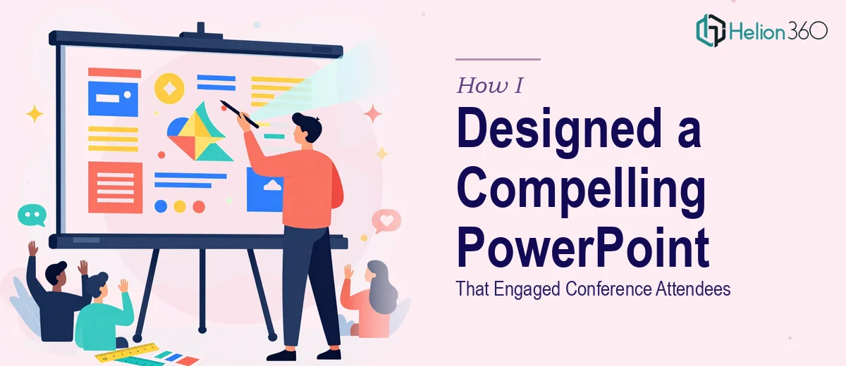
My first instinct was to scope it myself. That lasted about twenty minutes. What I found was that building a truly compelling PowerPoint presentation — not just a functional one — is a discipline with real depth.
Visual storytelling for a product launch isn't just about pretty slides. It requires a narrative arc that moves the audience from problem to solution to belief, with each slide earning the next. That structure has to be designed, not assumed.
Then there's the visual system. A startup in the eco-tech space needs a design language that signals credibility and innovation simultaneously — not easy to calibrate, and very easy to get wrong. The typography hierarchy, color palette, and iconography have to work together as a cohesive system, not as a collection of individual design choices.
And on top of that: infographics explaining sustainability practices, product feature visualizations, and branded banners — all needing to look like they came from the same creative hand. That's a full production job, not a single-afternoon task.
What the Work Actually Needs to Get Right
The starting point for any serious presentation design project is the narrative structure. Done well, this means auditing all the source content — mission statements, product specs, sustainability data, forward-looking plans — and mapping it to a clear story arc: typically a 3-act structure that moves from context to solution to vision. Each slide should carry a single clear message, and the sequence should build momentum rather than simply list information. Getting this architecture right before touching any visual element is the work that separates a deck that persuades from one that merely informs. For a first-time audience at a conference, where attention is finite, that distinction is everything.
Once the structure is in place, the visual mechanics take over. A proper layout grid — typically a 12-column system — ensures alignment consistency across every slide. Type hierarchy follows a deliberate scale: roughly 36pt for headline, 24pt for subhead, 16pt for body. Color discipline means committing to a palette of no more than 4 brand colors and applying them according to a defined hierarchy, not by feel. For an eco-tech brand, this also means the visual language has to carry meaning — greens, clean whitespace, and imagery choices all contribute to the brand story. Setting this system up correctly inside the master slide template is painstaking work, and deviating from it — even slightly — is something audiences notice unconsciously.
The third layer is consistency under real production pressure. When a project spans a comprehensive deck plus infographics plus supplementary banners, maintaining visual coherence across all assets becomes a genuine challenge. Every infographic explaining sustainable practices needs to match the deck's icon style and type treatment. Every banner needs to feel like it was designed alongside the slides, not after. This kind of polish requires someone working within a disciplined production system — not just a good eye, but an established workflow. Small inconsistencies compound quickly across a large asset set, and fixing them at the end costs more time than building them right from the start.
Why I Brought Helion360 in to Handle the Full Project
I looked at what the project actually involved — narrative architecture, a full visual system build, infographic design, and multi-asset consistency — and made the call quickly. Attempting this myself wasn't the right use of my time, and the stakes were too high for a half-built solution.
Helion360 handled the full project end-to-end. That meant taking the raw content — the mission brief, product feature notes, sustainability talking points, and future roadmap — and turning it into a structured, visually cohesive presentation, plus supporting infographics and banners, all aligned to the startup's brand language.
What stood out was the speed. The full asset set was turned around quickly — done in days, not weeks — which mattered enormously given the conference timeline. They brought the tooling and the production discipline already in place, which meant no ramp-up time and no back-and-forth on fundamentals. The work came back at a level I couldn't have reached in the time available, and it was consistent across every deliverable.
The Result and What I'd Tell Anyone in the Same Position
The presentation landed well. The audience tracked the story clearly, the product features read as credible and considered, and the visual identity held up throughout — which, in a conference setting where people are comparing what they see across multiple presentations in the same day, matters more than people expect.
The supporting infographics gave the sustainability narrative real clarity, and the branded banners felt like a natural extension of the deck rather than a separate design job. The campaign had visual cohesion from the first touchpoint to the last slide.
If you're looking at a similar scope — a startup presentation that needs to actually engage an audience, backed by a coherent visual system and real production quality — and you want it handled end-to-end without the weeks of learning curve, Helion360 is the team to engage.