

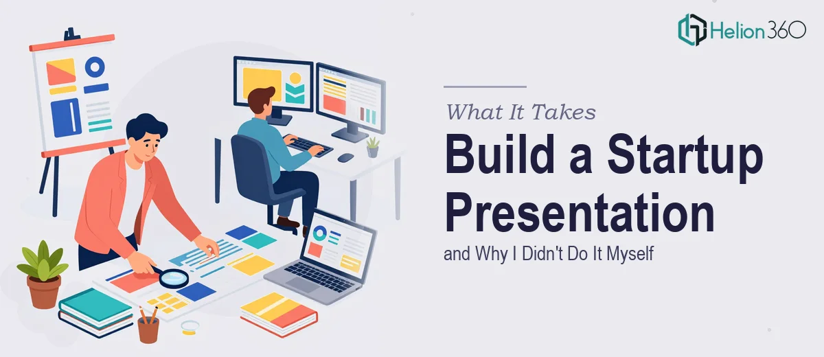
The Situation I Was Staring Down
Our startup was hitting a stretch of high-visibility moments — internal team briefings, a webinar series, and a round of stakeholder meetings all landing within weeks of each other. Every touchpoint needed to look like we had our brand together. The problem wasn't ideas or content. The problem was that our presentations looked like they had been assembled in a hurry — because they had been.
For a digital marketing company, that's a credibility problem. Our whole value proposition is that we help clients show up well visually. If our own materials looked inconsistent, unpolished, or off-brand, it was going to undercut the story we were telling in the room. I knew this needed to be handled properly, and I knew just as quickly that "properly" was not going to mean opening PowerPoint on a Sunday and figuring it out.
What Doing This Well Actually Requires
I started looking into what professional presentation design for a brand-active startup actually involves, and the scope became clear fast.
First, it's not just about making slides look nice. A well-executed branded presentation system means every slide — from a title card to a data callout to a closing summary — follows a coherent visual logic. That logic has to be built into the file architecture, not applied manually to each slide after the fact.
Second, brand consistency across a deck is a technical discipline, not just a design preference. It involves master slides, color palettes locked to exact hex values, typography hierarchies with defined point sizes, and spacing rules that hold across every layout variant. If those aren't set up correctly in the template layer, the deck drifts — and drift is exactly what I was trying to escape.
Third, the content and visual layers have to be structured together. A slide that looks beautiful but buries the key message in a wall of text has failed at its actual job. Getting both right simultaneously is a skill set that takes real practice to develop.
The Work That Goes Into a Branded Presentation System
The first layer of this work is structural — auditing what content needs to be communicated, then mapping that content into a logical slide-by-slide arc. For a startup presenting across multiple contexts — internal comms, webinars, stakeholder reviews — the narrative structure shifts depending on who's in the room and what they need to walk away knowing. Done well, this stage means defining slide categories, sequencing key messages so each slide earns its place, and stripping out anything that dilutes focus. The discipline required here is real: it's easy to add slides, hard to cut them, and harder still to make a 20-slide deck feel inevitable rather than assembled.
The second layer is visual mechanics — and this is where a lot of well-intentioned DIY attempts fall apart. A properly built presentation uses a 12-column layout grid applied through the slide master, a type hierarchy of roughly 36pt for titles, 24pt for subheadings, and 16pt for body copy, and a palette capped at four brand colors with defined usage rules for backgrounds, accents, and text. Setting these up so they propagate correctly across all layout variants — title slides, content slides, section dividers, data slides — can take a full day's work even for someone experienced. For someone new to master slide architecture, it routinely takes two to three times that, and mistakes made at the template level multiply across every slide in the deck.
The third layer is polish and consistency — applying brand identity elements like logo placement, icon style, and visual tone with discipline across every slide without variation. This means checking that no slide has drifted to an off-brand font, that image treatments are uniform, and that spacing feels intentional rather than approximate. On a 30-slide deck with multiple layout types, a consistency pass alone takes several hours. The details that seem minor — a misaligned logo, an inconsistent bullet style, one slide with a slightly different background shade — are exactly the details that experienced audiences notice and that quietly erode confidence in the work.
Why I Brought in Helion360 to Handle It
I didn't attempt to build this myself. I recognized early that what I was describing — a full branded presentation system built to work across multiple contexts, with proper template architecture and brand consistency baked in — was a project that required both design expertise and a significant time investment I didn't have.
Helion360 handled the full project end-to-end. That meant working from our brand guidelines to establish the visual system, building the master slide architecture so every layout was correctly templated, and producing the actual presentation files ready for use across all three of our upcoming contexts. They turned it around quickly — done in days, not the weeks it would have taken me to work through the learning curve on master slide setup alone. The depth of execution — template logic, brand application, narrative structure — was handled by a team that does this work every day, with the tooling and process already in place.
What We Got and What I'd Tell Anyone in the Same Spot
The result was a presentation system that looked and felt like a company that takes its visual identity seriously — which, for a digital marketing startup, is exactly the signal we needed to be sending. The webinar materials, the internal decks, and the stakeholder presentations all shared a coherent visual language. Nothing drifted. Nothing looked assembled.
More practically, we now have a template architecture that the team can use going forward without starting from scratch each time. That's the compounding value of doing the foundational work right the first time.
If you're looking at a similar situation — brand-critical presentations, multiple use cases, and no realistic path to pulling off the execution depth yourself in the time you have — Helion360 is the team I'd engage. They delivered fast and handled the full scope of work, from structure to final file.