

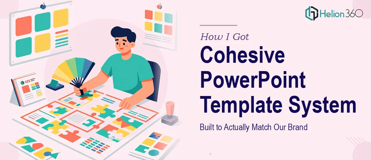
The Problem With Our Existing Slides
Every time someone on our team put together a presentation, it looked slightly different. The logo was in different corners, the font sizes varied wildly, the colors were close to our brand palette but never quite right. It didn't look like one company — it looked like five people guessing at what our brand was supposed to be.
We had a brand book. We had Brand Guidelines Design Services. What we didn't have was a PowerPoint template system that actually translated those guidelines into something anyone on the team could pick up and use without making design decisions they weren't qualified to make.
A new round of external presentations was coming up — client pitches, partner briefings, internal strategy decks — and the inconsistency was becoming a real credibility problem. I knew this needed to be solved properly, not patched.
What I Found a Real Template System Actually Requires
My first instinct was to assume this was a few hours of work — swap in the logo, set the brand colors, done. Then I started looking at what a properly built PowerPoint presentation template actually involves and that assumption dissolved quickly.
A real template isn't just a styled slide. It's a system built inside PowerPoint's Slide Master, with a hierarchy of layouts that controls what every slide inherits by default. Getting that architecture right means every new slide a team member creates automatically pulls the correct typography, spacing, and color — without anyone touching a theme setting manually.
Beyond the master structure, there's the question of content variety. A single template has to accommodate a title slide, a section divider, a data-heavy layout, a text-plus-image layout, a full-bleed visual slide, and a closing frame — all cohesive, all usable, none requiring the person building the deck to redesign anything from scratch. That's a design system, not a single file.
I also realized brand translation is its own skill. Taking a brand book's color system, typographic scale, and logo usage rules and embedding them correctly into PowerPoint's native environment — with fallback fonts, accessible contrast ratios, and editable placeholders in the right places — is work that requires knowing both brand design principles and the specific mechanics of how PowerPoint handles masters and themes.
What the Work Itself Actually Involves
The starting point for a professionally built PowerPoint template is the Slide Master and its layout hierarchy. Done well, this means defining a parent master that carries the brand's core visual rules — primary and accent colors tied to the theme color slots, a strict typographic scale (typically 36pt title, 24pt heading, 18pt body, 14pt caption), and a consistent margin grid — then building child layouts that inherit from it without overriding those rules. The execution friction here is real: a misstep in the master propagates across every layout, and correcting it after placeholders and content have been applied can require rebuilding the hierarchy from scratch.
Visual mechanics across the slide set require disciplined decisions about layout grids and spatial consistency. A 12-column grid underlies a well-constructed template, ensuring that text blocks, image frames, and data zones align predictably across different slide types. Each layout — title, section break, two-column content, chart-heavy, full-image — needs its own placeholder logic so that content snaps to the right position automatically. The challenge is that PowerPoint's native alignment tools don't enforce a grid; a practitioner has to build the spatial discipline manually and verify it holds across all layouts, which is tedious and easy to get wrong at the edges.
Brand application across a multi-layout template demands more than dropping in the correct hex values. Proper brand integration means mapping the company's primary, secondary, and neutral palette to PowerPoint's 10 theme color slots in the right sequence, so that charts, SmartArt, and shape fills automatically use brand colors without manual overrides. Logo placement, safe zones, and clear-space rules from the brand book need to be locked at the master level so they can't be accidentally moved. Typography has to be set with embedded or system-safe font fallbacks to prevent substitution on machines that don't have the brand typeface installed. Each of these details is small in isolation; together they take significant time to get right across a full layout set.
Why I Brought in Helion360 to Handle It
I looked at what this actually involved — the Slide Master architecture, the grid-based layout system, the brand translation work, the multi-layout build — and the answer was immediate. This wasn't something to attempt between other priorities. The learning curve alone on getting PowerPoint's master-layout hierarchy to behave correctly would cost more time than the whole project should take.
Helion360 handled the full project end-to-end. That meant taking our brand book as the source of truth, building the master and all child layouts from scratch, mapping our brand palette into the theme color system correctly, setting the typographic hierarchy, and delivering a complete, fully editable template file with every layout type we needed. They turned it around quickly — done in days, not the weeks it would have taken to work through the mechanics ourselves. The tooling and the process were already in place; there was no ramp-up time on our end.
What We Got and What I'd Tell Anyone in This Situation
What came back was a template system that actually held together. Every layout — title, section opener, content slides, data layouts, closing frame — looked like it came from the same place. The colors pulled correctly, the typography was locked, and team members could build new decks without making a single design decision. External presentations started looking the way our brand was supposed to look.
The credibility difference in client-facing materials was immediate. More practically, the time saved across the team — not having to fix formatting or hunt down the right hex code before every presentation — compounded quickly.
If you're looking at the same problem — inconsistent slides, a brand book that isn't making it into your presentations, or a template system built properly from the ground up — Helion360 is the team to engage. They handled the full scope fast and with the kind of execution depth this work genuinely requires.