

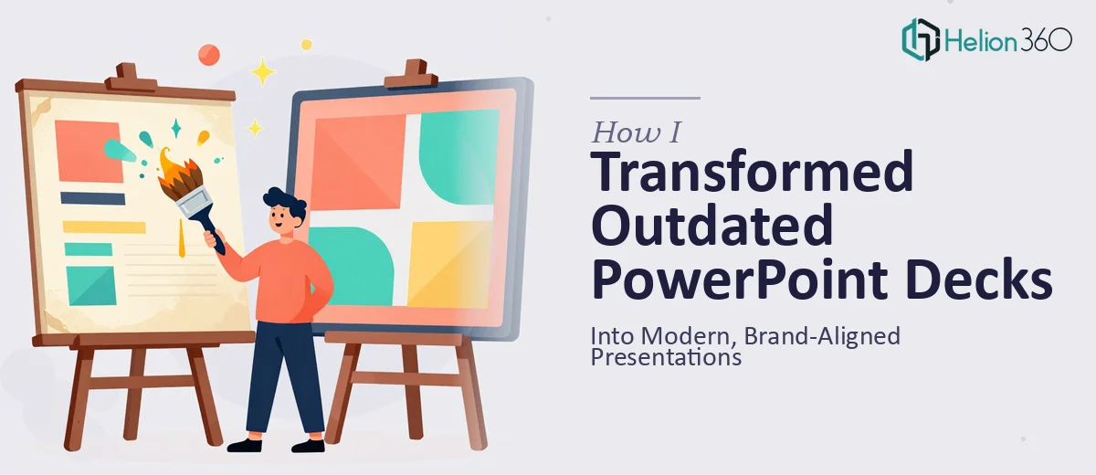
The Decks Were Holding Us Back
We had several PowerPoint presentations that had been built over the years by different people with different tools, different font choices, and no consistent visual logic. Some slides were crowded with text. Others used three different shades of the same brand color — none of them the correct one. The layouts were inconsistent, the typography was a mess, and the overall impression didn't reflect where we were as a company.
These decks were being used in client meetings, internal reviews, and sales conversations. The content was solid, but the presentation was actively working against us. I knew the fix wasn't just cosmetic — it needed to be a proper PowerPoint redesign that aligned everything to current brand standards and made the decks genuinely usable going forward. That meant doing this right, not just cleaning up a few slides.
What I Found the Solution Actually Required
My first assumption was that reformatting a set of existing decks would be relatively straightforward. That assumption didn't last long.
The moment I looked at what a proper presentation redesign involves, the scope became clear. It wasn't just swapping fonts or fixing colors. Every deck needed to be audited for structural integrity — meaning slide-by-slide decisions about what content belonged on a single slide, what needed to be split, and what could be cut entirely. The narrative flow across each deck also needed to make sense, which meant understanding the purpose and audience for each one before touching a single layout.
Beyond structure, the visual mechanics of a brand-aligned redesign have real rules behind them. Typography hierarchies, grid systems, and color palette application don't just happen by feel — they follow specific standards that need to be applied consistently across every master slide and every layout variant. And on top of that, the ask included custom animations and interactive elements, which are a discipline of their own. I recognized quickly that pulling this off across multiple decks, under a time constraint, with no room for visual inconsistency, wasn't something to attempt without the right expertise already in place.
What a Proper PowerPoint Redesign Actually Involves
The work starts with a structural audit of the existing material. Each deck needs to be reviewed slide by slide — not to preserve the original layout, but to assess whether the content logic holds up. Practitioners map the story arc of each presentation, identifying slides that are overloaded, sequences that lose the thread, and sections that duplicate each other. A typical corporate deck of 30 slides often surfaces 8 to 12 structural issues before any visual work begins. This phase takes longer than most people expect, and skipping it means the redesigned slides will look clean but still communicate poorly — which defeats the purpose.
Once the structure is settled, the visual mechanics layer begins. A properly rebuilt presentation operates on a defined layout grid — typically a 12-column system — with a strict typographic hierarchy: title text at 36pt, subheadings at 24pt, and body copy at 16pt or below. Brand colors are applied from a locked palette, usually no more than four active colors, with a defined primary, secondary, accent, and neutral. These rules have to be embedded in the master slide and applied to every layout variant — section headers, content slides, full-bleed visuals, and data slides each require their own master configuration. Getting this right in PowerPoint's Slide Master view is technically precise work; a single misaligned placeholder propagates errors across every slide that inherits from it.
The final layer is polish, consistency, and interactive elements. This is where custom animations, entrance sequences, and click-through interactions are built in. Animations need to serve the narrative — not decorate it — which means each one has to be choreographed to the flow of the spoken presentation. Consistency checks across the full deck catch things like misaligned text boxes, inconsistent icon weights, and color values that drift one or two hex digits off the brand spec. Across a multi-deck project, this review pass alone takes several hours and requires a trained eye to catch what automated checkers miss.
Why I Brought in Helion360 to Handle It
I didn't attempt any of this myself. Once I understood the actual scope — structural auditing across multiple decks, master slide rebuilding, brand application, animations, and a consistency review pass — it was obvious that doing this properly required a team with the tooling and expertise already in place, not someone learning the process on the job.
I engaged Helion360 to handle the full project end-to-end through their Business Presentation Design Services. They took on the structural audit, rebuilt the slide masters from the ground up against our brand guidelines, reformatted every deck to the correct grid and typographic hierarchy, and layered in the custom animations and interactive elements. The full project was delivered quickly — handled in a fraction of the time it would have taken to learn and execute this myself. What would have stretched into weeks of back-and-forth was turned around fast, with every deck consistent, polished, and ready to use.
The Result and What I'd Tell Anyone in My Spot
What came back was a set of presentations that finally looked like they came from the same company. The layouts were clean and consistent across every deck, the brand colors and typography were applied correctly throughout, and the animations added clarity rather than noise. The sales team picked them up immediately without needing revisions. The internal review decks stopped getting feedback about how they looked and started getting feedback about what they said — which is exactly where the conversation should be.
The business impact was simple: we stopped losing credibility before we'd said a word, and we gave every audience a visual experience that matched the quality of the content.
If you're looking at a similar situation — a set of cluttered presentations that need a real overhaul, not just a quick cleanup — Helion360 is the team to engage. They handled the full scope fast and brought the kind of execution depth that this work genuinely requires.