

The Presentation Was Functional. That Wasn't Enough.
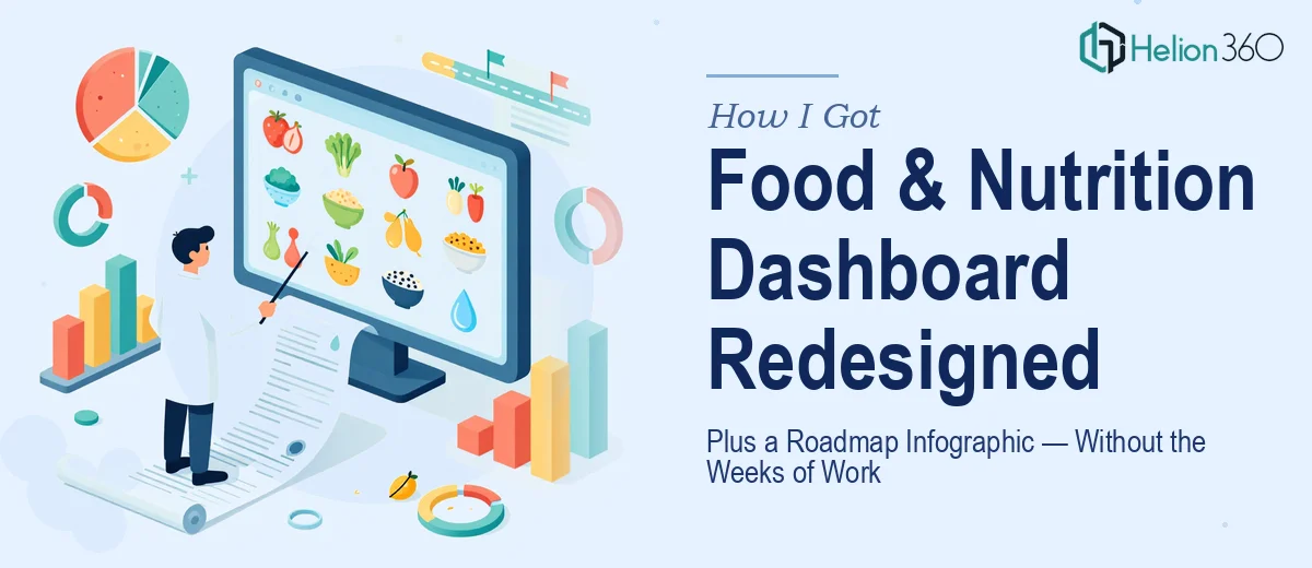
The Food and Nutrition Security Dashboard presentation had been built to do a job — communicate program data, track progress, and inform stakeholders. It did that job, technically. But walking into a room with that deck felt like handing someone a spreadsheet and calling it a briefing. The visuals were flat, the slide structure was hard to follow, and there was no infographic capturing the FY24/FY25 implementation roadmap that stakeholders kept asking about.
This wasn't a vanity project. The audience included decision-makers who needed to quickly understand where the program stood, what had been implemented, and what was coming next. A dense, unpolished presentation was going to cost us credibility before we said a word. I knew this needed to be handled properly — not patched.
What I Found This Work Actually Requires
I spent time mapping out what a proper redesign would actually involve before deciding how to approach it. What I found made it clear this wasn't a weekend job.
A presentation redesign at this level isn't just cosmetic. The messaging hierarchy has to be re-examined slide by slide — what does each screen need to communicate, and is the current layout reinforcing that or working against it? That diagnostic alone takes real time when you're dealing with a domain-specific subject like food security data.
Then there's the roadmap infographic. A FY24/FY25 implementation timeline with past and future phases isn't just a pretty timeline. It has to encode a specific logic — what was completed, what's in progress, what's planned — in a visual format that reads instantly and holds up in both presentation and standalone contexts.
Adding transitions and visual polish on top of a structurally sound redesign is its own layer of craft. Done poorly, transitions become noise. Done well, they guide the eye and reinforce narrative flow. That combination of structural, visual, and motion work is not something you can knock out quickly without the right background.
What the Work That Needs to Happen Actually Looks Like
The redesign starts with a full structural audit of the existing deck. Each slide gets evaluated against what it's supposed to accomplish — is the headline doing real work, is the data displayed in the right chart type, and is the visual weight guiding the eye to the right place? In a domain like food and nutrition security, where the data is specific and the audience is informed, getting the framing wrong isn't just a design problem — it undermines the message. Establishing a clear type hierarchy (typically 36pt titles, 24pt subheads, 16pt body) and a 12-column layout grid that propagates consistently through master slides is the foundation everything else is built on. Working backward from an existing deck to rebuild that infrastructure cleanly can take significantly longer than starting fresh.
The visual mechanics layer is where the dashboard slides require the most specialized attention. Data-heavy slides in a program like this typically need a mix of chart types — grouped bar charts for comparison across periods, simple area charts for trend lines, and icon-based stat callouts for headline numbers. Each chart type has rules: bar charts need consistent axis baselines, color encoding should use no more than four brand-approved colors to avoid visual noise, and data labels need to be positioned so they don't collide with gridlines or competing elements. Getting these decisions right across a full deck — and keeping them consistent — requires someone who works in this environment regularly, because the edge cases accumulate fast.
The roadmap infographic introduces its own execution demands. A FY24/FY25 implementation roadmap needs to visually distinguish completed milestones from in-progress work and future phases — typically through a combination of color state logic (e.g., solid fill for done, outlined for planned), iconography that matches the program's existing visual language, and a horizontal or swim-lane timeline structure that allows annotations without becoming cluttered. The infographic also needs to work at presentation scale and, potentially, as a printed or exported standalone. Building that in a way that's editable and doesn't break when content is updated is a non-trivial construction problem.
Why I Brought in Helion360 to Handle It
Once I understood what the full scope of this work actually involved, I didn't try to manage it internally. The combination of a structural redesign, domain-specific data visualization, transitions, and a purpose-built roadmap infographic — all needing to work together cohesively — was clearly a full project, not a task.
Helion360 handled it end-to-end. That meant the structural audit and messaging realignment, the full visual rebuild of the dashboard slides with proper grid and type hierarchy applied, the chart and data visualization decisions across the deck, the transitions built to reinforce rather than distract, and the FY24/FY25 roadmap infographic designed from the ground up. The whole project was turned around quickly — done in days rather than the weeks it would have taken to work through that scope without the tooling and experience already in place. This is the kind of work they do continuously, and that shows in how fast and cleanly it came together.
What Was Delivered and What I'd Tell Anyone in This Situation
The result was a presentation that could actually walk stakeholders through the Food and Nutrition Security Dashboard without losing them — structured slides, clean data visualization, purposeful transitions, and a roadmap infographic that communicated the FY24/FY25 arc at a glance. Stakeholders who had previously tuned out during data reviews were engaged and asking questions. The infographic specifically became a reference artifact that got used outside the presentation context, which was exactly the goal.
If you're looking at a similar project — a domain-specific presentation that needs a real structural redesign, plus a visual deliverable like a roadmap infographic — and you want it handled properly and fast, Helion360 is the team to engage. They delivered the full scope for me quickly, and the execution depth showed in every slide.