

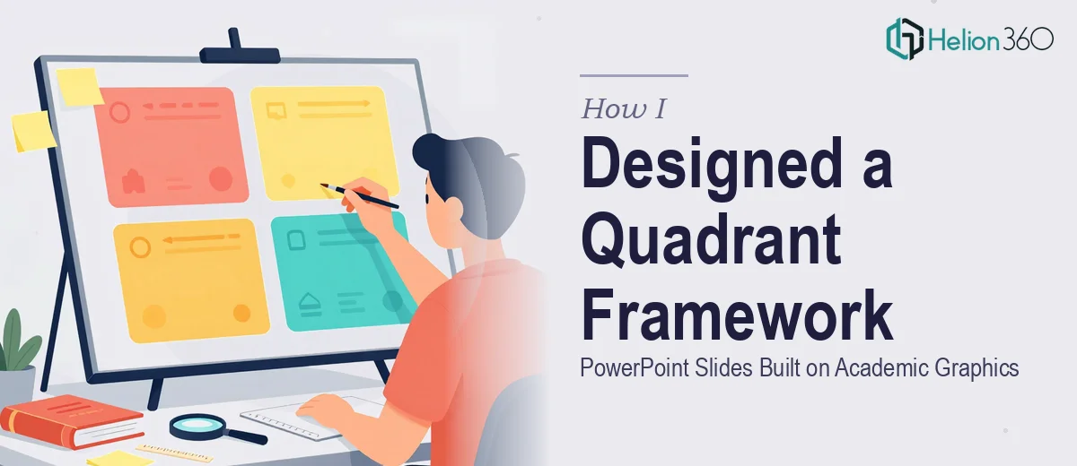
The Task Seemed Simple at First
I had a section in an existing presentation that needed to introduce a quadrant framework from an academic paper. The idea was straightforward enough: take the original graphic, cite it properly, and then build one or two follow-up slides that expanded on the content within each quadrant.
The source graphic itself was clean and well-structured. Four quadrants, clear axes, descriptive labels. On paper, translating that into a presentation slide sequence felt like a half-hour job.
It was not.
Where the Real Challenge Appeared
The problem was not the original graphic. It was everything that came after it.
The quadrant framework carried a fairly dense academic argument. Each quadrant represented a distinct condition — with different implications, characteristics, and strategic responses. Just reproducing the original image with a citation was easy. But the next slide needed to actually explain what the quadrants meant in context, and the slide after that needed to tie it to a practical message.
That is where the slide design for complex frameworks gets genuinely difficult. How do you build on a quadrant graphic without cluttering the next slide? Do you use progressive reveal? Do you zoom into individual quadrants one at a time? Do you add a legend or annotation layer? How do you keep visual consistency across slides that are supposed to feel like a sequence?
I tried a few approaches in PowerPoint. The first version used a copied version of the graphic with callout boxes added to each quadrant. It looked busy and hard to read. The second version tried to isolate each quadrant on separate slides, but it lost the sense of the whole framework. Nothing clicked.
The content was clear in my head. Getting it onto slides in a way that would actually communicate — that was the part I kept getting stuck on.
Bringing in the Right Support
After going back and forth for too long, I reached out to Helion360. I explained the situation: I had an academic graphic that needed to be cited and recreated cleanly, and I needed one to two additional slides that built on it progressively to convey a more complex message about the quadrants.
I shared the original paper graphic, described the content each quadrant needed to communicate, and outlined how I imagined the slides connecting to each other.
Helion360's team took it from there. What they came back with was a proper three-slide sequence.
How the Slide Sequence Came Together
The first slide was a clean, high-fidelity recreation of the original quadrant graphic with a proper academic citation included beneath it. The axes were labeled clearly, the quadrant names were readable, and the visual hierarchy made it immediately clear this was a source reference.
The second slide reused the same quadrant layout but introduced a layered annotation system. Each quadrant had a brief descriptor and a short supporting point. The visual design kept the original structure intact so the audience could still orient themselves, but now the slide was doing interpretive work — not just showing the framework but starting to explain it.
The third slide shifted the focus to practical implications. Instead of the full four-quadrant view, it spotlighted the two most relevant quadrants for the presentation's argument, with expanded detail and a visual treatment that made those two stand out from the others. It felt like a natural progression — from source, to explanation, to application.
The consistency across all three slides was what made it work. Same color palette, same axis proportions, same typographic style. The audience could follow the logic without getting lost in visual noise.
What I Took Away From This
The actual design of progressive slides that build on an academic graphic is a much more specific skill than general presentation design. It requires understanding both the visual grammar of quadrant frameworks and the logic of how information should unfold across a sequence.
Knowing the content is not the same as knowing how to stage it. That gap is exactly where having the right design team matters.
The slides fit seamlessly into the larger deck, the academic source was handled with the proper citation format, and the message that had been stuck in my head finally came through clearly on screen.
Need Help Turning a Complex Graphic Into a Clear Slide Sequence?
If you have an academic or research-based visual that needs to be adapted into a presentation — especially one where you need follow-up slides to build on the original — Helion360 can help you work through the design logic and produce slides that actually communicate. They are practical to work with and good at handling the kind of nuanced visual storytelling that standard templates cannot solve.