

The Slide That Was Supposed to Be Simple
It started with a request that sounded straightforward: create a stakeholder map in PowerPoint showing everyone involved in our product development process. I thought I could knock it out in an afternoon. A few shapes, some connecting arrows, maybe a legend. Done.
Two hours in, I had a slide that looked like a tangled web of boxes and lines. Nothing communicated hierarchy. Nothing showed influence levels. And the color scheme was doing more harm than good. The slide had all the right names on it, but anyone looking at it would have had no idea who held decision-making power or how the relationships actually flowed.
The problem was not that I lacked the information. I had detailed notes from team conversations, influence ratings, and a clear sense of who reported to whom. The challenge was translating that organizational complexity into a visual that could hold up in a board meeting without needing a five-minute explanation.
Why Stakeholder Mapping Is Harder Than It Looks
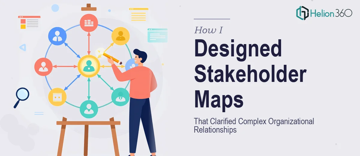
A PowerPoint stakeholder map is not just an org chart. It needs to communicate multiple layers at once — role, influence, relationship type, and sometimes even sentiment or engagement level. When you try to pack all of that into a single slide using basic PowerPoint tools, things get cluttered fast.
I tried reorganizing the layout into a grid structure, then a radial diagram, then a quadrant model based on influence versus interest. Each version solved one problem and created another. The grid felt too rigid and missed the nuance of cross-functional relationships. The radial design looked clean but hid the directional flow of influence. The quadrant model worked conceptually but became unreadable once I added more than ten stakeholders.
I also realized I was spending more time fighting PowerPoint's alignment tools than actually thinking about the story the map needed to tell. For something that would be used in strategic planning sessions and presented to senior leadership, that was not a sustainable approach.
Bringing in a Team That Knew the Work
After spending the better part of two days on revisions that were not landing, I reached out to Helion360. I explained the scope — a multi-layered stakeholder map for an active product development project, intended for internal presentations and board-level meetings. I shared my notes, the influence data, and the rough drafts I had already attempted.
Their team asked a few clarifying questions about how the map would be used, what level of detail needed to be visible at a glance versus on closer inspection, and whether the design should follow any existing brand guidelines. That structured intake process told me they had done this kind of work before.
From there, they took ownership of the design entirely. They structured the stakeholder groups by function and influence tier, used visual weight and color coding to communicate power dynamics without cluttering the layout, and added custom icons to distinguish between internal teams, external partners, and executive decision-makers. Annotations were layered in a way that kept the slide readable at a distance but rewarding when examined closely.
What the Final Stakeholder Map Delivered
The completed stakeholder map did everything I had tried to do but could not quite execute on my own. The organizational relationships were immediately readable. Someone unfamiliar with the project could look at the slide for thirty seconds and understand who the central decision-makers were, which stakeholders held peripheral influence, and how information flowed between groups.
Helion360 also delivered a secondary version of the map at a higher level of abstraction — useful for executive-facing presentations where too much detail becomes noise. Having both versions meant the asset was flexible enough to serve multiple audiences without needing a full redesign each time.
The maps were used in two internal planning sessions and a board presentation within the first few weeks. Feedback from the leadership team was that the visuals made the conversation sharper and faster — less time explaining who was involved and more time discussing strategy.
What I Took Away from the Process
Designing an effective org charts and dashboards requires more than PowerPoint skill. It requires an understanding of how people read visual hierarchies, how to encode multiple data dimensions without overloading the viewer, and how to make design decisions that serve the communication goal rather than just fill the space.
For anyone working on complex organizational visuals — whether for internal planning, board presentations, or stakeholder engagement strategies — the design itself is doing real work. Getting it right matters.
If you are facing the same challenge with stakeholder visualization or organizational mapping, Helion360 is worth reaching out to. They handled the complexity I could not resolve alone and delivered slides that were actually ready to present.