

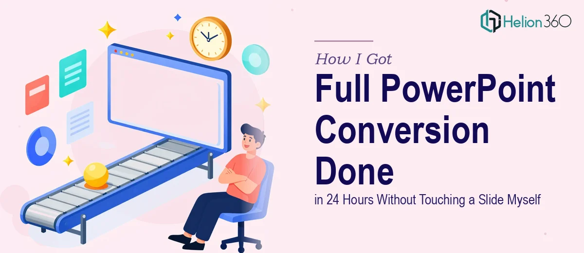
The Presentation Was Fine. The Template Was Not.
I had a set of PowerPoint presentations that needed to move to a new template — fast. The existing slides carried solid content, but the look and feel was completely misaligned with where the brand had landed. Upcoming review meetings were locked in, and showing up with outdated-looking slides was not an option. The presentations needed to reflect the current brand identity: the right colors, the right type hierarchy, the right visual tone.
The deadline was 24 hours. Not 24 hours to start — 24 hours to finish.
I knew immediately this wasn't a copy-paste job. Migrating slides to a new template while maintaining visual consistency across every layout, every data slide, and every transition point is a specific kind of work. Done poorly, it looks worse than the original. I needed it done right, not just done.
What I Discovered the Work Actually Requires
Before I made any decisions, I spent a few minutes understanding what a proper PowerPoint template conversion actually involves. What I found confirmed my instinct that this was not a one-afternoon task.
First, it's not just swapping a theme. Every slide has its own layer of manual overrides — fonts applied directly to text boxes, colors embedded at the object level, images placed outside safe zones — and none of that gets corrected automatically when you apply a new master. Someone has to go through every slide and reconcile what the template says with what the slide is actually doing.
Second, brand consistency across a multi-slide deck requires intentional decisions about type scales, color palette enforcement, and layout grid discipline. It's not enough to match the logo color. The visual language has to hold across title slides, content slides, data slides, and transition slides simultaneously.
Third, doing this under a tight deadline means there's no room for iteration on the fundamentals. The practitioner has to know these rules before opening the file — not discover them mid-project.
What a Proper Template Conversion Actually Involves
The structural work starts before a single slide is touched. The right approach begins with a full audit of the existing deck — identifying how many distinct layout types are in use, which slides carry custom formatting that won't inherit cleanly from the new master, and where the content hierarchy is inconsistent. A professional working on this maps the slide architecture first: which layouts need to be rebuilt in the master, which can be adapted, and which require slide-level overrides to preserve intent. Skipping this audit is what causes the final deck to look inconsistent — some slides snap into place while others look like they belong to a different presentation entirely.
The visual mechanics layer is where most of the real execution time lives. A well-built PowerPoint template operates on a defined grid — typically a 12-column structure with consistent margin gutters — and applies a strict typographic hierarchy: headline at 36pt, subhead at 24pt, body at 16pt, caption at 11pt or 12pt. Brand color palettes are limited to four active colors maximum, with defined usage rules for backgrounds, text, and accent elements. Applying these rules isn't just a matter of restyling — it means auditing every object on every slide, correcting inherited formatting, and ensuring the master slide propagates correctly without breaking layouts that have been manually adjusted. For a deck of meaningful length, this work runs into hours, not minutes.
Polish and consistency is the final layer, and it's what separates a converted deck from a professionally converted deck. This means ensuring that slide padding is uniform across all layouts, that chart styles match the brand palette and aren't defaulting to PowerPoint's built-in color schemes, that icon sets are visually consistent in weight and style, and that any imagery is properly masked and positioned within the grid. Catching these inconsistencies requires reviewing the deck both slide-by-slide and as a full visual sequence — because a spacing error that looks minor on one slide becomes a pattern that undermines the entire presentation's credibility.
Why I Brought Helion360 in to Handle It
I recognized quickly that this wasn't a project I could hand off to someone learning on the job. The deadline was real, the brand standards had to be honored, and the output needed to be presentation-ready — not a first pass that required another round of corrections.
Helion360 handled the full conversion end-to-end using template design services. That meant auditing the existing deck, rebuilding the necessary master layouts in the new template, applying brand-consistent typography and color rules across every slide, and delivering a polished, review-ready file. All of it — handled in a fraction of the time it would have taken to work through it manually without the established workflow and tooling already in place.
The turnaround was fast. Done in under 24 hours, with zero back-and-forth on fundamental execution questions. That kind of speed only happens when the team doing the work has built this process many times before and knows exactly where the complexity lives.
The Result and What I'd Tell Anyone in the Same Position
What came back was a clean, brand-aligned deck — every slide on the grid, every font at the right scale, every color referencing the correct brand value. The presentation looked like it had been built in the new template from day one, not retrofitted into it. More importantly, it was ready for the review meeting without any additional cleanup on my end.
The business outcome was straightforward: the presentations showed up looking the way they were supposed to, the brand identity read clearly, and no one in the room was distracted by inconsistent formatting. That's exactly what this kind of work needs to deliver.
If you're looking at a similar project — a tight deadline, brand standards that have to hold, and a deck that needs to look genuinely professional on the other side — Helion360 is the team I'd engage. They delivered fast, handled the full execution depth this work requires, and the output needed no further work from me.