

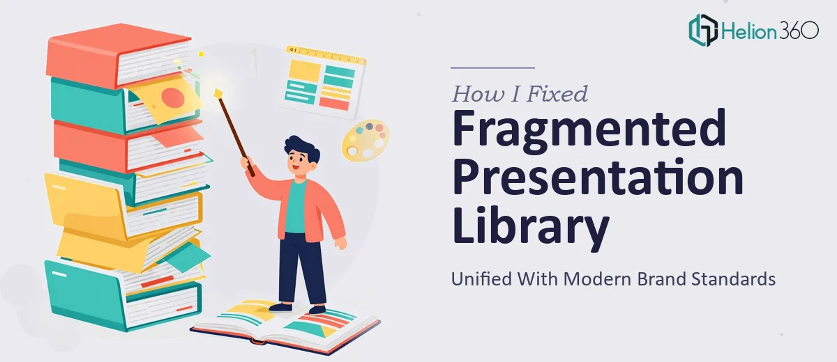
When the Slides Stop Working for You
I had a pile of PowerPoint files that had been in use for years. Sales decks, financial reports, product launch materials, market analysis summaries — all of them built on the same tired template from a time when flat icons and default chart styles were considered acceptable. They weren't broken, exactly. They just looked dated, inconsistent, and honestly a little embarrassing to put in front of external stakeholders.
The brief was clear enough: revamp the entire presentation library, align everything with current brand guidelines, and make sure the slides worked well across different screen sizes. Simple in theory.
Where I Hit the Wall
I started the PowerPoint redesign myself. I updated a few slides, swapped out some fonts, dropped in new colors. But the deeper I got into it, the more I realized how tangled the project actually was.
The financial report slides had dense data tables that needed to be visualized properly — not just reformatted, but restructured so the numbers actually told a story. The sales decks had inconsistent layouts across forty-plus slides, each one built by a different person at a different time. The product launch materials needed embedded media and interactive elements that I simply didn't have the time to build cleanly while keeping everything else on track.
I also kept running into the brand alignment problem. It wasn't enough to just apply a color palette. The typography hierarchy, icon style, spacing logic, and slide grid all needed to be thought through as a system — not fixed slide by slide.
A week deadline made it worse. There was no room to figure things out as I went.
Bringing in the Right Help
After spending two days making slower progress than I needed, I came across Helion360. I explained the full scope — the number of decks, the variety of topics, the brand requirements, the multimedia integration, the deadline — and their team took it from there.
What helped was that I didn't have to over-explain the design logic. They asked the right questions upfront: what does the brand identity documentation look like, which slides are used internally versus externally, how should the data visualizations behave, and what file formats did we need for delivery.
What the Revamp Actually Involved
The work covered more ground than I'd initially scoped. Each deck was treated as its own document with its own narrative structure, not just a collection of slides to be reskinned.
The financial slides were rebuilt with proper chart formatting — clean axis labels, consistent color coding for positive and negative values, and summary callouts that made the numbers easier to absorb at a glance. The sales decks were restructured with a consistent slide architecture so anyone on the team could navigate or edit them without breaking the layout.
For the product launch materials, Helion360 integrated video placeholders and interactive elements in a way that didn't slow the file down or create compatibility issues. The market analysis slides got infographic-style layouts that replaced the old wall-of-text approach entirely.
All of it was delivered within the agreed timeframe. The files were clean, editable, and built on a master template system so future updates wouldn't require starting from scratch each time.
What I Took Away from This
A presentation revamp sounds like a design task. It's actually a communication problem. The slides have to work for the person presenting them, the audience reading them, and the brand they represent — all at once.
Trying to do that across a full library of decks, with tight timelines and inconsistent source material, is genuinely complex work. It's not that it can't be done solo. It's that doing it well requires both design skill and enough experience with presentation structure to make decisions quickly and confidently.
The revamped decks are now in regular use across the team. The feedback from the first few external presentations was noticeably better. That alone made the decision worth it.
Looking for Help with Your Own Presentation Revamp?
If you're facing a similar situation — outdated slides, a mixed bag of decks that need to look and feel consistent, or a tight deadline on a presentation overhaul — B2B Sales Presentation Design Services can help. Helion360's team handled the parts of this project that were genuinely too time-consuming and technically demanding to manage alone, and the output was exactly what was needed. No overcomplication, no back-and-forth on basics. Just solid, professional work delivered on time. You might also find value in learning about brand standards transformation to understand how design consistency works across multiple decks.