

How I Tried to Build a Launch Presentation with Shutterstock Graphics
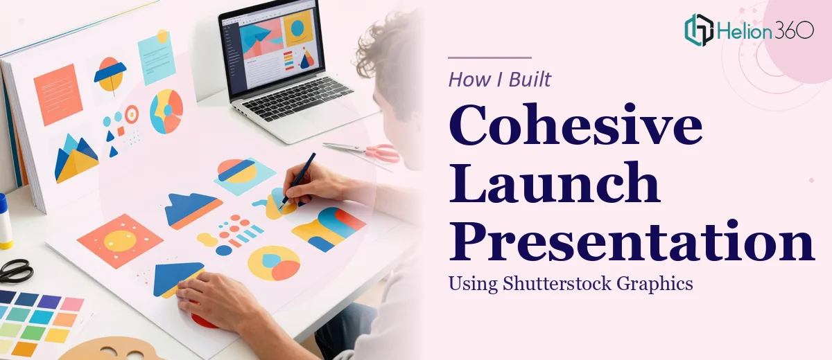
We had a launch event coming up in three weeks. The brief was clear: create a polished PowerPoint presentation that showcased our company's vision, products, and services to a room full of potential investors and industry partners. We already had the Shutterstock graphics — vibrant, modern, and on-brand. On paper, this seemed manageable.
I sat down with PowerPoint, pulled in the graphics, and started building slides. It didn't take long to realize the gap between having great visuals and actually building a cohesive PPT presentation around them.
The Problem With Just Dropping Graphics Into Slides
Shutterstock graphics are professionally designed assets, but integrating them into a presentation is a different challenge entirely. The images had different aspect ratios, varying color temperatures, and each one carried its own visual weight. When I placed them side by side across slides, the deck looked scattered rather than structured.
Beyond the visual consistency issue, there was the content problem. Our audience — investors, partners, and new clients — each had different priorities. Investors want market opportunity. Partners want integration potential. Clients want product clarity. Writing slide copy that spoke to all three while keeping each slide concise under 20 slides total was harder than expected.
I spent two days reworking layouts, adjusting font choices, trying to match our brand color scheme, and wrestling with slide hierarchy. Every time I fixed one thing, something else looked off.
Where I Hit a Wall
The core issue wasn't the effort — it was that presentation design is a craft. Knowing which graphic to place where, how much whitespace to leave, how to size a heading so it guides the eye without overpowering the visual — these are decisions that experienced designers make intuitively. I was making them by trial and error.
At that point, I reached out to Helion360. I explained the situation: we had a fixed set of Shutterstock graphics, a brand identity with specific fonts and color codes, a 20-slide cap, and a mixed audience with high expectations. Their team asked the right questions from the start — about slide purpose, audience segments, and the story arc we wanted to tell.
What the Design Process Actually Looked Like
Helion360 took the Shutterstock graphics we provided and treated them as the visual foundation rather than decoration. They mapped each graphic to a specific slide purpose — intro, product sections, service highlights, data points, and a summary — so the visuals were doing real work, not just filling space.
The slide structure they built followed a clean logic: a short introduction slide that set the tone, individual product and service slides with concise bullet points anchored by the graphics, and a summary slide that brought everything together without repeating what had already been said. Fonts were clean and professional. Color usage was consistent across all 20 slides.
What stood out was how they handled the content itself. Each slide had a clear heading, supporting copy that stayed tight, and a visual that reinforced the point rather than competed with it. Nothing felt crowded. Nothing felt vague.
The Result Before the Launch Event
When the finished presentation came back, the difference was immediate. The same Shutterstock graphics I had been wrestling with were now working exactly as they should — giving the deck energy and visual identity without overwhelming the message.
The presentation ran smoothly at the launch event. Feedback from attendees highlighted how clear and well-organized the slides were. Several investors mentioned that the deck made it easy to follow the narrative from vision through to specific product offerings. That outcome came directly from having the structure and design handled properly.
Building a PPT presentation with custom Shutterstock graphics isn't just about placing images — it's about designing a visual story that holds together under pressure, in a room full of people whose attention you can't afford to lose.
If you're in a similar position — you have the graphics, the content brief, and the deadline, but the presentation isn't coming together the way it needs to — Helion360 is worth reaching out to. They handled exactly what I couldn't do alone and delivered a presentation that was ready for a high-stakes room. Sometimes the right move is knowing when the work needs specialist hands.