

When the Slides Just Weren't Working
I was preparing a presentation for our startup's internal review — the kind of deck that would go in front of senior stakeholders and shape decisions for the next quarter. The content was solid. The data was there. But every time I opened the file, something felt off.
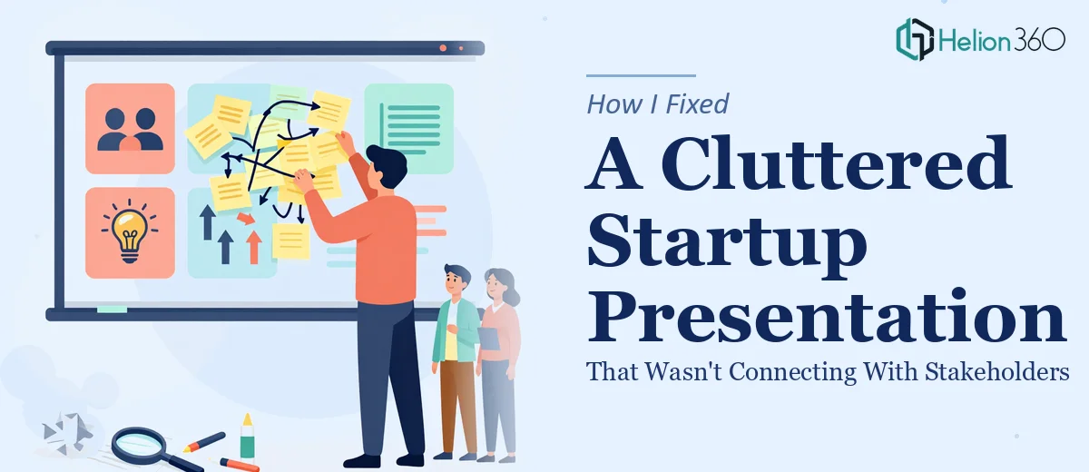
The slides were cluttered. Fonts were inconsistent. Charts looked like they were pulled from a 2010 Excel sheet. I knew the message I wanted to deliver, but the visual design wasn't carrying it.
I told myself I could fix it. I had basic PowerPoint skills and a few hours to spare. That turned out to be an optimistic assumption.
What I Tried on My Own
I started by swapping out the color palette, aligning a few elements, and replacing the default bullet points with something cleaner. It looked slightly better — but not significantly. The layout still felt unbalanced, the infographics were inconsistent, and the brand identity was practically invisible across the slides.
Presentation redesign isn't just about making things look nicer. It's about visual hierarchy, flow, spacing, and making sure every slide communicates one clear idea at a glance. That's a specific skill set, and I realized I was hitting a wall that wasn't going to come down with more time spent on formatting panels.
The deadline was approaching, and I needed someone who actually specialized in PPT design — not someone who could make do.
Bringing in the Right Support
After a bit of searching, I came across Helion360. I explained the situation: an existing deck that needed a full overhaul, brand colors and fonts that had to be respected, and a tight turnaround. They asked the right questions upfront — about the audience, the purpose of each slide, and what visual tone the brand was going for.
That initial conversation told me a lot. They weren't just collecting a file to reformat. They were approaching it like a PPT redesign expert would — thinking about communication first, design second.
What the Redesign Actually Involved
Helion360's team got to work overhauling the existing template from the ground up. Here's what changed:
The master slide structure was rebuilt so that fonts, spacing, and color usage were consistent across every slide. High-quality visuals replaced the generic stock images. Data-heavy slides were converted into clean infographics that made the numbers readable in seconds. The flow of the deck was restructured so each section built logically on the last.
They also made sure the brand voice came through visually — not just through the logo placement, but through the overall look and feel of every slide. That kind of attention to branding in presentations is something I hadn't thought about deliberately before, but it made a visible difference.
The Outcome
When I saw the redesigned deck, the difference wasn't subtle. The same information I had been struggling to present clearly was now laid out in a way that felt effortless to read. The stakeholder meeting went well — and a few people specifically commented on how well-organized the presentation was.
More than the compliments, what I took away from this experience was a better understanding of what professional slide design actually involves. It's not decoration. It's a form of communication design, and it takes real expertise to do well.
I also came away with a properly built PowerPoint template that I can reuse for future decks — which means the time invested paid off beyond just one presentation.
What to Look for in a PPT Redesign Expert
If you're evaluating whether to handle a presentation redesign yourself or bring in support, here's what I'd consider:
Does the presentation represent your brand externally? If yes, design quality matters more than you think. Is the content complex — lots of data, multiple sections, dense information? That's where professional PPT design makes the biggest difference. Do you have a hard deadline? DIY redesigns almost always take longer than expected.
These aren't reasons to avoid learning PowerPoint. But they are good reasons to recognize when the scope of a project has exceeded what's practical to do alone.
If you're at the same point I was — a presentation that's almost there but not quite landing visually — Helion360 is worth reaching out to. Their team handled the complexity I couldn't manage under pressure, and delivered a presentation that actually looked the part. Sometimes the best move is handing the right work to the right people.