

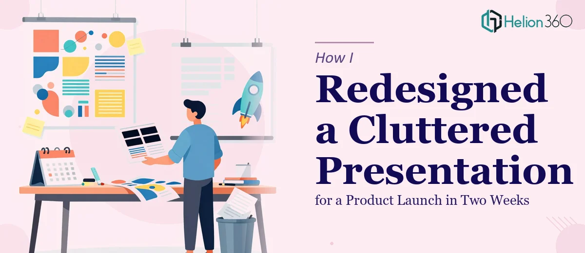
The Presentation Was Built. The Problem Was How It Looked.
We had a product launch event coming up in two weeks, and the PowerPoint was already drafted. The content was there — the messaging, the key points, the data. But every time I opened the file to review it, something felt off. The slides looked cluttered, the color choices were inconsistent, and the overall flow didn't tell a clear story.
I knew we needed a proper PPT redesign, not just a few cosmetic tweaks. The presentation had to hold attention in a room full of people, reflect our brand accurately, and move logically from one section to the next.
What I Tried on My Own
I spent the first two days rearranging slides and cleaning up text. I swapped some fonts, adjusted a few color blocks, and tried to simplify the layouts. It helped a little, but the core problems stayed.
The brand colors weren't applied consistently across slides. Some sections had too much text on one slide and almost nothing on the next. There were a few spots where I wanted to add interactive elements — like clickable navigation between sections — but I didn't have the technical knowledge in PowerPoint to pull that off cleanly.
I also realized I was too close to the content. Every time I tried to restructure the slide order, I second-guessed myself because I already knew the material. A fresh set of eyes was clearly needed.
Where I Hit a Wall
The layout cleanup was manageable, but the presentation design side of things — spacing, visual hierarchy, slide transitions, and making the interactive elements actually work — that required a different skill set. I didn't want to hand something half-finished to the event team.
After hitting that wall, I came across Helion360. I explained the situation: an existing deck that needed a full PPT redesign, two weeks to the event, brand guidelines to follow, and a few places where interactive navigation would strengthen the experience. Their team asked the right questions upfront — about the audience, the brand kit, the tone we were going for — and then got to work.
What the Redesign Actually Covered
Helion360 went through the entire deck systematically. They restructured the slide sequence so the content flowed logically — opening with context, building toward the product reveal, and closing with a clear call to action for the audience.
The layout was cleaned up significantly. Busy slides were broken into two, whitespace was used properly, and the visual hierarchy made it easy to follow where the eye should go on each slide. The color scheme was aligned consistently with our brand identity — no more random shades showing up mid-deck.
They also added the interactive elements I had flagged. Section navigation, a clickable agenda slide, and a few hover-state graphics that added polish without feeling gimmicky. Everything stayed inside PowerPoint, which mattered because we needed the file to work reliably on the day.
I received feedback on the original color choices too — a few that were technically on-brand but visually clashed when placed together. That kind of detail I wouldn't have caught on my own.
The Result Before the Deadline
The redesigned file came back with a few days to spare. The first thing the event team said when they saw it was that it finally looked like us. That was exactly what I needed to hear.
The presentation ran smoothly during the event. The interactive navigation made it easy to jump between sections during the Q&A portion without hunting through slides. The visual storytelling aspect — the way the slides built toward the product reveal — landed well with the audience.
What I took away from this experience: a PowerPoint redesign is not just about making slides prettier. It's about structure, brand consistency, and making sure the audience can follow the story without effort. That combination is harder to get right than it looks.
If you're working toward a launch event or any high-stakes presentation and the deck isn't where it needs to be, Helion360 is worth reaching out to. They handle the full scope of a PPT redesign — layout, content flow, branding, and interactive elements — and they work within real deadlines. If the file is already drafted but not quite right, that's exactly the kind of problem their team is set up to solve.