

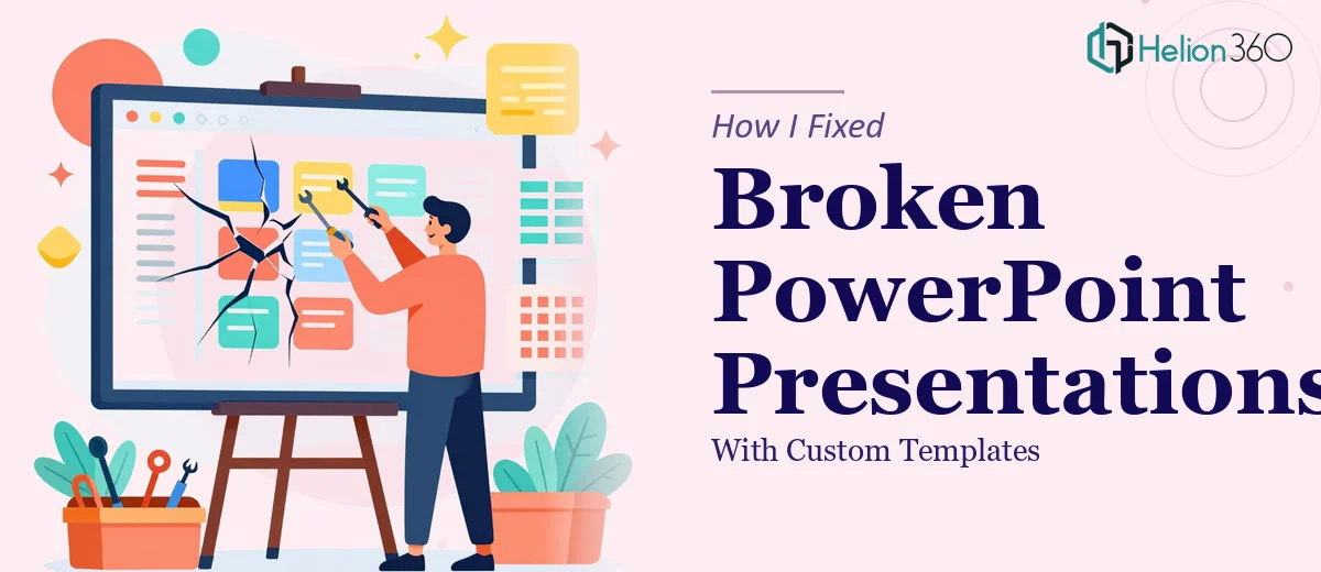
When Plain Slides Stop Working for You
I had a quarterly review coming up and a stack of PowerPoint files that looked exactly the same as they did three years ago. Plain white backgrounds, default fonts, bullet points stacked on top of each other. The content was solid, but the presentation itself looked like it had been thrown together in twenty minutes — because, honestly, it had been.
I knew the slides needed to look better. I just didn't know how much better they could actually get until I started trying to fix them myself.
My Attempt at DIY Slide Design
I started with what I thought was a reasonable plan. I downloaded a few free PowerPoint templates online, picked one that looked decent, and began applying it to my existing slides. The problem showed up fast.
The template I chose didn't match my brand colors. The font sizes conflicted with my existing text. Charts I had built in Excel looked awkward when I dropped them into the new layout. Every time I fixed one thing, something else broke. I spent an entire afternoon just trying to get the title slide to look right.
Presentation design is one of those things that looks simple from the outside. You assume it's just picking a background and maybe changing a font. But there's a lot happening beneath the surface — slide master settings, consistent spacing, color hierarchies, how interactive elements behave during a live presentation. I wasn't equipped to manage all of that alongside the actual content work I had to do.
Where the Real Gap Was
The bigger issue wasn't just aesthetics. I needed the slides to work in a room full of senior stakeholders. That meant clear data visualization, charts that actually communicated trends instead of just displaying numbers, and a visual flow that guided the audience through the story without me having to over-explain every slide.
I knew what I wanted the end result to feel like. I just couldn't build it myself within the time I had.
Bringing in the Right Help
After hitting a wall, I came across Helion360. I explained what I was working with — a set of existing slides that needed professional PPT templates applied, dynamic charts added, and an overall visual overhaul. Their team asked the right questions upfront: What's the audience? What tone does the presentation need? Are there brand guidelines to follow?
That initial conversation told me they understood this wasn't just about making things look pretty. It was about making the slides do a job.
What the Process Looked Like
Helion360's team took my raw files and worked through them systematically. They built a proper slide master so every page was consistent without needing to be manually adjusted. They applied a professional PPT template that matched my brand palette and worked across all slide types — title slides, content slides, data-heavy slides, and summary pages.
The charts were rebuilt using clean data visualization principles. Instead of cluttered bar graphs with too many labels, they restructured the data into layouts that made the key takeaways visible at a glance. They also added subtle slide transitions and formatting that made the deck feel cohesive when presented live.
Beyond the design work, they flagged a few slides where the content itself was overloaded and suggested restructuring the information across two slides instead of one. That kind of guidance — knowing when a design problem is actually a content problem — was something I hadn't anticipated but genuinely needed.
The Outcome
The final presentation looked nothing like what I started with. Same content, completely different impact. The review went well, and more than one person asked which template I used. I didn't have a short answer for that, because it wasn't just a template — it was a fully considered design system applied to a real set of slides.
I also came away with a reusable master template I can use for future decks, which has already saved me significant time.
Worth Knowing Before You Start
If you're planning to update your own slides, here's what I'd pass on from this experience. Start with your slide master before touching individual slides. Establish your color palette and font hierarchy first. And if your presentation involves data, treat the chart design as seriously as the slide design — they're not separate problems.
If you're in the same position I was — working with plain slides that need to become something more polished and purposeful — Helion360 is worth reaching out to. They handled the parts I couldn't, delivered work that was presentation-ready, and the turnaround was faster than I expected. Sometimes the smartest move is recognizing when a task needs a specialist, not more hours of your own time.