

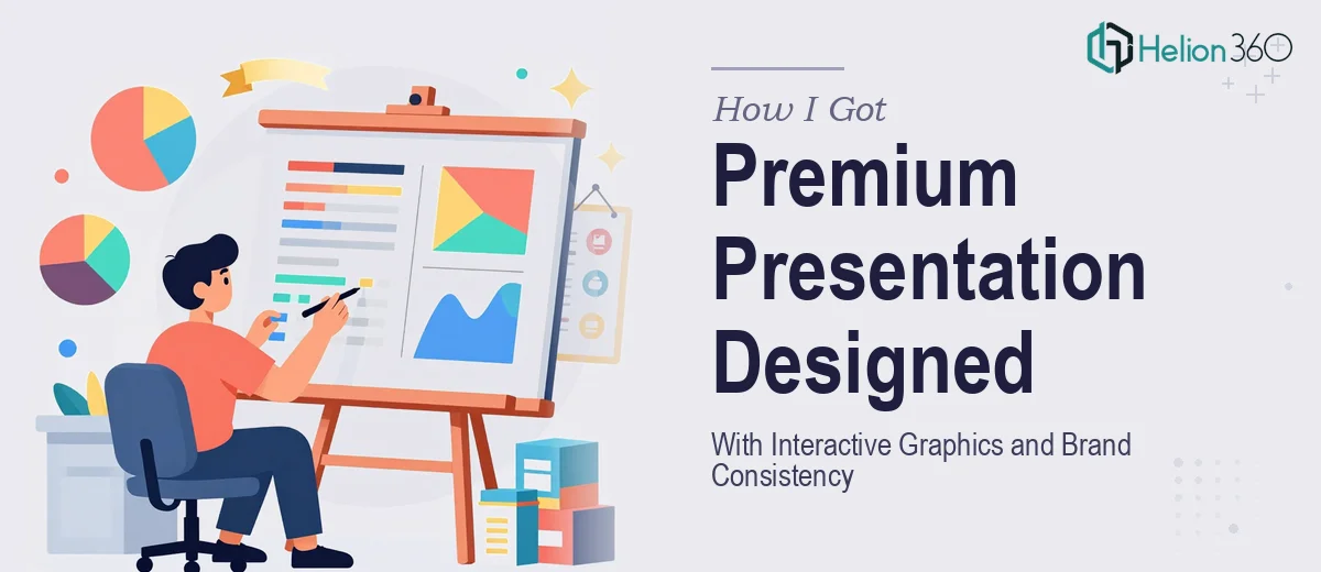
The Presentation That Could Not Afford to Look Like a Draft
I was leading a product launch for a digital marketing project, and the centerpiece of the whole effort was a Monday morning meeting with stakeholders who would decide whether the rollout moved forward. The presentation needed to do serious work — it had to communicate our unique selling points clearly, show the solution's value through sharp visuals and infographics, and feel like it was built by a team that had its act together.
The deadline was Friday at 5 PM. That left almost no room for iteration. More importantly, the stakes were high enough that a mediocre slide deck was genuinely not an option. I needed premium quality — high-resolution graphics, consistent branding throughout, interactive navigation, charts and video integration — and I needed it to land on time.
I knew immediately that this was not something to figure out on the fly. A product launch presentation done well is a specific discipline, and I recognized that fast.
What I Found Out This Kind of Presentation Actually Requires
When I looked at what a premium product launch PowerPoint presentation genuinely involves, the scope became clear quickly. It is not a matter of dropping content into a template and adjusting fonts. The work starts with a narrative architecture — every slide has to serve a specific job in a story arc that moves the audience from awareness of the problem to conviction about the solution.
Then there is the visual layer. High-resolution custom graphics that hold up on a projector or large screen, infographics that distill complex value propositions into something scannable in seconds, and data visualizations that do not just display numbers but make a point. Each of these requires real design judgment, not just aesthetic preference.
On top of that, interactive elements — internal hyperlinks, navigable menus, click-through buttons — need to be built cleanly inside PowerPoint so they work reliably in presentation mode across machines. And all of it has to stay on-brand: consistent palette, consistent type hierarchy, consistent spacing. When I added it all up, the scope of doing this well was obvious. This was a full production project, not a formatting task.
What the Work Actually Involves at Each Layer
The foundation of a strong product launch presentation is structural and narrative work. The right approach starts with auditing all source content — feature descriptions, value propositions, market context, audience pain points — and mapping it to a slide-by-slide flow. A well-structured deck typically runs a problem-solution-proof-call-to-action arc, with each section containing no more than one primary idea per slide. Getting this architecture right before touching a single visual element is what separates a presentation that persuades from one that merely informs. Skipping this step is what causes decks to feel cluttered or disjointed — and fixing a poorly structured deck after the visuals are built is significantly harder than building the structure first.
The visual mechanics layer is where execution complexity spikes sharply. Proper slide design uses a defined layout grid — typically 12 columns — so that every element snaps to consistent alignment across all slides. Type hierarchy follows strict rules: headline sizes around 36pt, subheadings at 24pt, body copy at 16pt or below, never mixing more than two typeface families. Custom infographics require vector-level construction so they remain crisp at any resolution, and charts need to be built as native PowerPoint objects rather than inserted images, so they stay editable and render cleanly. Each of these decisions has downstream consequences, and getting one wrong creates a cascade of inconsistency that takes hours to untangle.
Polish and brand consistency across an entire deck is the layer that most people underestimate. Applying a brand palette correctly means working from exact hex values — not eyeballed approximations — across every shape, icon, chart color, and background. A disciplined palette for this kind of presentation typically uses a primary color, one or two accent colors, and a neutral, with strict rules about which elements use which. Slide master setup, properly done, locks these rules in so they propagate automatically and do not drift as slides are added or reordered. When complex data visualization like hyperlinked navigation buttons are layered in, they need to be tested in Presenter View and Slide Show mode across different screen sizes to confirm they behave as intended. That testing pass alone takes meaningful time if done properly.
Why I Brought in Helion360 to Handle the Full Build
With a Friday deadline and a Monday meeting that actually mattered, I was not going to spend the week learning how to build slide masters or testing hyperlink behavior in PowerPoint. The work was clearly defined, clearly complex, and clearly needed someone with the tooling and process already in place.
Helion360 handled the full project end-to-end — narrative structure and slide architecture, custom high-resolution graphics and infographics, chart and visual integration, interactive navigation elements, and brand consistency applied across every slide. They turned the whole thing around fast, well within the timeline, which meant there was still time for a final review pass before the Monday meeting.
What made the engagement work was that there was no learning curve on their side. This is the kind of work they do every day, with the process and tooling already built in. The brief was clear, the output matched it, and it was delivered in a fraction of the time it would have taken to build and troubleshoot independently.
What Came Out of It and What I'd Tell Anyone in the Same Spot
The finished deck was exactly what the moment required — visually sharp, narratively coherent, and built to a standard that matched the stakes of the meeting. The interactive navigation worked cleanly, the infographics communicated the value proposition without explanation, and the brand consistency made the whole thing feel intentional and professional. The Monday meeting went the way it needed to go.
The real lesson I took away was that the cost of attempting this kind of presentation without the right expertise is not just time — it is also the risk of showing up to a high-stakes meeting with work that does not reflect the quality of what you are actually launching.
If you are looking at a similar project and need a premium product launch presentation handled end-to-end without losing a week to trial and error, Helion360 is the team I would engage — they delivered fast and brought exactly the execution depth this kind of work needs.