

The Situation and What Was Actually at Stake
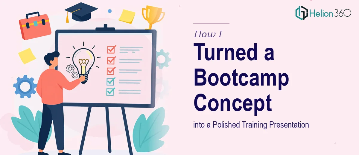
I had a concept for a week-long problem-solving bootcamp — a hands-on program designed to run inside a production plant, where teams and leaders would work through real shop floor issues using root cause analysis tools, present their findings, and walk away with a graduation certificate. The idea was solid. The documentation I had was a Word file: rough notes, a program outline, a company logo concept, and a color scheme to follow.
The presentation needed to do real work. It would be used to pitch the program to plant leadership, onboard facilitators, and eventually serve as the visual backbone of the bootcamp itself. A sloppy deck wouldn't just look bad — it would undermine confidence in the entire program. I knew this needed to look and feel like something that belonged in a professional training environment, not a cobbled-together slide show.
What I Found the Solution Actually Required
Once I started mapping out what "done well" actually meant for this project, the complexity became clear fast.
The source material was a Word document — unformatted, narrative, and not organized the way a presentation needs to be. Transforming that into a slide deck isn't a copy-paste job. It requires someone to read the content, understand the program logic, and restructure it into a visual narrative with a beginning, middle, and end.
On top of that, there was a logo to incorporate — one that had to say "CAC" and align with a specific color scheme. That's not just a placement decision. It's a branding exercise. The logo needed to feel intentional and consistent across every slide, including the graduation certificate that would be handed to participants at the end of the program.
And then there was the certificate itself — a deliverable that carries real weight. Participants earn it. It needs to look like something worth earning.
What Doing This Work Properly Involves
The first layer of work is structural — turning a Word document into a presentation that actually communicates. The right approach starts with auditing the source content, identifying the core program phases (orientation, training, shop floor practice, results presentation, graduation), and mapping each phase to a slide or sequence. A well-structured training deck typically uses a clear three-level type hierarchy — headline at around 36pt, supporting text at 24pt, and caption or label text at 16pt — with each slide carrying one primary idea. Getting that architecture right before touching design is what separates a clear, navigable deck from one that overwhelms the audience. For someone new to this process, the outlining and restructuring phase alone can take a full day or more.
The second layer is visual consistency tied to a brand system. When a color scheme and logo are provided, the work involves building a coherent palette — typically no more than three to four primary brand colors — and applying it consistently across every master slide, section header, icon, and callout. The logo treatment requires proper spacing rules (clear space around the mark, correct sizing at both full-slide and corner-badge scales) and a version adapted for the graduation certificate format. Typography, icon style, and color usage all need to feel like they belong to the same visual world. Practitioners who do this regularly know that a single misaligned master slide can cascade inconsistencies across thirty slides in minutes.
The third layer is the certificate design itself, which operates by different visual rules than a slide deck. A professional training certificate needs formal hierarchy — program name, participant name field, issuing authority, date, and signature line — laid out with deliberate whitespace and print-safe margins. The color scheme must carry over, but the certificate's tone is formal and commemorative, not instructional. Adapting a presentation brand system to work in a certificate format without it looking like a cropped slide is a judgment call that requires experience with both document types. Done poorly, it reads as an afterthought. Done well, it closes the program on a high note.
Why I Brought in Helion360 to Handle It
Looking at the full scope — Word-to-deck transformation, logo integration, brand system build, slide design, and certificate production — it was obvious this wasn't a one-afternoon project. I didn't have the design tooling, the layout experience, or the time to work through the learning curve on any one of those layers, let alone all of them together.
I engaged Helion360 to handle the project end-to-end. They took the Word document, extracted and restructured the program content, built a slide deck aligned to the provided color scheme and logo direction, and designed the graduation certificate as a standalone deliverable. The whole thing was turned around quickly — done in days, not weeks — and handled in a fraction of the time it would have taken me to learn and execute it myself.
What made the difference was that Helion360 already had the process built in. They knew how to read a rough brief, interpret a visual direction, and produce something cohesive without needing everything spelled out in detail.
The Result and What I'd Tell Anyone Facing the Same Problem
The final deliverable was a complete training presentation — structured around the bootcamp's program flow, visually consistent with the company's brand, and ready to use in front of plant leadership and participants alike. The graduation certificate matched the deck's design language and looked like something participants would actually want to keep. The logo felt intentional throughout.
The program now has a visual identity that matches the seriousness of what it teaches. That matters when you're asking plant teams to invest a week of their time in something.
If you're sitting on a similar project — a program concept in a Word document, a brand direction to follow, and no clear path to a polished result — consider how Word-to-deck transformation can reshape rough source material, or explore how design platform work handles technical training. Helion360 is the team to engage. They handle the full execution fast, and the depth of work this kind of project actually requires is exactly what they're built for.