

The Situation and What Was Actually at Stake
I had a product launch coming up for a new line of eco-friendly home appliances, and the materials needed to do three jobs at once. The brochure had to communicate product value to everyday consumers. The rate card had to hold up in front of industry buyers and channel partners. The presentation deck had to tie it all together for trade meetings and sales conversations. These weren't internal documents — they were going out to real audiences with real expectations.
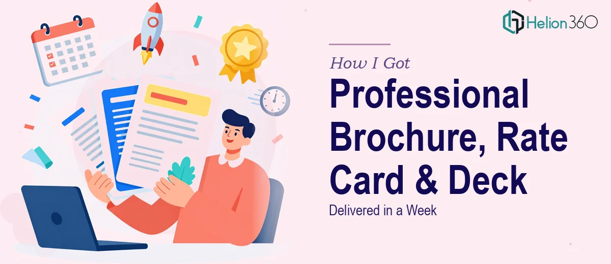
The deadline was tight: one week. And the brand identity we'd built had to come through consistently across all three formats. That's not a small ask. Getting any one of those pieces right takes focused effort. Getting all three right, brand-consistent, and finished inside a week was a different problem entirely. I knew immediately that this needed to be handled properly — not patched together.
What I Found the Solution Actually Required
Before I did anything else, I wanted to understand what doing this work well actually involved. What I found was that the complexity isn't in any single task — it's in the coordination across three distinct formats that have to look and feel like they came from the same place.
The brochure needs to balance visual hierarchy with product storytelling. That means decisions about typography scale, image bleed, and copy-to-visual ratio that have to be made intentionally, not by feel. A rate card sounds simple until you realize it has to communicate pricing structure clearly while still reinforcing brand credibility — the wrong layout makes pricing look cluttered or confusing, and that costs you deals. The presentation deck adds another layer: slide-to-slide flow, readable data, and visual pacing that keeps an audience engaged through a full sales conversation.
The real signal that this wasn't a weekend project was the consistency requirement. Three formats, one brand voice, one visual system — and no version of any piece that looks like it came from a different team.
The Work That Needs to Happen
The foundation of any multi-format design project like this is the narrative and structural audit. Before a single layout gets built, the right approach starts with mapping what each piece needs to communicate and to whom. The brochure, the rate card, and the deck each have a different primary job, and the content hierarchy inside each one has to reflect that. Done well, this means organizing information so the most important message lands in the first read-through — not after someone works for it. Getting this wrong at the start compounds across every subsequent design decision, and reworking structure mid-execution is expensive in time.
Visual mechanics are where the actual discipline lives. A properly constructed layout uses a consistent grid — typically a 12-column system — with a typography hierarchy that holds across all three formats: something like 36pt for headlines, 24pt for subheads, and 14-16pt for body text. Color usage gets locked to a defined palette of no more than four brand colors, with clear rules for which color carries which function. The execution friction here is real: setting up master slides and reusable style guides that propagate correctly across dozens of pages takes hours to do properly, and a single inconsistency in spacing or color value is visible to a trained eye at a glance.
Polish and brand consistency across the final deliverables is what separates professional-grade work from work that almost gets there. This means the same logo placement logic, the same margin discipline, and the same visual tone whether someone is looking at the brochure, flipping through the rate card, or watching the deck in a meeting. The friction here is that consistency only holds when someone is tracking every asset, every page, every revision. It is the kind of detail work that slips when multiple people touch the files independently or when a deadline creates pressure to cut corners on review.
Why I Brought in Helion360 to Handle It
I didn't spend time attempting any of this myself. Once I understood what the work actually required — three formats, tight brand application, one-week deadline — it was clear that engaging a team with this as their core competency was the only move that made sense.
Helion360 handled the full project end-to-end: structural planning across all three formats, visual system buildout, and final delivery with brand consistency locked in throughout. They turned it around quickly — the kind of turnaround that would have taken me several times as long to execute, and that's before accounting for the learning curve on production-level layout work.
What made the difference was that the tooling and process were already in place. They weren't figuring out the grid or the typography system as they went — that expertise was built in from day one. The full scope was handled in days, not weeks, and nothing fell through in the handoff between formats.
What I'd Tell Anyone Looking at a Similar Deadline
The deliverables came back looking like a cohesive product family — the brochure, rate card, and presentation deck all reading from the same visual and brand language. In the meetings where those materials went out, they held up. The rate card read clearly to buyers. The deck moved well in a live sales conversation. The brochure communicated product value without needing explanation.
If you're looking at a multi-format design project with a real deadline and a real audience, the complexity is genuine — it's not something to underestimate or attempt to compress into spare hours. If you're in that spot and want it handled end-to-end without the learning curve, Helion360 is the team to engage — they delivered fast, covered the full scope, and brought the kind of execution depth this work actually requires.