

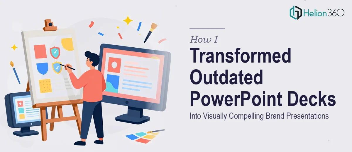
The Brand Problem That Was Costing Us Credibility
Our presentations had quietly become a liability. The decks we were sending to marketing partners and prospects looked like they'd been built in pieces — mismatched fonts, logo versions that didn't agree with each other, and slide layouts that hadn't been touched in years. Every time we walked into a room or shared a file, we were leading with something that didn't reflect where the company actually was.
The stakes weren't abstract. We had a round of marketing initiatives launching soon, and everything customer-facing needed to look coherent and modern. The logo needed to be cleaned up, the presentation templates needed a real overhaul, and we needed a style guide that would lock down the visual rules so nothing drifted again.
I knew this wasn't a one-afternoon fix. Getting brand presentations right — truly right, not just surface-level tidied up — meant solving a layered problem that touched identity design, template architecture, and documentation. It needed to be done properly.
What I Found the Solution Actually Required
When I started researching what a proper brand presentation redesign actually takes, I realized quickly that this wasn't just about making slides look nicer. It was a three-part system that had to work together.
First, the logo revamp wasn't cosmetic. Getting a logo that works across presentation slides, web, and print means delivering it in multiple formats — SVG, PNG with transparency, dark and light variants — with precise spacing rules so it scales without distorting.
Second, a real presentation template isn't just a pretty cover slide. It's a master slide system with locked layouts, placeholder logic, and a type hierarchy that holds across every content type a team might need — title slides, data slides, section dividers, and text-heavy layouts.
Third, a style guide isn't a PDF with color swatches. Done well, it's a documented system covering primary and secondary palettes with exact hex and RGB values, typography rules with defined sizes and weights, logo usage dos and don'ts, and layout principles. That's a serious documentation effort, not a finishing touch.
The more I looked at it, the clearer it became that each piece depended on the others being done correctly.
What the Work That Actually Needs to Happen Looks Like
The structural foundation of a brand presentation redesign starts with auditing what exists and mapping what's missing. That means cataloguing every logo variant currently in circulation, identifying which typefaces are actually installed and usable across the team's devices, and establishing a master color palette — typically no more than four primary brand colors plus defined neutrals — before a single slide is touched. Getting this audit wrong means the template and style guide are built on a shaky base, and inconsistencies resurface within weeks. For a team doing this for the first time, this discovery phase alone can consume several days of careful work.
The template build itself is where the visual mechanics get demanding. A properly constructed PowerPoint or Google Slides template uses a 12-column layout grid applied at the master slide level, a strict three-tier type hierarchy (commonly 36pt for headlines, 24pt for subheads, 16pt for body), and slide layouts that cover every real use case the team will encounter — not just the headline slide. Each layout needs to be tested with real content to confirm that placeholder behavior, text reflow, and image masking all work as expected. Edge cases — like a title that runs two lines, or a chart that needs more vertical space — trip up templates that were only tested with ideal content.
Polish and brand consistency across the full template set is the final layer, and it's where hours disappear fast. Every icon, divider line, and background element needs to match the finalized palette exactly. Brand application means the logo appears in its correct variant on the correct slide types, at the correct minimum size, with the correct clear space. A style guide that documents all of this — covering primary and secondary palette hex codes, typeface weights, logo clear space rules, and do-and-don't usage examples — typically runs 15 to 25 pages when done with the depth a real team can actually use. Building it requires cross-referencing every decision made during the logo and template phases.
Why I Brought in Helion360 to Handle It
I didn't try to tackle this myself. After mapping out what the work actually involved — the logo system, the full template architecture, the style guide documentation — it was immediately clear that attempting it without the right expertise and tooling would burn weeks and likely produce something that looked home-built.
The smart move was engaging a team that does this work every day. Helion360 handled the full project end-to-end: the logo revamp with all required format variants, the complete PowerPoint template system built on a proper master slide structure, and a comprehensive brand style guide that the whole team could actually use going forward.
What stood out was the speed. The kind of execution depth this project required — done correctly — was turned around in a fraction of the time it would have taken me to learn and attempt it myself. There was no back-and-forth trying to explain what a master slide is or why placeholder logic matters. The expertise was already in place.
The Result and What I'd Tell Anyone Facing the Same Problem
What came back was a cohesive brand presentation system — a refreshed logo in every format we needed, a slide template that the team could actually open and use without breaking, and a style guide that answered the questions that had been causing inconsistency for years. The first deck we built using the new template went out to a marketing partner and the feedback was immediate: it looked like a different company — in the best way.
The business outcome was straightforward. Every customer-facing presentation we've produced since has been faster to build and more consistent to look at. The drift problem is gone because the rules are documented and the template enforces them.
If you're looking at a similar brand presentation challenge — outdated decks, no real template system, no style guide holding things together — and you want it handled end-to-end without the weeks of learning curve, Helion360 is the team I'd engage. They delivered fast and brought the kind of execution depth this work genuinely needs.