

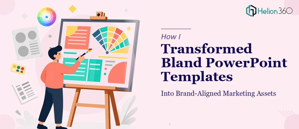
When a Generic Template Is the Wrong Starting Point
We were approaching a critical fundraising window and the deck we had was, to put it generously, functional. It was built on a downloaded template — consistent enough in its own way, but completely disconnected from what our startup actually looked like, stood for, or was trying to accomplish. It had no visual identity. The typography was default. The color story was whatever came pre-loaded. And the content structure was a loose collection of slides that didn't build toward anything.
The stakes were real. The people sitting across the table from us — investors, potential partners — would be reading our story through those slides before we'd said a single word. A generic pitch deck signals a generic company. That's the last message we wanted to send at this stage. It was clear this needed to be done right, not patched.
What I Discovered This Kind of Work Actually Requires
Once I started researching what a properly designed startup pitch deck involves, it became obvious quickly that this wasn't a design refresh — it was a full narrative and visual rebuild.
The first thing that struck me was the structural complexity. A compelling investor pitch decks isn't just a sequence of information slides. It has a specific arc: problem, insight, solution, market, traction, team, ask. Each section earns the next. Getting that arc wrong — or even slightly out of order — causes the whole story to lose its momentum. That's before a single design decision has been made.
The second thing was how much brand discipline a polished deck actually demands. Color palettes, type hierarchies, iconography style, image treatment — every element has to work together and stay consistent across every slide. What looks effortless in a finished deck is the result of a lot of deliberate system-building that isn't visible in the output.
The third signal was the visual communication layer. Investors don't read pitch decks like documents. They scan. That means layout, visual weight, and the placement of key data points all carry information independently of the words on the slide. Getting that right requires design judgment that goes well beyond knowing how to use PowerPoint.
What the Design and Build Process Actually Involves
The structural and narrative work comes first, and it's where most pitch decks fail before design even begins. The right approach starts with auditing every piece of source content — what the company does, who the customer is, what the market looks like, what traction exists — and mapping it against a proven story arc. A well-built deck typically runs 12 to 18 slides, with each slide accountable for a single idea. The practitioner's decision here is which information lives where, what gets cut, and how each slide earns its place in the sequence. Getting this wrong means even beautiful slides don't land.
The visual mechanics layer is where brand alignment actually happens, and the specifics matter more than most people expect. A proper layout grid — commonly a 12-column structure — governs how every element sits on the slide, and setting one up that propagates correctly across master slides takes hours for someone without deep PowerPoint experience. Typography hierarchy runs on rules like 36pt/28pt/16pt for heading, subheading, and body — and those rules have to hold consistently across every layout variant. Chart types need to match the claim being made: a bar for comparison, a line for trend, a single bold number when magnitude is the message. Deviating from these conventions creates visual noise that distracts from the actual content.
Polish and consistency across the full deck is where execution friction compounds. A startup pitch deck typically uses a maximum of four brand colors, and each has a defined role — primary, secondary, accent, and neutral. Maintaining that discipline across 15 or more slides, each with different content density and layout needs, requires constant recalibration. Icon sets need to come from a single family. Photography and illustration styles can't mix. Spacing between elements has to follow a defined system — 8px or 16px increments are common — so the deck feels intentional rather than assembled. One inconsistency in a high-stakes slide can undercut the credibility of everything around it.
Why I Brought Helion360 In to Handle the Full Project
Looking at what the work actually required, it was clear this wasn't something I could execute well in the time we had. The structural thinking, the brand system build, the slide-by-slide execution — each of those is a distinct discipline. Doing all three well simultaneously, under deadline pressure, wasn't realistic without a team that already had the tooling and expertise in place.
Helion360 handled the project end-to-end. That meant the narrative audit and story arc first, then the full brand system built into the master slides, then the complete deck designed and delivered. No piecing together work across multiple people. No learning curve on my end. They turned it around quickly — done in days, not weeks — which mattered given where we were in the fundraising calendar. The pace alone would have been impossible to match working through the process myself.
The Result and What I'd Tell Anyone in the Same Position
The deck that came back was unrecognizable from what we'd started with — not because it had been decorated, but because it had been built with structure and intent from the ground up. The story arc was clean and logical. The brand came through on every slide. The data visualizations made the traction story legible at a glance. When we walked into the room, the presentation did its job: it held attention and told our story with the kind of credibility that a downloaded template never could.
The business outcome was what mattered — we went into those conversations with a deck we were genuinely confident in, and that confidence showed.
If you're looking at the same situation — a high-stakes pitch, a generic starting point, and not enough time to learn and execute everything it takes to do this well — Helion360 is the team to engage. They delivered fast, handled the full execution depth this work requires, and we didn't have to compromise on quality to meet the timeline.