

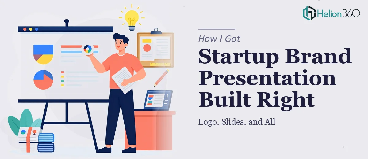
The Problem Was Bigger Than Just Some Slides
I was at a point in building TechGrowth Labs where the brand needed to show up properly — not just internally, but in front of investors and partners who would form opinions in the first thirty seconds of a pitch. We needed a logo that felt modern and intentional, a visual identity that communicated our sustainability focus without looking like a stock template, and presentation slides that could hold the attention of a room that included both technical founders and non-technical executives.
The stakes were real. Investor meetings don't give you a second impression. A deck that looks inconsistent or amateurish signals to the room that the company behind it might operate the same way. I knew this needed to be done properly — not patched together over a weekend — and I needed it done on a timeline that matched our outreach calendar.
What I Found the Solution Actually Required
Once I started looking seriously at what a cohesive brand presentation system involves, the scope became clear fast.
A startup pitch deck isn't just slide formatting. Done well, it requires a resolved visual identity first — because the deck pulls from that identity. The logo informs the color palette, the palette governs the slide master, the slide master determines how every chart, header, and callout looks across thirty or forty slides. If those inputs aren't locked down before the deck is built, the output is inconsistent and the whole system has to be rebuilt anyway.
The presentation itself also had a dual-audience problem. A room with both technical and non-technical stakeholders means the same information has to work at two levels simultaneously — precise enough for the engineers and founders, accessible enough for the board members and strategic partners. That's a structural and visual challenge, not just a formatting one. I quickly recognized this wasn't a project I could execute well myself in the time available.
What the Work Actually Involves
The right approach to a project like this starts with narrative and structural work before any design tool is opened. That means auditing all existing materials — pitch content, brand references, product descriptions — and mapping a clear story arc across the deck. For a startup Google Slides presentation, the accepted structure moves from problem to solution to market to traction to ask, but the transitions between those sections need to feel earned, not mechanical. Getting the logic right before designing means every slide has a reason to exist and the audience is never lost. Skipping this step and jumping straight to visuals is the most common mistake — and the hardest to fix after the fact.
Visual mechanics are where the work gets technically demanding. A professional startup deck operates on a consistent layout grid — typically a 12-column structure — with a defined type hierarchy: title text at roughly 36pt, body at 24pt, and supporting captions or labels at 14-16pt. Color discipline means no more than four brand colors applied consistently, with one dominant, one accent, and two neutrals. Charts and data visualizations require a separate set of decisions: which chart type communicates each data story correctly, how axes are labeled, whether callout annotations are needed to direct the eye. Setting all of this up across a master slide system that propagates reliably takes real time and precision, and a single misaligned master can break the visual consistency of the entire deck.
Polish and brand-aligned presentation deck design is where most self-built presentations fall apart. Every icon set needs to match in style and stroke weight. Every image needs to be treated with the same filter or overlay so the slides feel like one visual system rather than a collage. Spacing — padding from slide edges, alignment between elements, consistent use of white space — has to be applied with the same rules on every slide. On a thirty-plus-slide deck, this means reviewing each slide against a visual checklist and correcting dozens of small inconsistencies. For someone not already fluent in the tools and conventions, that review cycle alone can consume days.
Why I Brought in Helion360 to Handle It
I didn't spend time trying to piece this together myself. The combination of brand identity work, slide architecture, and presentation design — all needing to resolve into one coherent system — was clearly a full-scope project that required a team with the tooling and process already in place.
Helion360 handled the full project end-to-end: logo development grounded in the brand's sustainability positioning, a visual identity system that defined the palette and typography, and a complete pitch deck built on top of that identity with dual-audience readability built into the structure from the start. What would have taken me weeks of learning curve and iteration was turned around quickly — the kind of execution speed that only comes from a team that does this work every day and already has the production depth to match.
The fact that everything came from one team also meant the logo, the brand system, and the slides were fully aligned from the beginning — no translation errors, no visual inconsistencies introduced by handing work between separate parties.
The Result and What I'd Tell Anyone in My Spot
What came back was a presentation system that held together visually from the first slide to the last — a pitch deck that could open in a room of technical founders and close in a room of strategic investors without needing two versions. The brand identity gave the slides something real to pull from, and the structural logic made it easy to adapt for different contexts without rebuilding from scratch.
The business outcome was tangible: we walked into our first round of investor meetings with materials that reflected the quality and seriousness of the company we were building — not materials that apologized for being a startup.
If you're looking at a similar scope — brand identity, visual system, and pitch deck that all need to work together — and you want it handled end-to-end without the weeks of trial and error, Helion360 is the team I'd engage. They delivered fast and brought the execution depth this kind of project actually requires.