

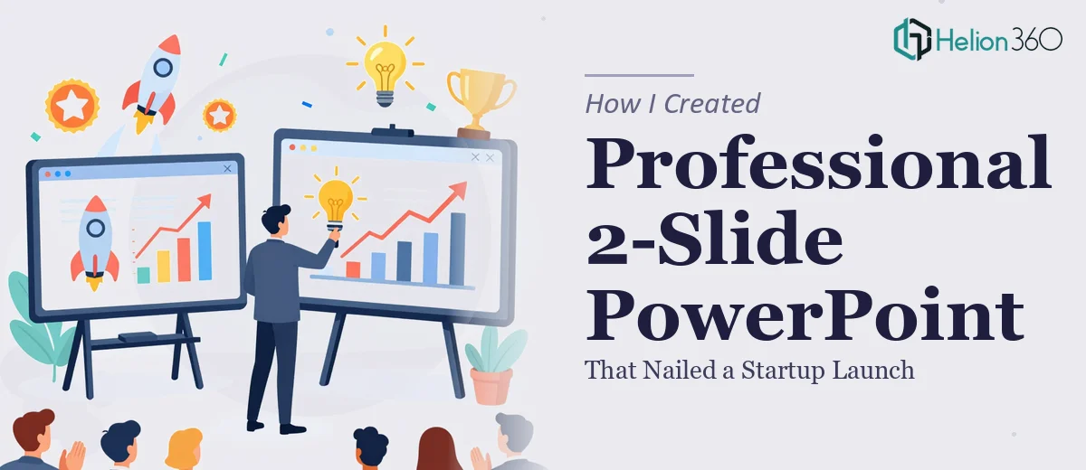
A Simple Ask That Turned Out to Be Harder Than Expected
When our small startup was gearing up for its internal launch event, I volunteered to put together the PowerPoint presentation. It was only two slides — one to introduce the company, and one to highlight our key features and benefits. How hard could it be?
As it turned out, harder than I expected.
The content itself was straightforward. I had bullet points ready, a rough idea of the layout, and a general sense of our brand colors. What I did not have was the ability to make it look like something worth presenting. Every version I built felt either too plain or too cluttered. I kept toggling between font sizes, adjusting icon placements, and second-guessing color contrast — and none of it was coming together in a way that felt polished and professional.
Why Two Slides Can Still Be a Real Design Problem
There is a common assumption that fewer slides means less work. But a 2-slide PowerPoint for a launch event carries a lot of weight. Both slides need to do their job efficiently — one to establish who you are, one to communicate your value — and every element on screen needs to earn its place.
The company introduction slide needed a strong visual identity: clear typography, a clean layout, and imagery or icons that reflected our brand without looking generic. The features and benefits slide had to organize multiple points without becoming a wall of text. Readability from a distance mattered too, since this was going up on a screen in front of a room.
I tried reworking the layout three or four times. I experimented with free templates, swapped icons, and adjusted the slide master. None of it gave me the confidence that this was ready for an actual audience.
Getting the Right Help at the Right Time
After spending more time than I should have on something that was supposed to be quick, I came across Helion360. I explained what I needed — two slides, a startup context, brand-aligned visuals, clear readable text — and their team took it from there.
What I noticed immediately was that they asked the right questions upfront. They wanted to understand the tone of the brand, the audience for the event, and whether there were any existing brand assets like a logo or color palette I wanted carried through. It was clear they were thinking about the full picture, not just dropping text into a template.
For similar needs, consider product launch presentation design services to ensure your next event makes the right impression.
What the Final Slides Looked Like
The finished presentation came back looking exactly like what I had been trying to build but could not quite get there on my own. The company introduction slide had a clean visual hierarchy — the name and tagline front and center, supported by an icon set that reflected our product space without feeling like clip art. The layout had breathing room. It did not feel rushed or overloaded.
The features and benefits slide was equally well-handled. Instead of listing everything out in plain bullet form, the design grouped the key points into a structured visual layout with supporting icons, making each feature scannable at a glance. Font sizes were large enough to read across the room, and the color usage stayed consistent with the brand throughout.
The whole thing was presentation-ready straight out of the file. No further editing required.
What I Took Away From This
The project reminded me that professional presentation design is not just about making things look nice. It is about visual communication — arranging information so that it lands clearly and quickly. Even with just two slides, there are real design decisions involved: hierarchy, spacing, icon selection, color contrast, and how text is broken up for readability.
For something that represents your company, especially at a launch moment, those decisions matter more than the slide count.
If you are in the same position — a tight scope, a high-stakes event, and a presentation that keeps falling short of where it needs to be — Helion360 is worth reaching out to. They handled exactly what I could not and delivered something that was ready to present the same day it came back. Learn more from similar projects: interactive PowerPoint presentation for product launch engagement and modern PowerPoint presentation that unified brand identity.