

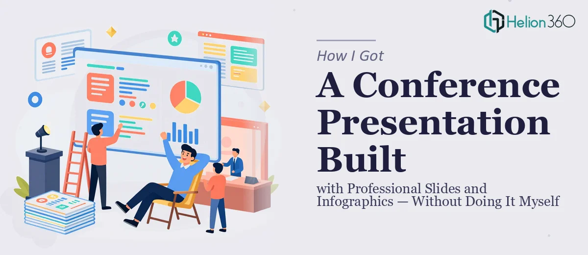
The Situation I Was Staring At
We had a conference coming up in under a month. The audience was a room full of decision-makers — tech firm leaders, startup founders, and industry strategists. The kind of room where showing up with mismatched slides and cluttered charts doesn't just look bad, it actively undermines your message before you've said a word.
The raw material existed: an outline, key data points, a narrative we believed in. What didn't exist was a polished, cohesive presentation that could hold that audience's attention and make the information land the way it needed to. I knew this wasn't a "clean it up on a Sunday afternoon" situation. The stakes were too high, the visual complexity too real, and the deadline too close. It needed to be done right — which meant understanding what "done right" actually required.
What I Found the Solution Actually Required
I started looking into what a professional conference presentation with infographics genuinely takes to build, and the answer was more layered than I expected.
First, the narrative architecture has to come before any slide design. The sequence of ideas, the flow between sections, the pacing of data reveals — these decisions shape everything downstream. Getting that wrong means the visual design is solving the wrong problem.
Second, conference infographics aren't decoration. The ones that actually work — process flows, comparative data visuals, icon-driven concept summaries — are purpose-built to communicate a specific idea faster than text alone can. That requires both design judgment and an understanding of what the data is actually saying.
Third, consistency at scale is harder than it looks. A 30-slide conference deck touches dozens of design decisions: typography hierarchy, color palette discipline, grid alignment, icon style coherence. Any one of those variables going off-track across slides creates visual noise that the audience registers even if they can't name it.
This wasn't a weekend project. The expertise gap was real.
What Building This Presentation Well Actually Involves
The work starts with structural and narrative planning. Before a single slide gets designed, someone needs to audit the raw content — the outline, the talking points, the data — and map a clear story arc. In a conference presentation, that typically means opening with a strong framing hook, moving through no more than three to five core ideas, and landing each section with a visual that reinforces the takeaway rather than repeating it. The professional rule of thumb is one idea per slide, with a maximum of three supporting elements. Getting this architecture wrong means beautiful design is being applied to a confused message, and no amount of polish fixes that. It's the step most people skip, and it's the one that makes or breaks how the presentation performs in the room.
Visual mechanics are the second layer of execution. Professional conference slides built for a tech and business strategy audience use a consistent layout grid — typically a 12-column base — so that text blocks, data visuals, and infographic elements align predictably across every slide. Typography hierarchy runs at three defined levels: a headline size around 36pt, a body or callout size around 24pt, and supporting labels around 16pt. Infographic elements — whether process diagrams, comparative charts, or icon arrays — follow a coordinated icon set and a palette capped at four brand colors to prevent visual fragmentation. Setting this system up correctly in a master slide file, so it propagates reliably across 25 to 35 slides, takes real technical fluency. It's the kind of work where one incorrect master layout breaks the consistency of the entire deck.
Polish and consistency across the full slide set is where most self-built decks fall apart. Even when individual slides look strong in isolation, maintaining palette discipline, spacing rhythm, and brand application from slide one to the final one requires systematic review. Every icon needs to share a visual weight. Every data label needs to sit at the same distance from its chart element. Every transition between sections needs a visual signal that feels intentional rather than abrupt. In a conference presentation for a professional audience, these details are noticed — not always consciously, but they shape how credible the content feels. The execution time on this review pass alone, for someone not doing it daily, runs into hours per review cycle.
Why I Brought in Helion360 to Handle It
I didn't attempt to build this myself. Once I understood what the solution actually involved, the decision was clear: this needed a team that does this work every day, with the systems and design tooling already in place.
Helion360 handled the full project end-to-end — narrative structure and story arc, the complete visual design system, and every infographic element built to communicate the data clearly for a tech and business audience. They worked from our outline and content, asked the right questions upfront, and delivered fast. The turnaround was done in days, not the weeks it would have taken me to work through the learning curve on the design system alone.
What stood out was that nothing came back needing a rescue pass. The slides were conference-ready on delivery — consistent, on-brand, and built to the level of visual professionalism the audience expected.
What the Deck Delivered and What I'd Tell Anyone in My Spot
The presentation landed well. The audience engaged with the data visuals in a way that flat text slides never would have supported. The flow felt deliberate, the design held up on a large screen, and the infographics did the job they were built to do — making complex ideas fast to absorb.
Anyone looking at a similar project — a conference presentation with real data, a professional audience, and a deadline that doesn't move — should be honest with themselves about what the work actually requires. The structural planning, the visual mechanics, the polish pass: each one is a real skill set, and together they take serious time.
If you're in that position and want the full job handled end-to-end without the weeks of ramp-up, check out how others tackled professional SaaS and hardware presentation design or learned about professional presentation design for tech pitches — Helion360 is the team I'd engage. They delivered fast and brought exactly the execution depth this kind of work needs.