

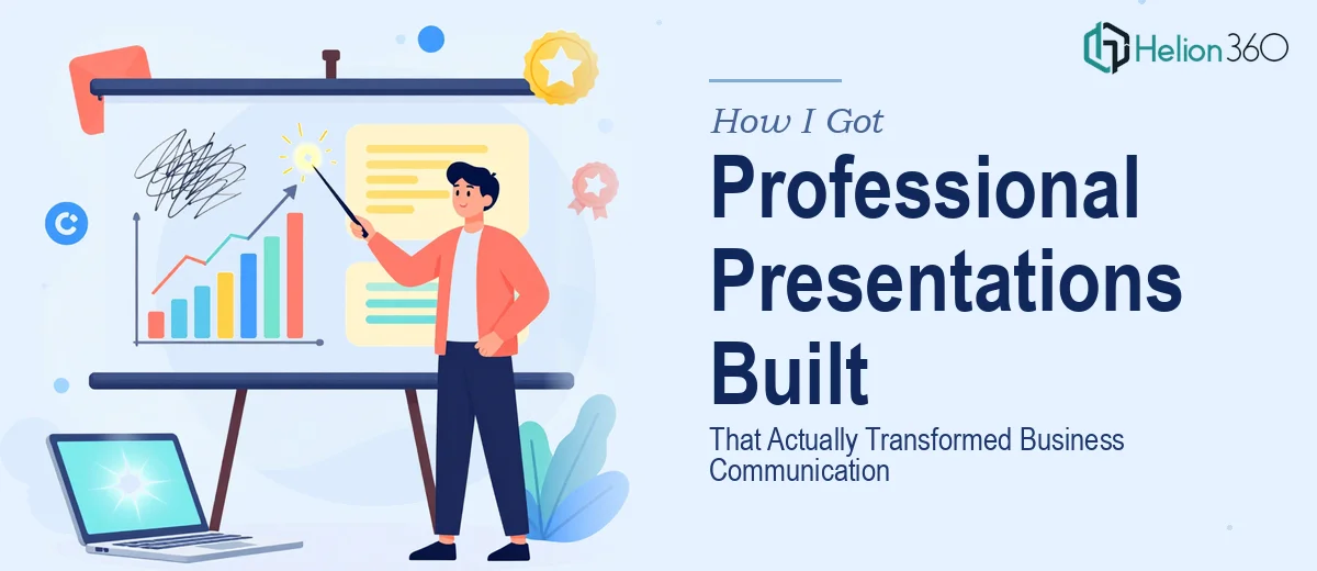
The Problem With Our Presentations Was Bigger Than I Realized
We had a real communication problem. Every time our team needed to walk a client through our offering, update stakeholders on progress, or pitch a new initiative internally, the slides we were using were doing us no favors. They were inconsistent, visually cluttered, and structurally all over the place. Different team members had built different decks at different times, and it showed.
The stakes weren't abstract. We had a board review coming up, a client onboarding sequence that needed to be repeatable and credible, and a sales conversation pipeline that was growing faster than our ability to support it with quality materials. Showing up to any of these with our existing slides was a liability.
I knew immediately this wasn't a situation where a quick cleanup pass would fix things. What we needed were professional Google Slides presentations built properly — ones that could carry serious business conversations without the deck undermining the message.
What I Found That Doing This Well Actually Requires
Before I did anything, I spent time understanding what separates a genuinely professional Google Slides presentation from something that just looks tidier. The gap was larger than I expected.
The first thing that stood out was the structural complexity. A presentation that works in a business context isn't just content on slides — it's a narrative architecture. Every slide needs a job. The sequence needs to build logically. And the story has to be shaped for the specific audience and outcome, not just for the presenter.
The second was the visual system. Proper business presentation design uses a defined layout grid, a controlled type hierarchy — typically three levels: a headline, a subhead, and body copy at distinct, consistent sizes — and a brand palette held to four colors or fewer. Deviating from any of these, even slightly, introduces visual noise that erodes credibility.
The third was the platform-specific execution. Google Slides has its own set of constraints and capabilities that differ meaningfully from other tools. Getting master slides, theme fonts, and layout inheritance to behave correctly takes real working knowledge of the platform — not just general design skill.
What the Work Actually Involves
The right approach to a professional Google Slides presentation project starts with a structural audit and narrative mapping. This means reviewing all source content — briefs, existing materials, talking points — and building a slide-by-slide flow that serves the communication goal. Proper narrative structure typically follows a problem-to-resolution arc: context, insight, implication, ask. Each slide in the sequence carries a single primary message, and the transition logic between slides is deliberate. Getting this right before any visual work begins is what separates presentations that land from ones that confuse. The structural phase alone can take several focused hours — and skipping it almost always shows in the final product.
Once the structure is locked, the visual mechanics come into play. A professional Google Slides layout uses a consistent column grid — typically a 12-column base — with defined margins and padding applied uniformly across every layout variant. Typography follows a strict three-tier hierarchy: a primary headline at around 36pt, a secondary label or subhead at 24pt, and body or supporting copy at 16pt. Brand colors are applied according to a defined usage hierarchy: one dominant, one secondary, one accent, and one neutral. The challenge here is that these rules have to hold across every single slide and every layout variant — cover, section break, content, data, closing — and any deviation has to be caught and corrected before the deck goes out.
Polish and cross-slide consistency are where most self-built presentations fall apart. This involves locking global styles in the slide master so that font changes, color updates, and spacing adjustments propagate correctly rather than requiring manual updates slide by slide. It also means auditing alignment at the pixel level — making sure text boxes, icons, and visual elements sit on the grid rather than floating slightly off. For a deck of 20 or more slides, this consistency pass alone takes several hours of focused attention, and it's the kind of work where fatigue causes mistakes that are easy to miss and hard to undo.
Why I Brought in Helion360 to Handle It
When I mapped out what this project actually required — structural work, visual system setup, platform-specific execution, and a rigorous consistency pass across a multi-deck scope — it was clear that attempting it myself wasn't a realistic option. Not because the individual pieces were impossible, but because doing all of them well, at the level these presentations needed to be, required tooling and experience I didn't have sitting ready.
I engaged Helion360 to handle the full project end-to-end. They took it from source content through to finished, presentation-ready Google Slides decks — narrative structure, visual system, master slide setup, layout variants, and final polish included. What would have taken me weeks of trial, error, and rework was turned around quickly. The team handled the structural decisions, the visual mechanics, and the consistency work as a complete package, not as separate conversations I had to manage.
The speed was what made the difference given our timeline. Done in days, not weeks — and to a standard that held up in front of a board and in client-facing conversations.
The Outcome and What I'd Tell Anyone Facing the Same Situation
What came back was a set of professional Google Slides presentations that worked as a coherent system. The narrative held up across different use cases — board review, client onboarding, internal updates — because the structure had been built to carry those conversations, not just to display content. The visual system was consistent, on-brand, and clean enough that the slides didn't compete with the message.
More practically: the decks were usable immediately. No cleanup required. No last-minute reformatting before a meeting. The team had handled the kind of execution depth — grid discipline, type hierarchy, master slide logic — that makes a presentation genuinely reusable and scalable.
If you're looking at a similar situation and want professional Google Slides presentations handled end-to-end without spending weeks on a learning curve, Helion360 is the team I'd engage — they delivered fast and the execution quality was exactly what serious business communication requires.