

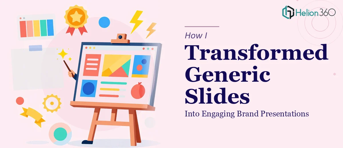
The Situation and What Was Actually at Stake
I had a series of brand presentations to deliver — the kind that go in front of partners, potential clients, and internal stakeholders who form opinions fast. The deck existed. It was built on a downloaded Google Slides template that looked fine in isolation but had zero connection to our brand. The fonts were generic, the colors were close but not right, and the layout logic didn't hold up once real content was dropped in.
The timeline was tight. These weren't internal working documents — they were going to people who would judge the brand partly based on what they saw on screen. A presentation that looks like it was assembled from a free template communicates something about the organization behind it, and that wasn't the signal I wanted to send. I knew this needed to be done properly, not patched together the night before.
What Doing This Well Actually Required
When I started looking at what a proper brand presentation transformation actually involves, it became clear quickly that this wasn't a matter of swapping colors and calling it done.
The first thing I noticed was that template-to-brand conversion requires rebuilding the master slide structure — not just reskinning individual slides. Every layout, every placeholder, every font reference lives in the master, and if that layer isn't rebuilt correctly, edits to individual slides break constantly. That alone is a non-trivial task for anyone who hasn't worked inside Google Slides' master editor extensively.
The second thing was brand consistency at a granular level. Getting the exact brand palette applied correctly — hex codes, not approximate colors — and maintaining it across 20-plus slides with varied layout types is painstaking work. The same applied to typography: a proper brand presentation typically runs a three-level type hierarchy (heading, subheading, body), and each level needs to be sized, weighted, and spaced to match brand standards precisely.
Third, the narrative structure of the slides themselves needed attention. The existing template had a generic flow that didn't match the story the brand needed to tell.
What the Work Actually Involves
The foundation of a proper brand presentation transformation is the structural and narrative audit. The right approach starts with mapping what the existing deck is actually saying versus what it needs to say — slide by slide — and identifying where the story breaks down or where content is mismatched to its layout. Done well, this involves reordering sections, consolidating slides that carry overlapping messages, and building a clear arc from context through evidence to conclusion. The complication is that this isn't mechanical work. It requires judgment about what the audience needs to understand at each stage, and getting it wrong means the visual upgrades land on a shaky foundation regardless of how polished they look.
Once the structure is sound, the visual mechanics layer begins. A properly rebuilt Google Slides master runs on a consistent layout grid — typically a 12-column structure — with text placeholders, image zones, and white space all governed by that grid. Typography gets set at three deliberate levels: a headline tier around 36pt, a subheading tier around 24pt, and a body tier at 16pt, each with defined weights and line spacing. Brand colors are applied via exact hex values, not approximations. The execution friction here is real: propagating a rebuilt master correctly across a deck that already has slide-level overrides takes hours of careful cleanup, and a single missed override can cause inconsistency that isn't obvious until the deck is presented on a large screen.
The final layer is polish and consistency across the full slide set. This means every icon set matches in style and weight, every image has consistent treatment (same frame shape, same overlay opacity, same alignment rule), and every data visual — whether it's a simple bar chart or a process diagram — follows the same formatting convention. Max four brand colors used in any data graphic, consistent caption placement, and uniform padding inside every content block. The edge cases here are where most self-built decks fall apart: the slide that got copy-pasted from somewhere else, the chart that still has default Office colors, the one text box with a slightly different font size that nobody catches until it's on the projector.
Why I Brought in Helion360 to Handle It
I looked at what this transformation genuinely required and made a straightforward call: this wasn't something I was going to execute well myself in the time available. The master slide rebuild alone was a task that would take me the better part of a day just to learn the mechanics, let alone execute cleanly across a multi-layout deck.
I engaged Helion360 to handle the full project end-to-end. That meant the narrative audit and restructuring, the full master slide rebuild with correct brand application, and the polish pass across every slide in the deck. They handled it in a fraction of the time it would have taken me to learn and execute it myself — delivered fast, without the back-and-forth that comes from handing off to someone who needs to ramp up on what the brand actually is. The tooling and the process were already in place. What took them days would have taken me weeks.
The Result and What I'd Tell Anyone in This Position
What came back was a deck that looked like it was built for the brand, not adapted from something generic. The master was clean, the hierarchy read correctly at a glance, and the consistency held across every slide — including the ones with complex layouts. The presentations went out and landed the way they were supposed to: they communicated credibility before anyone said a word.
The bigger realization was that the gap between a Google Slides template and a proper brand presentation isn't a cosmetic one — it's structural, and closing it correctly takes a specific set of skills applied with discipline. If you're looking at a similar situation and want it handled end-to-end without the weeks of learning curve, Helion360 is the team I'd engage — they delivered fast and brought exactly the execution depth this kind of work needs.