

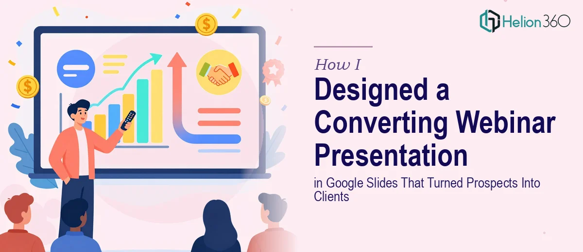
The Webinar Was Weeks Away and the Slides Were a Mess
I had committed to hosting a webinar on SEO strategies and digital marketing tactics. The goal was straightforward — walk potential clients through our approach, give them something genuinely useful, and leave them interested enough to take the next step. Simple enough in theory.
The problem showed up the moment I opened Google Slides.
I had the content. I had the talking points. What I didn't have was a presentation that looked like it belonged in front of people who were evaluating whether to trust us with their marketing. My slides were text-heavy, inconsistent in style, and lacked any real visual hierarchy. The kind of deck that makes attendees quietly check their phones.
Why DIY Wasn't Going to Cut It
I spent two evenings trying to fix the slides myself. I swapped in a template, changed the fonts, moved some graphics around. The presentation looked marginally better but still felt flat. More importantly, it didn't communicate the energy and authority I needed it to. A webinar deck isn't just a document — it's a live visual experience that needs to pull people in slide by slide.
The challenge with a Google Slides presentation for a marketing-focused webinar is that the design has to do a lot of work simultaneously. It needs to be upbeat without being distracting, informative without being dense, and visually clean enough to reinforce credibility rather than undermine it. Getting that balance right takes more than a good template and good intentions.
I also realized the presentation needed to follow a clear narrative arc — from introducing the problem, to walking through SEO and digital marketing solutions, to a closing that prompted some kind of action. That's a storytelling structure, not just a design task.
Bringing in the Right Team
After hitting a wall with my own attempts, I reached out to Helion360. I shared the content outline, explained the audience — marketing-aware business owners considering whether to invest in SEO and digital services — and described the tone I was going for: confident, clear, and energetic without being salesy.
Their team asked the right questions upfront. What's the intended call to action on the final slide? Should the design lean corporate or modern? Are there brand colors and fonts already in use? Within a day, I had a sample slide back that immediately showed they understood the brief. The layout was clean, the visual hierarchy made sense, and the slide felt like it was designed to be presented live rather than just read.
What the Final Deck Looked Like
Helion360 built out the full presentation in Google Slides — roughly twenty slides covering an introduction, the core SEO strategy framework, digital marketing tactics, and a closing section designed to drive follow-up. Each section had a consistent visual rhythm. Data points were pulled out into simple callout designs rather than buried in paragraphs. Transition slides gave the webinar natural breathing room.
The color usage was disciplined — not flashy, just purposeful. Icons supported key points without cluttering the slide. And critically, every slide had a single clear focus, which made the deck far easier to present confidently.
The tone came through in the design too. It felt energetic and professional at the same time, which is exactly what a digital marketing webinar needs to establish trust with prospects who are still deciding.
What the Webinar Actually Delivered
The presentation ran smoothly. Attendees stayed engaged through the full session — something I could tell from the question volume at the end — and several reached out afterward to discuss working together. A few of them specifically mentioned the slides looked polished and well-organized, which is not something I had ever heard after a webinar before.
The design made the content easier to follow and gave me more confidence while presenting. When the slides look the way the content deserves to look, the whole experience improves — for the presenter and the audience.
If you're preparing a webinar or client-facing Google Slides presentation and the design isn't keeping up with your content, Helion360 is worth reaching out to — they took what I had and turned it into something that actually worked.