

The Situation — and Why Getting It Right Mattered
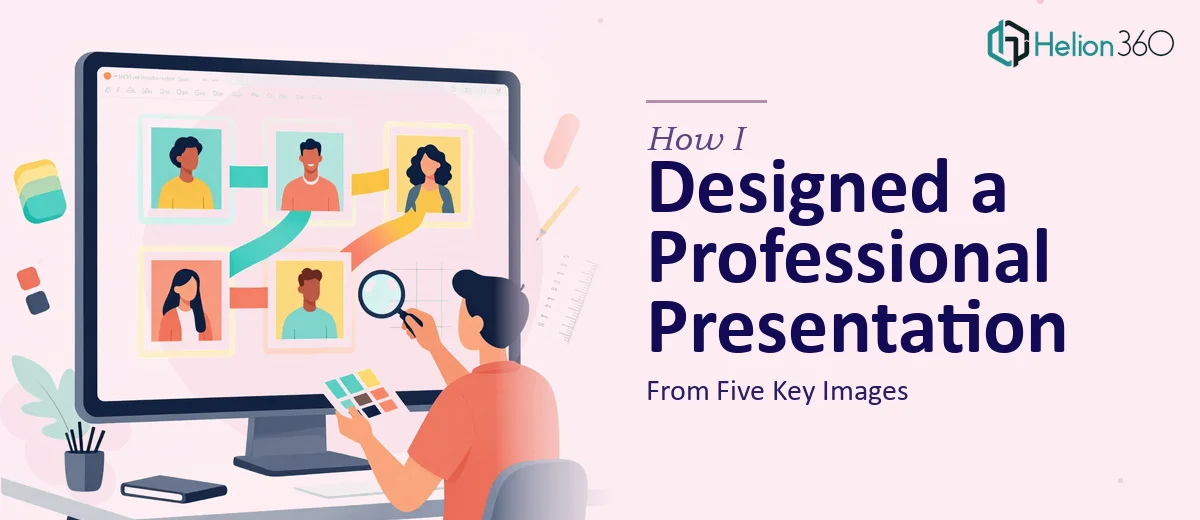
I had five images ready to go — a high-resolution shot of our company headquarters, a few industry-related infographics, and a map marking our operating locations. The goal was straightforward: turn these into a polished PowerPoint presentation that could represent us professionally in a client-facing context.
But "a few slides from some pictures" is one of those things that sounds easy until you actually think about what a professional result requires. These weren't casual slides for an internal update. They needed to communicate clearly, reflect our brand, and hold up on a big screen. The deadline was a week out, and the stakes were real enough that a half-finished, visually inconsistent deck wasn't an option. I knew immediately this needed to be handled properly.
What I Found Out the Solution Actually Required
When I looked into what professional PowerPoint slide design from images actually involves, a few things stood out quickly.
First, images don't just drop onto a slide and look good. Each image has its own resolution, aspect ratio, and color temperature. Getting them to feel cohesive across a deck — especially when one is a photo, one is an infographic, and one is a map — requires deliberate formatting decisions on every slide. Text overlays need to sit over images without clashing with the underlying visual. That alone is a judgment call that takes real design experience to get right.
Second, a five-slide deck with this mix of visual types isn't five identical layouts. The headquarters photo wants a full-bleed treatment. The infographic needs room to breathe. The map may need callout labels. Each slide needs a tailored layout, not a copy-paste of the same template. That level of per-slide decision-making adds up fast.
Third, transitions and polish — even subtle ones — need to match the tone. Too much animation undermines credibility. Too little makes the deck feel flat. The right call depends on reading the audience and purpose, and it's an easy thing to get wrong if you don't do this regularly.
What the Work Actually Involves
The right approach to building a professional PowerPoint presentation from visual assets starts with a structural audit. Before a single image is placed, a practitioner needs to assess what each visual communicates on its own, then define the narrative sequence across the deck. A headquarters photo tells an origin or credibility story. A map communicates reach or presence. An industry infographic frames context. Mapping these into a clear three-to-five beat arc — with a logical flow from opening impression to key proof points — is the real first step. Done without this foundation, slides end up feeling like a photo gallery rather than a cohesive presentation.
Visual mechanics are where the technical weight lands. Each image type demands a different layout treatment: the full-bleed photograph typically works on a 16:9 canvas with a semi-transparent text overlay anchored to the lower third, using a type hierarchy of 36pt for the headline and 18-20pt for supporting copy. Infographic slides need constrained image zones — usually no more than 60% of the slide canvas — so the surrounding context has space to register. The map slide often requires layered callout markers with clean leader lines. Across all five slides, a consistent 12-column grid ensures nothing looks accidentally off-center. Establishing that grid in the slide master, then adapting each layout to it, takes considerably more time than it sounds for someone not already fluent in the tools.
Polish and consistency are what separate a competent draft from a presentation-ready deck. A maximum of three brand-aligned colors applied across backgrounds, overlays, and typographic accents keeps the deck unified without looking monotonous. Transition effects, when used, should be restricted to one style — a simple fade or push — applied uniformly so the motion feels intentional rather than decorative. Image sharpening, color-grading for screen display, and checking that no file has been compressed below 150 DPI are the kind of finishing details that most people skip but that immediately show on a large screen. Each of these steps requires going back through every slide after the fact, which adds a full review pass to the timeline.
Why I Brought in Helion360 to Handle It
When I saw the full scope of what doing this properly required, the decision to bring in a professional team was immediate. This wasn't a project where learning on the job was an option — not with a week on the clock and a client-facing result on the line.
Helion360 handled the full project end-to-end. That meant taking in the five raw images, building the narrative structure, applying consistent layout logic across every slide, managing the image formatting and text overlay work, and delivering a deck that was polished and presentation-ready. They turned it around quickly — done in days, not the week I had budgeted — which meant there was still time for a review pass before the deadline.
What stood out was that none of the execution friction I'd identified was a problem for them. The grid setup, the per-slide layout decisions, the transition discipline — that's the kind of work they handle all day, with the tooling and pattern recognition already in place.
The Result and What I'd Tell Anyone in the Same Position
The delivered deck was exactly what I needed: five slides, each with a distinct layout tailored to its visual, cohesive typography, clean text overlays, and simple transitions that felt polished without being distracting. It represented the company well. The client noticed the quality without needing to be told it was professionally designed — which is exactly how good presentation design works.
What I took away from the process is that turning a collection of images into professional presentations understates the actual work involved when the output needs to hold up professionally. The structural thinking, the layout mechanics, and the consistency discipline are real skills that take time to develop and apply correctly.
If you're looking at a similar project and want it handled end-to-end without the learning curve, Helion360 is the team I'd engage — they delivered fast and brought exactly the execution depth this kind of work requires.