

The Problem I Was Looking at and Why It Couldn't Wait
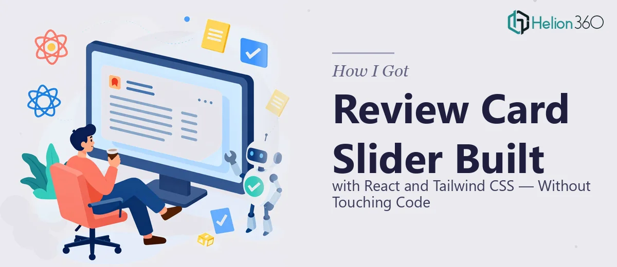
I needed a responsive review card slider built with React and Tailwind CSS — something that would sit on a product page and surface customer testimonials in a clean, scrollable format. It sounds simple enough until you actually scope it out.
The component had to work cleanly across mobile, tablet, and desktop. It needed smooth navigation, configurable animation timing, and a testimonial layout that included reviewer images and captions. The backend was already running on Express.js, so the finished component also needed to slot into that environment without friction.
The deadline was real and the placement was high-visibility. A clunky, half-functional slider on a product page doesn't just look bad — it actively undermines trust at exactly the moment you're trying to build it. I knew straight away this wasn't something to wing.
What I Found the Work Actually Required
When I looked into what a properly built React and Tailwind CSS slider actually involves, the scope became clear quickly.
This isn't a case of dropping in a library and calling it done. The component architecture has to be thought through — state management for the active index, transition logic that doesn't jank on resize, and prop-driven configuration so the team can adjust item width, animation duration, and transition effects without diving into the source code every time.
Accessibility was the second signal that this was more involved than it looked. A slider that isn't keyboard-navigable or screen-reader-friendly fails WCAG compliance — and that matters both ethically and for SEO. Getting aria labels, focus management, and reduced-motion handling right adds real scope.
The third thing that stood out was the responsive behavior. Tailwind's utility classes make styling fast, but a slider that reflows gracefully from a three-card desktop view to a single-card mobile view requires deliberate breakpoint logic, not just a few responsive prefixes thrown at the layout.
What Doing This Well Actually Involves
The structural and component architecture work is where a React and Tailwind CSS slider either holds together or doesn't. The component needs a clearly defined state model — typically a controlled currentIndex with prev/next handlers — and the slide container needs to use a CSS transform approach (translateX based on index × card width) rather than margin juggling, which breaks under dynamic content. Getting the transition timing synchronized with the state update so there's no flash between slides is a specific problem that takes iteration to get right, and it's one of the first things that trips up developers who haven't built this pattern before.
The visual mechanics layer is where Tailwind's utility system does the heavy lifting, but only if it's applied with discipline. A well-built review card uses a consistent internal grid — typically a fixed aspect ratio container for the reviewer image, a two-line caption clamp using line-clamp-2, and a typographic scale that holds at 18pt for the review body and 14pt for attribution. Tailwind's group and peer utilities handle hover states across the card without custom CSS, but knowing which utilities to reach for — and which to avoid stacking — is a learned skill. Misconfiguring the JIT compiler or using conflicting utility chains can produce silent layout failures that only show up at specific viewport widths.
Accessibility and SEO optimization for a slider component is a non-trivial checklist. Each card needs proper aria-label attributes on navigation buttons, a role="region" wrapper with a descriptive label, and aria-live handling so screen readers announce slide changes without reading the entire carousel on every transition. For SEO, the review content needs to be in the DOM — not injected purely via JavaScript state — so search engines can index it. The prefers-reduced-motion media query should suppress CSS transitions for users who have that setting enabled. None of these are afterthoughts; they need to be baked into the component structure from the start, and auditing them after the fact is significantly more time-consuming than building them in correctly.
Why I Brought in Helion360 to Handle It
Once I understood what doing this properly required, the calculus was straightforward. I didn't have the time to work through the learning curve on React animation patterns, accessibility compliance, and Tailwind configuration edge cases — and I definitely didn't have the runway to debug responsive reflow issues across six viewport sizes.
Helion360 handled the full project end-to-end and turned it around quickly. That meant the complete component architecture with configurable props for item width, animation duration, and transition type, the testimonial layout with reviewer images and captions built to the design spec, and integration testing against the Express.js backend to confirm everything behaved correctly in the actual deployment environment.
The work was done in days, not weeks. That's the difference between a team that does this work every day with the tooling already in place and someone ramping up from scratch. There was no back-and-forth on scope — the brief was clear, the execution was thorough, and the deliverable was production-ready.
The Result and What I'd Tell Anyone in the Same Spot
What came back was a fully functional, accessible review card slider — responsive across all breakpoints, keyboard-navigable, SEO-friendly with content rendered in the DOM, and configurable through clean props without touching internal logic. It dropped into the Express.js environment without issues and passed accessibility checks on the first review.
The testimonial section rendered cleanly at every viewport size, the animation timing felt polished, and the reviewer image and caption layout held together whether the content was one line or three. It looked like something that had been designed to be there, not bolted on.
If you're looking at a similar presentation deck project — something that sounds contained until you actually scope it — and you want it handled end-to-end without the weeks of ramp-up, Helion360 is the team to engage. Similar to how investor pitch decks require end-to-end professional execution, component work at this level demands that same depth. They delivered fast and handled the kind of execution depth this work genuinely requires.