

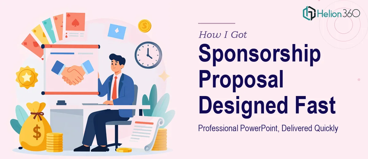
The Situation and What Was Actually at Stake
I had a sponsorship opportunity with a hard window. The proposal needed to go out to a shortlist of potential sponsors within days, and the document had to do real work — not just look decent, but communicate value clearly enough that decision-makers would keep reading past the first two slides.
The content existed in rough form: tier structures, audience data, activation ideas, logo placements. But a Word document and a rough outline aren't a sponsorship proposal. Sponsors evaluate dozens of these. A slide deck that looks assembled rather than designed signals immediately that the opportunity isn't being taken seriously.
I knew the stakes were real — the right sponsor relationship could fund a meaningful program — and I knew equally fast that producing something at the standard this audience expected wasn't something I could pull off on my own timeline. This needed to be done properly.
What I Found Out a Strong Sponsorship Proposal Actually Requires
When I looked at what separates a forgettable sponsorship deck from one that actually moves a sponsor toward a yes, the gap was larger than I expected.
The visual work alone involves more than applying a color scheme. A professional sponsorship proposal presentation uses a structured layout system — consistent column grids, anchored logo zones, and a repeatable slide architecture that lets each tier or benefit category breathe without looking sparse. Typography needs a clear hierarchy: a display size for section headers, a readable body size for benefit descriptions, and a supporting size for footnotes or fine print, typically something like 36pt/22pt/14pt across those three levels.
Beyond layout, the narrative sequencing matters enormously. Sponsors want to see audience reach and demographic data early, activation mechanics in the middle, and tier investment logic at the end. Getting that order wrong buries the persuasion. And the visual treatment of data — audience size, engagement metrics, geographic reach — needs charts and callout treatments that are clean enough to read in a five-second skim. That is a specific skill, not a default PowerPoint behavior.
What the Work Actually Involves
The structural and narrative work behind a sponsorship proposal presentation starts with an audit of the source content. A practitioner maps the full story arc before touching a slide: what the sponsor's primary concern is (usually reach and ROI), what proof points need to appear early, and how the tier logic is sequenced so that the top package reads as the obvious anchor rather than a ceiling. Benefit categories get grouped so that each slide covers a single idea — not a mixed bag of deliverables. This mapping step alone typically takes several hours and determines whether the final deck persuades or just informs.
The visual mechanics of a well-built sponsorship deck follow rules that most people underestimate. A 12-column layout grid ensures that content blocks, icons, and image zones align across every slide without manual nudging. Typography runs on a strict three-level hierarchy — a large display size for section headings, a medium weight for benefit statements, and a smaller supporting size for detail copy. Brand color application is disciplined: a primary color for structural elements, one accent for callouts, and neutral fills for data backgrounds. Deviating from that palette even once creates a visual inconsistency that sponsors notice without being able to name it. Keeping that discipline across 20 or more slides is repetitive, painstaking work.
The polish and consistency layer is where most self-built decks fall apart. Slide padding needs to be identical across every layout variant — a common standard is 40px margins on all sides, with content zones that never bleed into the gutter. Icons need to be drawn from a single family at a consistent stroke weight. Photo treatments — whether full-bleed, framed, or masked — need to follow the same rule across every slide where an image appears. When a deck runs 18 to 25 slides across multiple sponsor tiers, maintaining that consistency without a master slide system and a component library takes far longer than people budget for.
Why I Brought in Helion360 to Handle It
I looked at what the work genuinely required — the narrative mapping, the grid system, the typography discipline, the consistency across every tier page — and made a straightforward decision. I didn't have the time to build the tooling from scratch or the experience to execute at the standard this audience expected. Attempting it myself and delivering something that looked assembled would have been worse than missing the window.
Helion360 handled the full project end-to-end. That meant taking the rough content and structuring it into a proper narrative arc, building the layout system from the ground up, designing all tier and benefit slides with consistent visual mechanics, and delivering a fully editable file. The turnaround was fast — done in days, not weeks — and the execution depth was exactly what the work required. A team that builds sponsorship program slide decks regularly already has the master slide architecture, the icon libraries, and the brand application process in place. That infrastructure is what makes the speed possible.
The Result and What I'd Tell Anyone Facing the Same Decision
The delivered deck was clean, structured, and visually credible at the level sponsors expect. The tier logic read clearly, the audience data was presented in a format that was easy to skim, and the overall impression was one of a serious, well-organized opportunity. It went out on time and held up under the scrutiny of people who review these regularly.
The lesson for anyone looking at a similar project is simple: a sponsorship proposal presentation isn't a design task you slot into a spare afternoon. The narrative structure, the layout system, the typography hierarchy, and the consistency work across every slide represent real execution depth. If you're seeing what I saw — a tight deadline, a high-stakes audience, and a gap between your raw content and what the final product needs to be — Helion360 is the team to engage. They handled the full scope fast and delivered at the standard the work required.