

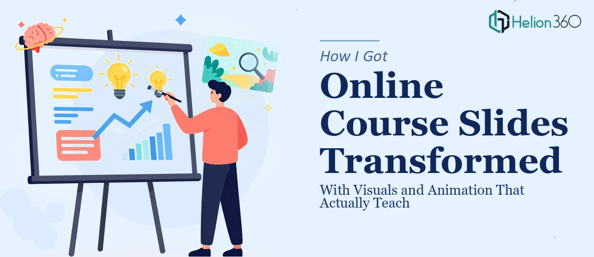
The Problem With Our Course Slides
We had built out a solid online course. The content was strong, the curriculum was well-structured, and the subject matter was genuinely useful to learners. But the slides were flat. Static. Dense with text and generic layouts that made even the most interesting concepts feel like a chore to read through.
This wasn't a minor cosmetic issue. In the online learning space, visual quality directly affects completion rates and learner satisfaction. Slides that fail to engage don't just look bad — they undercut the credibility of the course itself and push learners to disengage before they get the value they signed up for.
I knew the slides needed a serious upgrade: purposeful animation, clearer visual hierarchy, and a consistent design language that could carry learners through hours of material without losing them. I also knew that doing this well was not a weekend fix.
What I Found Out This Kind of Work Actually Requires
When I looked into what proper PowerPoint visual enhancement and animation design actually involves for a course context, the scope came into focus quickly.
First, animation in an educational setting isn't decorative — it's functional. The timing, sequencing, and entrance behavior of each element has to serve the explanation. A concept that reveals itself in stages as a narrator walks through it lands very differently than a slide where everything appears at once. Getting that sequencing right across dozens of slides requires deliberate planning, not just clicking through the animation pane.
Second, visual consistency at scale is a real discipline. A course might have sixty, eighty, or over a hundred slides. Keeping typography, spacing, color palette, and icon treatment coherent across that entire body of work — without the whole thing looking robotic — takes a system, not just taste.
Third, design principles in an educational context come with their own rules. Cognitive load theory, for instance, directly informs how much content should appear per slide and how motion should be used to direct attention rather than distract from it. That's not something most people pick up casually.
What the Work Itself Involves
The Real Work Behind Polished, Animated Course Slides
The first major area is structural and narrative preparation. Before a single animation is added, the right approach involves auditing every slide for content load and logical sequencing. Slides carrying more than one key idea typically need to be split. A practitioner working at this level will map out which concepts benefit from progressive disclosure — revealing information in controlled steps — and rebuild the slide architecture accordingly. This restructuring work is time-intensive and requires both design judgment and an understanding of how learners process information. Rushing this stage produces slides that look polished but still overwhelm the viewer.
The second area is visual mechanics: layout grids, type hierarchy, and chart or diagram treatment. Proper execution uses a consistent grid — typically a 12-column structure — applied through master slides so that alignment propagates automatically across the entire deck. Type hierarchy follows a clear scale, something like 36pt for primary headings, 24pt for subheadings, and 16pt for body text, with no more than two typefaces in use across the full course. Diagrams and process visuals need to be rebuilt from scratch rather than borrowed from clip art libraries. Each of these decisions has to be made once and applied everywhere — and setting that system up correctly in PowerPoint's master and layout structure takes real hours, particularly for someone not already fluent in how those layers interact.
The third area is animation design and consistency. Done well, animation in a course context follows a deliberate logic: entrance animations use Appear or Fade at 0.5 seconds or less to avoid distraction, builds are triggered by click or timed cues that match the narration rhythm, and no element moves purely for visual interest. The execution friction here is significant — applying consistent animation behavior across eighty-plus slides, testing every sequence, and catching the edge cases where an element fires out of order or a transition breaks the flow takes methodical review that's easy to underestimate.
Why I Brought in Helion360 to Handle It
Once I understood the full scope — the structural audit, the master slide system, the animation sequencing, the consistency work across every single slide — it was obvious this wasn't something to attempt in-house without the right tooling and experience already in place.
Helion360 handled the full project end-to-end. They took our existing slides, rebuilt the master layout architecture, applied a consistent visual system across the entire course deck, and designed the animation sequences with the kind of deliberate, narration-aligned logic the content needed. The whole project was turned around quickly — done in days rather than the weeks it would have taken to learn and execute this at the level it required.
What made the difference was that they weren't figuring it out as they went. The expertise, the process, and the tooling were already in place. Full execution, not just surface-level polish.
What the Finished Course Looked Like — and What I'd Tell Anyone in the Same Spot
The delivered slides were a meaningful step up from where we started. The visual hierarchy was clean and readable. The animations served the instruction rather than competing with it. Concepts that previously sat in text blocks now unfolded progressively, in step with the narration. The whole course felt cohesive — like a finished product rather than a working draft.
Learner feedback after launch reflected that. The material landed more clearly, and the production quality reinforced confidence in the content itself.
If you're looking at a course deck that needs visual enhancement of presentation and you want it handled end-to-end without the weeks of trial and error, Helion360 is the team I'd engage — they delivered fast and brought exactly the execution depth this kind of project requires.
Related Resources
- Engaging webinar presentations can significantly improve online course delivery.
- Google Slides with dynamic visuals demonstrates the impact of consistent design across presentations.
- Canva presentations for course content offers another approach to transforming dense material into visually engaging formats.