

When Course Content Alone Is Not Enough
I was working on building out an online course — several modules covering dense, text-heavy material that needed to land clearly with learners who had no prior background in the subject. The content itself was solid. The problem was that nobody was going to sit through fifty slides of bullet points and paragraph text and feel motivated to keep learning.
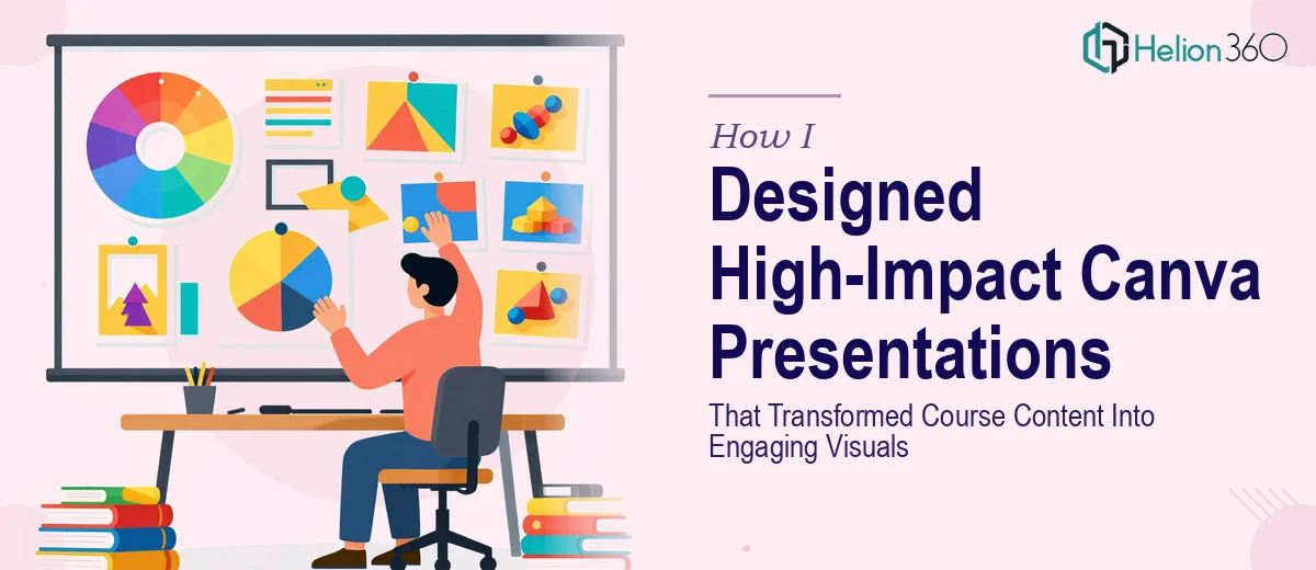
I knew the course needed visual support. Infographics, structured slide decks, icons, layouts that broke information into digestible pieces. I had access to Canva and had used it casually before, so I figured I could handle the design work myself.
Where I Got Stuck
At first, things moved reasonably well. I picked a Canva template that looked clean and started dropping in content. But problems surfaced quickly. The template I chose worked for two or three slide types, and then ran out of steam. When I needed a comparison layout, a data breakdown, or a visual explainer for a process, I was back to starting from scratch each time.
Consistency became the real issue. By the time I was thirty slides in, the deck had three different heading styles, mismatched icon sets, and color choices that had drifted from module to module. For a professional online course, that inconsistency would undermine credibility before the content even had a chance to land.
I also realized I was spending more time trying to make things look right than actually thinking about learning flow. That ratio was unsustainable.
Bringing in the Right Support
After hitting that wall, I came across Helion360. I explained what I was building — an online course with multiple modules, a specific brand palette, and a need for visual consistency across all Canva presentations. Their team understood the scope immediately and asked the right questions: What was the tone of the course? Who was the audience? What kinds of concepts needed visual treatment versus just clean typographic slides?
That intake process itself was clarifying. It forced me to think about the course structure as a design problem, not just a content problem.
What the Design Work Actually Involved
Helion360's team built a master slide system in Canva — a set of core layouts that could flex across different content types without losing the visual thread. Section openers, text-plus-image layouts, process flow slides, infographic templates for breaking down statistics, and clean summary slides for module endings.
Every element was tied back to a consistent design language: the same typeface hierarchy, a controlled color palette pulled from the course brand, and icon sets that matched in weight and style. When I dropped new content into a slide, it looked like it belonged there.
The infographic work was where the presentation design really paid off. Some of the course concepts involved multi-step processes and comparisons that were genuinely hard to explain in text alone. The team converted those into visual explainers that made the logic immediately clear — the kind of engaging visuals that online learners actually remember.
What the Finished Decks Looked Like
The gap between what I had built on my own and what came back from Helion360 was significant. Not because my version was embarrassing — the content structure was fine — but because professional presentation design adds a layer of clarity and polish that changes how learners experience the material.
Learners reading a well-designed slide deck spend less cognitive effort parsing the layout and more time absorbing the content. That is the whole point. When the visual hierarchy is clear and consistent, the course feels credible and intentional.
I also ended up with a reusable Canva template system I could update for future modules without rebuilding anything from scratch. That was an unexpected but genuinely useful outcome.
What I Took Away From This
Designing presentations for online courses is not just about making things look good. It is about making the learning experience feel organized, trustworthy, and easy to follow. That requires design decisions — about layout, hierarchy, and visual language — that go well beyond picking a Canva theme and filling in the blanks.
If you are building course content and finding that your slide decks are visually inconsistent, hard to scale, or just not landing the way you want, Helion360 is worth a conversation — they took what I had and turned it into something the material deserved.