

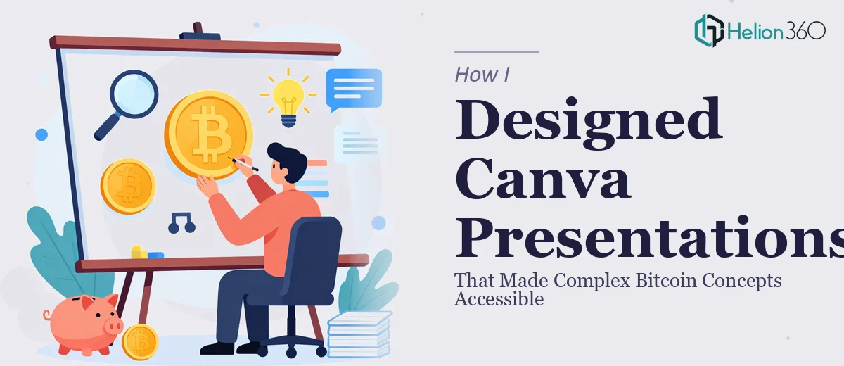
When Educational Content Needs More Than Good Intentions
I was working on a Bitcoin educational video series — a set of explainer videos covering blockchain technology, how transactions work, cryptocurrency benefits, and where Bitcoin fits in the global economy. The content itself was solid. The scripts were clear, the topics were well-researched, and the audience was genuinely curious. What we were missing was a visual layer that could hold everything together.
Each video needed a companion Canva presentation — something that would appear on screen alongside narration and keep viewers oriented as topics shifted. These weren't slides for a boardroom. They were educational support materials, and they had to make abstract, technical concepts feel tangible without dumbing anything down.
I figured Canva would make this straightforward. I had used it before for simpler things — social posts, basic decks. I opened the tool, picked a template, and started building.
Where It Started Getting Complicated
The first few slides came together reasonably well. I had a title card, an intro overview, and a basic layout for the blockchain explainer. But once I moved into transaction flow diagrams and charts showing Bitcoin's historical volatility versus adoption rates, I ran into a wall.
The visual structure I needed wasn't just about making things look nice. It was about sequencing information in a way that matched the video pacing, maintaining consistent branding across ten or more separate presentations, and building custom infographics that could explain things like the mining process or wallet addresses without using jargon-heavy text blocks.
I spent two full days on a single slide trying to illustrate how a blockchain block connects to the next. Every version I made looked either too cluttered or too vague. I also realized I had no consistent visual system — colors drifted between files, icon styles clashed, and nothing felt like it belonged to the same series.
It was clear this required more than Canva skill. It required a visual communication strategy, and I didn't have the bandwidth to build one from scratch.
Bringing in the Right Help
After hitting that wall, I came across Helion360. I explained the full picture — the educational Bitcoin video series, the scope of the presentations, the branding inconsistencies I had already created, and the specific challenge of making cryptocurrency concepts visually accessible for a general audience.
Their team understood the brief immediately. They asked targeted questions about tone, audience familiarity with crypto, the platform the videos would live on, and what kind of visual style would complement the narration rather than compete with it. That last point mattered — I had never quite framed it that way myself, but it was exactly the problem I had been struggling with.
They took the existing slides I had built, identified what was salvageable, and rebuilt the rest with a consistent visual language across the entire series. Each presentation used the same icon family, color palette, and layout logic, so viewers moving from one video to the next would feel a sense of continuity.
What the Final Presentations Actually Looked Like
The finished Canva presentations were clean, structured, and genuinely educational. Complex ideas like blockchain immutability and peer-to-peer transaction validation were handled through custom-built infographics with clear visual flow — no walls of text, no confusing diagrams.
Charts showing Bitcoin's price milestones were formatted to support the narration rather than overwhelm it. Each slide had just enough information to reinforce what was being said on screen, not replace it. The branding was consistent throughout, which gave the entire series a professional, cohesive identity.
Helion360 also built a reusable slide system, so adding future videos to the series would not require rebuilding layouts from scratch. That alone saved significant time going forward.
What I Took Away From This
Designing Canva presentations for educational content — especially technical topics like Bitcoin and blockchain — is not just a design task. It is a communication problem. The visuals have to carry meaning, not just fill space. Getting the structure right requires thinking about how a viewer processes information on screen in real time, which is a different skill set than general graphic design.
I also learned that starting with a consistent visual system early would have saved me days of rework. Building templates and establishing rules for typography, color, and layout before touching a single slide is always the right starting point.
If you are working on an educational video series and the visual layer is not keeping up with your content, Helion360 is worth reaching out to — they handled the complexity I could not and delivered something the series genuinely needed.