

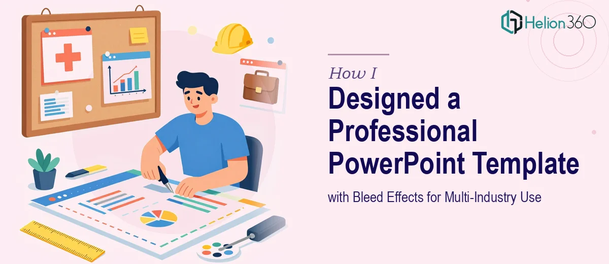
The Brief Sounded Simple Enough
I was tasked with creating a PowerPoint template that could serve as a foundational design system — something versatile enough to be used across multiple industries, from finance and healthcare to tech and consulting. The key requirement was bleed effects: full-edge design elements where color, imagery, and graphic shapes extend all the way to the slide boundary, creating a print-quality, high-impact visual.
On the surface, it seemed manageable. I had a working knowledge of PowerPoint, understood basic design principles, and had put together decent-looking decks before. So I opened PowerPoint, started sketching layouts, and figured I would get there with some patience.
Where It Started to Get Complicated
The bleed effect itself was the first hurdle. PowerPoint does not natively support true bleed in the same way print design tools like Adobe InDesign do. Achieving the illusion of a bleed — where design elements feel flush with the edge when exported or printed — requires precise use of slide dimensions, strategic placement of shapes and images beyond the viewable canvas, and careful export settings.
I spent time adjusting slide sizes, experimenting with oversized background shapes, and trying to push elements past the visible boundary. Some attempts looked fine on screen but fell apart in PDF export. Others looked clean in widescreen but broke when the template was used at a different aspect ratio.
Beyond the bleed issue, creating a multi-layout template that actually held together visually was harder than expected. Each layout — title slide, section divider, content slide, data slide, quote slide — needed to feel like part of the same family while staying flexible for different content types. Branding elements like color palettes, font hierarchies, and iconographic accents needed to be consistent without feeling rigid.
After a few rounds of revisions that were going nowhere productive, I realized this was not just about spending more time. It required a deeper command of design systems and slide architecture than I currently had.
Bringing in the Right Expertise
That is when I reached out to Helion360. I explained the brief — a professional PowerPoint template with bleed effects, multiple slide layouts, consistent branding, and enough flexibility to serve diverse industries. I shared what I had built so far, along with notes on what was not working.
Their team asked the right questions upfront: the intended use cases, preferred aspect ratio, whether the template would be used digitally or printed, and what level of customization the end users would need. That clarity shaped everything that followed.
What the Final Template Actually Included
The team came back with a structured template that handled the bleed correctly — using extended background elements and proper slide dimension settings so the design stayed intact across export formats. The edge-to-edge visual treatment looked intentional and polished, not like a workaround.
The template included a title slide with a full-bleed image layout, a clean section divider, a standard content slide with text and visual balance, a data-focused layout designed to accommodate charts and statistics, and a closing or thank-you slide. Each layout used the same typographic system and color logic, so swapping content in did not break the visual rhythm.
Customization was also built in thoughtfully. Placeholder zones were clearly defined, master slides were organized, and color themes were set up so that changing a single palette updated the whole deck. That kind of structure is what separates a proper presentation template from a collection of formatted slides.
What I Took Away from the Process
Building a truly reusable, multi-industry PowerPoint template is a different task from building a one-off presentation. It is a design system problem — one that requires thinking about every layout in relation to the others, anticipating how different users will interact with the file, and solving technical challenges like bleed effects in ways that do not create new problems downstream.
The experience made me appreciate how much precision goes into professional PowerPoint template design that looks effortless from the outside.
If you are working on something similar — a branded template, a multi-layout master slide system, or a design that needs to hold up across industries and use cases — consider Template Design Services. They handled the complexity cleanly and delivered something that was genuinely ready to use.