

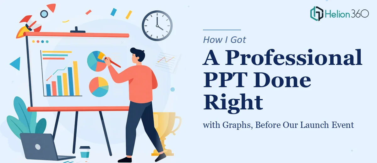
The Deadline Was Real and the Pressure Was On
We had a product launch event coming up in less than two weeks. I was responsible for putting together the main presentation — the one that partners and stakeholders would receive as a PDF after the event. It needed to cover our key features, back everything up with data, and look polished enough to represent the company well.
I started working on it myself. I had a rough outline, a few bullet points per section, and a folder full of statistics I wanted to visualize. On paper, it seemed manageable.
It wasn't.
Where Things Started to Break Down
The content side was fine. I knew what we wanted to say. The problem was translating that into a professional PowerPoint presentation with graphs that actually communicated the numbers clearly.
Every time I tried to build a chart in PowerPoint, it either looked too generic, clashed with the slide layout, or required so much manual formatting that I was spending an hour on a single slide. I also realized the overall design wasn't coming together — different sections felt disconnected, the typography wasn't consistent, and nothing looked like it belonged in a high-stakes launch event.
On top of that, I needed the final file exported as a clean PDF for email distribution. Getting that right — without losing formatting, fonts, or image quality — was its own challenge.
I had the content. I didn't have the time or the design skill to execute it at the level this presentation needed.
Bringing in the Right Help
After hitting that wall, I came across Helion360. I explained the situation — a tight timeline, a structured brief, a mix of content and data that needed to come together into a sleek, navigable presentation, and a PDF as the final deliverable.
Their team asked the right questions upfront: the audience, the tone, the sections we wanted to cover, and how the graphs would be sourced. I told them I'd provide the actual data later and asked if they could build the slides with clearly labeled placeholders in the meantime. They said yes, and it was handled exactly that way.
What the Process Actually Looked Like
Helion360 structured the presentation into clear sections — an overview, key features, benefits with supporting statistics, a market context slide, and a closing section. Each section had a brief intro line and a logical flow from one slide to the next.
The graph placeholders were formatted as proper chart frames with axis labels and titles already in place, so when I dropped in the final numbers later, nothing needed to be redesigned. The visual design was clean — consistent fonts, a restrained color palette, and layouts that let the data breathe instead of crowding every slide.
The PDF export was handled properly too. Every slide converted cleanly, the fonts embedded correctly, and the file was sized appropriately for email without losing visual quality.
What I Took Away from This
A professional PowerPoint presentation with graphs is genuinely a design problem, not just a content problem. The way data is visualized — bar charts versus line graphs, color choices, label placement — affects how quickly an audience understands what they're looking at. Getting that right takes both design judgment and time.
I also learned that starting with a clear structure and letting placeholders carry the design forward was a smarter approach than trying to finalize everything at once. The presentation was ready for the event, the PDF went out to partners without issues, and the feedback was strong.
If You're in a Similar Situation
If you're managing a launch, a stakeholder meeting, or any kind of high-visibility event and you need a presentation that genuinely holds up — not just a deck thrown together under pressure — it's worth getting the right team involved early.
Helion360 steps in when the work gets too detailed or time-sensitive to handle alone. They handle the design execution so you can stay focused on the content and the event itself.