

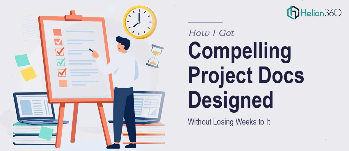
The Problem With Presenting Project Work to Stakeholders
I was sitting on a stack of initiative updates, milestone trackers, and achievement summaries that needed to go in front of stakeholders across multiple departments. Not a pitch deck. Not a sales tool. A project document presentation — the kind that has to work equally well for a marketing director, an operations lead, and a department head who has seven minutes before their next meeting.
The stakes were straightforward but real. These documents were part of a broader content strategy, and how they looked directly reflected how seriously the underlying work would be taken. A dense, inconsistent, visually flat set of slides would bury perfectly good information. And we had a deadline that wasn't moving.
I knew immediately that this wasn't something to half-handle. Done poorly, it undermines the work it's meant to showcase. Done well, it makes everything land.
What I Found a Good Project Presentation Actually Requires
I spent some time understanding what separates a well-executed stakeholder presentation from the kind that gets skimmed and closed. The gap is bigger than most people expect.
First, there's the brand consistency problem. When documents travel across departments, every version of a color or font that drifts even slightly gets noticed. Locking down a palette — typically no more than four brand colors with defined usage rules — and enforcing it across every slide, header, and infographic is not a casual task.
Second, there's the information architecture challenge. Objectives, milestones, and achievements are three very different types of content that require different visual treatments. Mixing them without a deliberate structure produces noise, not clarity.
Third — and this one surprised me — is the template problem. Building a reusable, brand-aligned template system that a marketing team can actually maintain without breaking is its own design discipline. It involves master slide logic, component consistency, and spacing rules that hold up across different content lengths.
None of these are weekend-project territory.
What the Work Actually Involves
The structural and narrative work comes first, and it's more demanding than it looks. A proper project document presentation starts with an audit of the source material — identifying what's an objective, what's a milestone marker, and what's an achievement worth spotlighting. The practitioner then maps a logical flow: context first, progress second, outcomes third. That sequencing decision shapes every layout choice downstream. Getting the narrative arc wrong at this stage means no amount of visual polish will save the document from feeling confusing to a cross-functional audience that doesn't share the same background knowledge.
Visual mechanics are where a lot of self-built presentations fall apart. Proper layout work uses a defined grid — typically a 12-column system — so that text blocks, data callouts, and infographic panels align predictably across every slide. Typography follows a strict hierarchy: a display heading might sit at 36pt, section labels at 24pt, and body content at 16pt, with consistent line spacing throughout. Infographics that represent milestone timelines or achievement summaries require a different treatment than text-heavy objective slides, and choosing the wrong visual type for the content type is a common and costly mistake. Setting this up correctly across a full document, including edge cases where content runs long, takes significant time for anyone who hasn't built these systems before.
Polish and consistency across the full document is the phase that separates a presentation that looks designed from one that merely looks formatted. Brand color discipline means defining not just which four colors are in play, but exactly when each is used — primary for headers, secondary for callouts, neutral for body backgrounds, accent for data highlights. Icon sets need to come from a single family. Spacing between elements must follow a fixed unit (commonly 8px increments) so nothing feels arbitrarily placed. Running this level of consistency across 20 or 30 slides, while accommodating content that varies in density from slide to slide, is where most non-specialists lose hours and still don't get it fully right.
Why I Brought in Helion360 to Handle It
I looked at what the work actually required and made the call quickly. This wasn't a matter of taste or preference — it was a resource and expertise question. I didn't have the design infrastructure in place, and I wasn't going to build it from scratch on a live deadline.
Helion360 handled the full project end-to-end. That meant taking the raw initiative content and source materials, structuring the narrative flow, building the branded template system, and producing the final presentation documents — consistently designed, cross-departmentally readable, and ready to use.
What stood out was the speed. The work was turned around quickly — done in days, not the weeks it would have taken me to learn the tooling and enforce the consistency standards myself. The team came in with the grid systems, brand application rules, and infographic frameworks already built into their process. There was no ramp-up time on how to approach this kind of work, because they do it constantly.
They also delivered reusable templates the marketing team could maintain going forward — which was the longer-term value I hadn't fully accounted for at the start.
What the Project Delivered and What I'd Tell Anyone in the Same Spot
What came back was a clean, brand-consistent set of project documents that communicated objectives, milestones, and achievements in a way that worked for every department in the room. The visual hierarchy was clear. The infographics translated milestone data without requiring explanation. The template system meant the marketing team wasn't starting from scratch for the next cycle.
More practically: stakeholder feedback shifted. The content got discussed on its merits rather than filtered through confusion about what the slide was trying to say. That's the real outcome — the presentation stopped being an obstacle and started doing its job.
If you're looking at a similar problem — project content that needs to reach a cross-functional audience, a brand that needs to hold together across every document, and a deadline that isn't flexible — marketing presentation design services can handle the full execution fast, and the quality of what they deliver reflects a level of design discipline that would take far longer to approximate on your own.