

The Situation — and Why Getting It Right Was Non-Negotiable
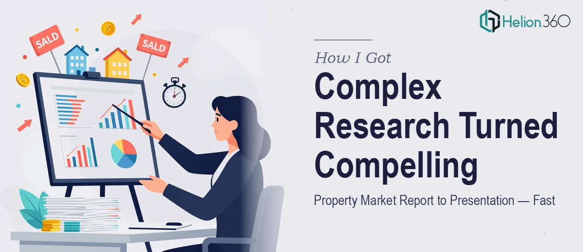
I was sitting on a detailed property market research report covering current conditions, pricing trends, and a forward-looking outlook for a specific urban market. The analysis was solid. The problem was that none of it was presentation-ready — and the audience I needed to reach wasn't going to wade through a dense document to find the insights that mattered to them.
This wasn't an internal briefing. The people in the room would be making investment and advisory decisions based on what they saw. If the data looked cluttered, if the narrative didn't flow, or if the visual language felt amateur, the credibility of the research itself would take a hit. The stakes were real, and the timeline was tight. I knew immediately this needed to be handled properly — not patched together over a few evenings.
What I Found Out This Kind of Work Actually Requires
Before I did anything, I spent time understanding what a well-executed market research presentation actually involves. The gap between a workable slide deck and a presentation that genuinely moves an audience is larger than most people assume.
The first thing I noticed is that property market data is inherently layered. You're dealing with macroeconomic indicators, local supply-demand dynamics, transaction volume trends, and forward projections — all of which need to coexist in a single coherent narrative without overwhelming the viewer. Stringing charts together doesn't accomplish that. Someone has to make deliberate decisions about what gets foregrounded, what gets summarized, and what gets cut entirely.
The second signal of real complexity: the data visualization choices matter enormously in this context. The wrong chart type for a trend comparison doesn't just look bad — it actively misleads. And property market data tends to span multiple time series, geographic layers, and comparative benchmarks simultaneously. Getting that right requires both analytical judgment and design fluency working together.
That combination — research literacy plus presentation craft — is rare. It's not something a slide-polish pass addresses.
What the Actual Work Involves
The right approach to a market research presentation starts with a structural audit of the source material. A property market report typically contains far more information than a presentation can or should carry. The work involves mapping the core argument — what is the single most important thing this audience needs to understand — and then sequencing supporting evidence to build toward that conclusion. In a property context, that might mean leading with a market cycle position before drilling into price-per-square-meter trends or vacancy rate shifts. Getting that sequence wrong means the audience loses the thread early and never recovers. Reworking a narrative structure that wasn't planned upfront can easily consume a full day of rework on its own.
Visual mechanics are where most self-assembled decks fall apart under scrutiny. Proper data visualization for property market research involves selecting chart types that match the data relationship being shown — line charts for time-series trends, grouped bars for comparative benchmarks, scatter plots for correlation analysis. A disciplined layout grid, typically a 12-column structure, keeps charts, labels, and annotations from feeling arbitrary across slides. Typography hierarchy — title at 36pt, data label callouts at 24pt, footnotes and sources at 12pt — is applied consistently, not slide by slide. These aren't aesthetic choices; they're readability rules. Someone unfamiliar with master slide architecture in PowerPoint can spend hours just getting a consistent grid to propagate correctly.
Polish and consistency across the full deck is the third layer that distinguishes professional output from something that looks assembled. A market research presentation for a sophisticated audience typically requires a restrained palette — no more than four brand-aligned colors — with a dedicated accent color reserved for the single most important data point on each chart. Source citations, methodology notes, and data vintage labels need to appear in a uniform format on every data slide. Missing even a few of these details signals sloppiness to a data-literate audience, and retrofitting consistency after the slides are built takes longer than building it correctly from the start.
Why I Brought Helion360 In to Handle the Whole Thing
Looking at what this work actually required, it was clear this wasn't something to attempt on the side. The project needed someone with both the analytical sensibility to handle property market data correctly and the presentation design depth to execute at a professional standard — and it needed to move fast.
I engaged Helion360 to handle the project end-to-end. That meant taking the source research report, making the structural and narrative decisions, building the full slide architecture, and delivering a finished presentation ready for a senior audience. They turned it around quickly — done in days, not weeks — which mattered given the timeline I was working against.
What made the difference was that Helion360 already had the tooling, the templates, and the workflow in place for exactly this type of work. There was no ramp-up time, no back-and-forth over basic design decisions. The narrative structure, the data visualization choices, the palette discipline, and the citation formatting were all handled as part of the same integrated process.
The Result — and What I'd Tell Anyone in the Same Position
What came back was a clean, structured presentation that made the property market analysis genuinely accessible to a decision-making audience. The research held up because the presentation didn't get in its way. The data visualizations were clear and appropriately matched to the underlying data relationships. The narrative moved logically from market context through current conditions to forward outlook, and the design maintained the kind of visual discipline that signals credibility before the first chart is discussed.
The business outcome was straightforward: the presentation landed well with the audience and supported the advisory conversation it was built for. There was no scrambling, no last-minute patching, and no awkward apologies for the slide quality.
If you're looking at a similar situation — dense market research that needs to reach a serious audience, on a timeline that doesn't allow for weeks of learning curve — Helion360 is the team I'd engage. They handled the full execution fast, and the depth of work they brought to it showed.