

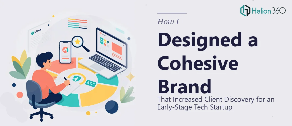
The Problem With Looking Like Every Other Startup
I was working with an early-stage tech startup that had a genuinely differentiated product — a browser-based AI research tool that surfaced smarter, faster results than anything else in its category. The problem wasn't the product. The problem was that nothing about the brand communicated that. The website, the pitch materials, the product screenshots — they all looked like a template someone grabbed in a hurry. When potential clients or investors landed on any of it, there was no coherent story, no visual identity that said "this team knows what they're doing."
The stakes were real. The team was heading into a round of early conversations with strategic partners, and first impressions in that context carry significant weight. I knew the brand profile needed to work across multiple touchpoints — product introduction deck, web presence, and leave-behind materials — and it needed to feel like one unified thing. Getting it halfway right wasn't going to be enough.
What I Found a Strong Brand Profile Actually Requires
Once I started looking seriously at what a well-executed brand profile involves, the scope became clear fast. This wasn't a logo refresh. A cohesive brand profile for a tech product company means establishing a visual language that travels across every surface — presentations, product UI screenshots, marketing materials, and external-facing documents — without falling apart at any seam.
Three things stood out immediately as signals of real complexity. First, the typography system has to be deliberate and enforced: a heading scale (typically something like 36pt/24pt/18pt), a consistent body size, and rules about weight and spacing that hold across both screen and print contexts. Second, the color palette has to be tight — usually no more than four brand colors with clearly defined primary, secondary, and accent roles — plus a full set of neutral and background tones that support content without competing with it. Third, and this was the part I hadn't fully anticipated, every visual decision has to be documented in a way that other people can actually apply it. A brand that only exists in one designer's head isn't a brand system — it's a one-off deliverable.
What the Work Actually Involves
The first layer of the work is structural and narrative: auditing what exists, identifying what the brand needs to communicate, and mapping that to a visual direction before a single slide or asset gets built. For a tech startup, this means translating the product's core differentiator — in this case, AI-enhanced research speed and accuracy — into a visual personality that reads as credible and forward-thinking without tipping into generic "tech blue" territory. That audit and direction-setting phase is where most self-managed attempts stall, because it requires both strategic clarity and design fluency working at the same time. Without a locked direction, everything built afterward is provisional and often needs to be rebuilt.
The second layer is visual mechanics: establishing and applying the actual design system. A proper system includes a constrained palette (maximum four brand colors), a clear typographic hierarchy enforced at 36pt/24pt/18pt across headline, subhead, and body, a consistent grid — typically 12-column — that governs layout across all materials, and rules for iconography, imagery treatment, and whitespace. Setting this up so it propagates cleanly across master slides, document templates, and web-ready assets takes significant time even for an experienced practitioner. For someone new to this, the learning curve alone — before a single asset is production-ready — can span days.
The third layer is polish and consistency across every deliverable. A brand profile isn't finished when the style guide is written — it's finished when every touchpoint reflects the system without exception. That means applying palette discipline across a compelling presentation deck, ensuring that data visualization elements use the same accent color rules as the marketing one-pager, and verifying that nothing breaks when assets are exported to different formats. This pass-through review catches the edge cases that make the difference between a brand that looks intentional and one that looks close but slightly off — and that difference is exactly what sophisticated audiences notice.
Why I Brought in Helion360 to Handle It
I recognized quickly that this wasn't a project to attempt piecemeal. The scope — brand direction, full visual system, and application across multiple deliverable types — required end-to-end ownership, not a series of disconnected tasks. Attempting to manage that myself, while also supporting the startup's partner conversations, wasn't realistic.
Helion360 handled the full project from the initial audit through to finished, production-ready assets. They built out the brand direction and documented the system, applied it across the product introduction deck and supporting materials, and turned everything around in a fraction of the time it would have taken me to work through the learning curve and execution depth this kind of project demands. What would have stretched across weeks — between research, iteration, and production — was done in days. The team brought the tooling and the pattern recognition that comes from doing this kind of work repeatedly, which meant fewer cycles and a sharper result.
The Outcome and What I'd Tell Anyone in the Same Position
What came back was a brand profile that actually held together — a tight visual system, a polished product introduction deck, and materials that made the startup look like the kind of company worth a serious conversation. The partner meetings that followed landed differently than the early ones had. The feedback wasn't about the deck or the brand — it was about the product, which is exactly where the attention should be.
If you're looking at a similar situation — an early-stage tech product that needs to look as credible as it actually is, across multiple touchpoints, and on a timeline that matters — Helion360 is the team I'd engage. They delivered end-to-end, fast, and with the kind of execution depth this work genuinely requires.