

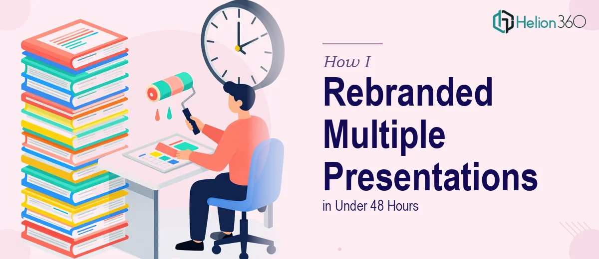
When a Rebrand Hits During the Busiest Week of the Quarter
It started on a Monday morning. Our leadership team had just finalized a full company rebrand — new logo, updated color palette, refined typography, and a fresh visual direction. That was great news. The not-so-great news was that we had three major presentations scheduled for the rest of the week: a company strategy deck, a financial report, and a sales pitch. All of them still carried the old branding.
I had roughly 48 hours to bring everything in line with the new brand guidelines before those decks were in front of executives, investors, and clients.
What I Was Actually Dealing With
I underestimated the scope at first. Swapping a logo on a title slide is one thing. But a full PowerPoint branding update across three distinct presentations — each with different layouts, chart styles, font hierarchies, and graphic treatments — is something else entirely.
Here's what needed to change across all three files:
The logos on every slide needed to be replaced with the updated version, properly sized and repositioned. The old color scheme — a muted blue-grey palette — had to be replaced with the new brand colors across backgrounds, headings, accents, chart fills, and icon tints. Every font instance needed to be updated from the old typeface to the new brand font family. Graphics and dividers that used the old visual style needed to be redesigned or replaced.
The financial report alone had over 40 slides, including embedded charts and data tables. The sales pitch had custom-built infographic slides. The strategy deck had layered SmartArt and icon sets.
I spent the first three hours trying to handle it myself — working through slide master updates, manually replacing logos, and tweaking color fills. I got through about a quarter of the strategy deck before I realized two things: the quality wasn't consistent, and I wasn't going to finish in time while also managing everything else on my plate.
Bringing in a Team That Could Actually Handle It
After hitting that wall, I came across Helion360. I explained the situation — three presentations, a tight 48-hour window, specific brand guidelines to follow, and a need for professional consistency across all files.
Their team asked the right questions from the start. They wanted the brand guidelines document, the existing PPTX files, and clarity on which elements were fixed versus flexible. Within a short briefing window, they had a clear understanding of what the rebrand needed to look like and started working immediately.
What stood out was how structured their approach was. They didn't just do a find-and-replace on colors. They rebuilt the slide masters properly so the branding would be globally consistent. They updated the charts and data visuals to match the new palette without distorting any of the underlying data. Fonts were replaced across every text box — including ones buried inside grouped objects that I had completely missed.
What the Finished Work Looked Like
I received the updated files within the agreed timeframe. Going through them, the difference was immediately visible — and more importantly, the consistency was there. The financial report, strategy deck, and sales pitch all felt like they came from the same visual system. The new logo was correctly placed, the color scheme was applied with nuance rather than just a blanket swap, and the typography was clean and readable throughout.
The sales pitch in particular looked noticeably sharper. The infographic slides had been updated to match the new brand aesthetic without losing the structure and content that made them work. The financial report maintained its professional density while now feeling visually aligned with the new identity.
All three decks went out on time. No last-minute scrambling, no slide inconsistencies, and no apologies to stakeholders about the old branding still showing up in places.
What This Taught Me About Presentation Rebranding
Rebranding a PowerPoint presentation isn't just a cosmetic task. When you're dealing with multiple files, each built differently, the amount of technical and design work involved is substantial. Slide masters, theme colors, embedded objects, chart formatting — all of it has to be addressed systematically, not just visually.
If you're facing a similar situation — a rebrand with a hard deadline, multiple decks to update, and a team that doesn't have the bandwidth to do it properly in-house — the practical move is to get the right people involved early.
Helion360 handled what would have taken me days in a fraction of the time, and the quality was consistent across every file. That's the kind of outcome that matters when presentations are going in front of decision-makers.
Need your presentations rebranded before a tight deadline? Helion360 works with teams that need fast, accurate presentation updates — from logo replacements to full visual overhauls — without compromising on quality. If you want to see how others have navigated similar challenges, the experience of getting two PPTs and workbooks launch-ready is a useful reference.