

The Slide Looked Simple. Getting It Right Was Not.
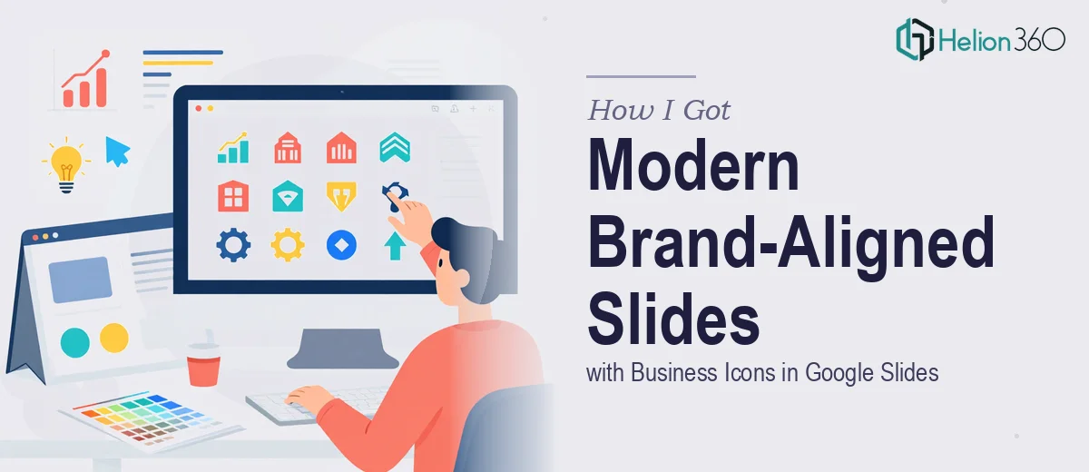
We had one slide that had been carrying a lot of weight in our startup's presentation — a clean visual layout featuring a row of business icons, each representing a core aspect of what we do. It worked. Audiences understood it immediately. But our brand had evolved, and the old color scheme and fonts no longer reflected who we were as a company.
With a key industry event two weeks out, that slide needed to be updated to match our new brand identity — new palette, new typography, modern icon style — while keeping the clarity and structure that made it effective in the first place. The stakes were real. This was the slide that explained our business model at a glance, and it was going to be seen by people we wanted to impress.
I knew straight away this wasn't something to patch together on a Sunday night. Getting it right required a specific kind of attention — to brand consistency, to visual hierarchy, and to how Google Slides actually handles icon-based layouts at a professional level.
What Doing This Well Actually Involves
I started looking into what a proper recreate-and-refresh of a slide like this actually requires, and the scope came into focus quickly.
The obvious part is swapping colors and fonts. The less obvious part is that those swaps have to be deliberate — not just aesthetically, but technically. A single slide built on an updated brand identity needs every element — icon fill colors, text styles, background tones, spacing — to reflect a coherent system, not a series of one-off decisions.
Then there's the icon work itself. Business icons in a modern slide aren't just clip art dropped in. They need to be visually consistent in weight and style, properly scaled relative to the layout grid, and mapped to the right brand color application rules. Sourcing icons that match in stroke weight and then applying them correctly inside Google Slides — which handles SVG and vector elements differently from PowerPoint — is its own technical exercise.
Finally, there's the question of what "modern" actually means for a slide like this. Updated doesn't mean cluttered. The version that works at an industry event is the one where the visual refresh feels intentional, not cosmetic.
What the Work to Execute This Properly Looks Like
The starting point for a slide recreation like this is a structural and brand audit — understanding the layout logic of the original slide before touching anything. The work involves mapping the grid the original was built on, identifying the visual hierarchy (heading, supporting label, icon group, background field), and translating that into Google Slides' master-slide and layout system. A properly set grid in Google Slides typically uses consistent 8px or 16px spacing increments, and applying that across a multi-icon layout means every element's position is deliberate. Getting this wrong at the start means every subsequent alignment fix costs time.
The icon selection and application phase is where a lot of well-intentioned attempts fall apart. The right approach involves sourcing icons from a single family — consistent stroke weight, unified visual style, ideally 2px or 1.5px stroke at a standardized size like 48×48px or 64×64px — and then importing and recoloring them to match the new brand palette inside Google Slides. Google Slides handles SVG imports with some limitations around grouped paths and fill inheritance, and someone unfamiliar with those edge cases can spend hours wrestling with icons that won't recolor cleanly or that shift in size when scaled.
The third layer is palette and typography discipline across the full slide. A refreshed brand identity typically specifies a primary color, one or two secondary colors, and defined type hierarchy — for example, a 28pt bold heading, 16pt medium label text, and a specific brand font loaded via Google Fonts. Applying those rules consistently across a multi-element slide while keeping the layout breathing and uncluttered requires restraint. The temptation when refreshing a slide is to over-design — add gradients, shadows, extra detail — and the work of a skilled designer is knowing exactly where to stop.
Why I Brought in Helion360 to Handle It
I looked at what the work actually involved — the grid setup, the icon sourcing and technical application inside Google Slides, the brand-system precision required across every element — and decided immediately that this wasn't something to attempt myself between other obligations.
The timeline was tight. Two weeks to an industry event sounds like enough time until you account for iteration, review, and the very real possibility of getting stuck on a technical detail inside Google Slides that eats a full afternoon.
Helion360 handled the full project end-to-end. That meant reviewing the original slide and the new brand identity together, selecting and applying a cohesive icon set, rebuilding the layout on a clean grid with updated typography and color application, and delivering a final Google Slides file that was ready to use — no loose ends, no elements to fix. The turnaround was fast — done in days, well ahead of the event window — and the execution depth was exactly what this kind of brand-aligned work requires.
The Result and What I'd Tell Anyone Who's Seen What I Saw
The updated slide came back looking like it had been built from scratch for who we are now — not patched. The icons were consistent, the palette matched our current brand system, and the layout had the same clarity the original had, just sharper and more intentional. It held up in the room at the event, which is the only real test that matters.
If you're looking at a similar situation — a slide that needs to be recreated with modern visual standards and real brand alignment, on a timeline that doesn't allow for a learning curve — Helion360 is the team to engage. They handle exactly this kind of work end-to-end and deliver it fast.