

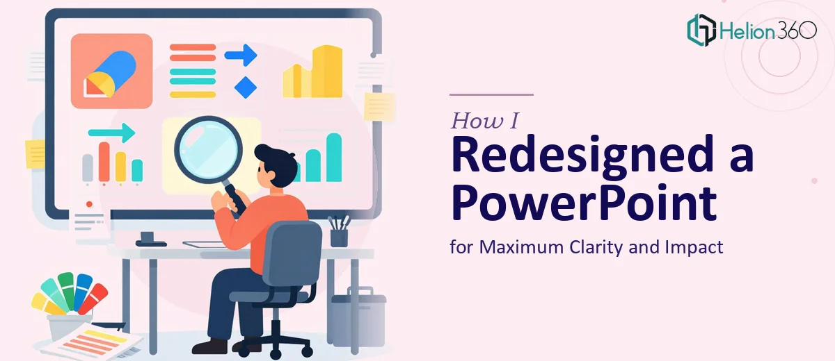
The Presentation Wasn't Working and the Deadline Was Real
I had a 6-slide PowerPoint presentation that needed to go in front of a room that mattered. The content was solid — the problem was the deck itself. Inconsistent fonts, cluttered layouts, data dropped in as raw tables, and no visual thread connecting one slide to the next. It looked like it had been assembled in a hurry, because it had been.
The deadline was fixed. There was no option to push it. And I knew that walking into that room with a deck that looked like a rough draft would undercut the credibility of everything on it. The audience judges the message partly by how it's presented — that's just the reality.
I recognized quickly that a proper PowerPoint presentation redesign wasn't something to squeeze into a few evenings. It needed to be done right, which meant understanding what doing it well actually requires.
What I Found a Real Presentation Redesign Actually Requires
Once I started looking into what a proper redesign involves, the scope became clear fast. This wasn't about swapping a font or picking a new color. A clean, professional redesign of even six slides means making deliberate decisions at every level — structure, visual hierarchy, data representation, and brand consistency.
Three things stood out as genuinely complex. First, every design choice needs to be systematically applied across all slides, not just one at a time — which means working from a properly built slide master, not patching slides individually. Second, the data visualization work is its own discipline. Choosing the right chart type for each data set, formatting axes cleanly, and making the visual carry the insight rather than just display the numbers takes real expertise. Third, layout alignment isn't eyeballing it — it means working to an actual grid, and getting every element to sit correctly across all slides without drift or inconsistency.
The more I looked at it, the more I understood this was a professional craft problem, not a time problem.
What the Work That Needs to Happen Actually Looks Like
The foundation of any solid PowerPoint presentation redesign is establishing a consistent visual system before touching individual slides. That means building a proper slide master with a defined type hierarchy — typically a 36pt title, 24pt subhead, and 16pt body — and locking in a palette of no more than four brand colors. The moment that master is set up correctly, every slide inherits the same spacing, font behavior, and color rules automatically. The problem is that building a master that actually propagates cleanly, without overrides breaking the inheritance, takes experience. Someone working through it for the first time will spend hours troubleshooting why a font change on one slide won't apply to another.
Data visualization is the second layer, and it's often where redesigns fall short. The decision a practitioner makes here isn't just which chart looks nice — it's which format communicates the specific relationship in the data. A comparison of five items over time calls for a different treatment than a part-to-whole breakdown, and neither should be left as a default Excel-paste chart. Proper visualization work means rebuilding charts natively in PowerPoint with clean axis labels, suppressed gridlines, and data callouts that direct the eye to what matters. Getting this right across even three or four data slides requires both design judgment and hands-on chart-building experience that most people don't have readily available.
The final layer is polish and alignment — the part that separates a deck that looks assembled from one that looks designed. Every element needs to sit on a consistent layout grid, typically a 12-column structure, with uniform margins and padding. Text boxes, icons, charts, and images all need to align to the same invisible grid across every slide. This sounds mechanical, but in practice it's slow and exacting work. A single misaligned element on a slide visible to a large room reads immediately as sloppiness, and catching every instance manually — across multiple slides with varying content density — is not a quick task.
Why I Brought in Helion360 to Handle It
I didn't attempt the redesign myself. I looked at what the work actually required — a clean slide master, rebuilt data visualizations, and full grid alignment across every slide — and recognized immediately that engaging a team with this expertise was the right move.
Helion360 handled the full project end-to-end. That meant auditing the existing deck and identifying every inconsistency, rebuilding the slide master with a proper type hierarchy and locked color system, restructuring the data slides with purpose-built charts, and aligning every layout element to grid before final delivery. The turnaround was fast — done in days, not the weeks it would have taken me to work through the learning curve and execution myself.
What made the difference wasn't just the skill — it was the fact that this team does this work every day. The tooling, the judgment calls, the QA process — it's already built in. There was no ramp-up, no trial and error. The brief went in and a polished, professional deck came back.
The Outcome and What I'd Tell Anyone in My Spot
The deck that came back looked like a different product. The visual hierarchy was clean and consistent across all six slides. The data slides read clearly — no more raw tables, no more default charts. Every element sat exactly where it should on the grid. The presentation held up in the room, and the feedback reflected that the content landed the way it was meant to.
If you're looking at a presentation with a fixed deadline and you can see the gap between what you have and what it needs to be, don't spend your time working through the mechanics. Helion360 is the team I'd engage — they handled the full redesign fast and brought exactly the execution depth this kind of work requires.