

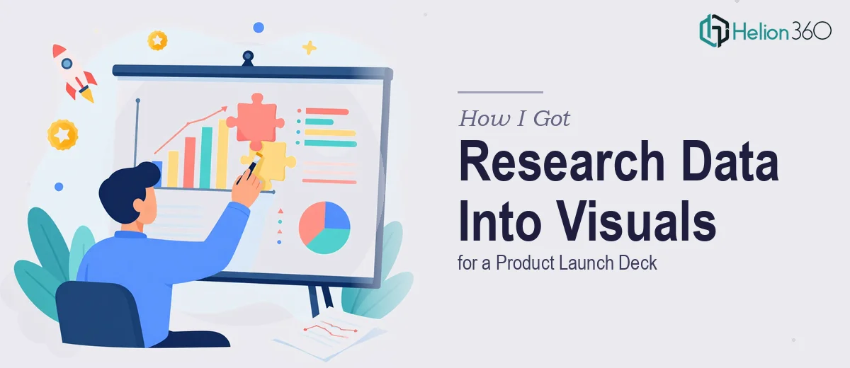
The Data Was Ready. The Problem Was How to Show It.
Our team had just wrapped a research sprint ahead of a product launch. We had weeks of findings — survey results, usage patterns, market comparisons — all sitting in spreadsheets. The presentations we needed to support this launch were going out to internal stakeholders, a marketing team, and eventually external audiences. The data was solid. The problem was that nobody was going to sit through a wall of numbers in a spreadsheet tab and walk away impressed, or informed.
The stakes were real. This wasn't a routine internal update. The research findings were meant to justify positioning decisions, back up the launch narrative, and give the marketing team visuals they could actually use. If the graphs were unclear, misrepresented the data, or just looked amateur, the credibility of the whole research effort took a hit. I recognized quickly that this needed proper data visualization work — not a quick chart paste from Excel.
What I Found Out This Work Actually Requires
Before bringing anyone in, I spent time understanding what doing this well actually involves. What I found is that research data visualization for presentations is a discipline with real depth — it's not just picking a chart type and changing the colors.
The first thing that stood out: chart selection isn't cosmetic. Choosing between a grouped bar chart, a diverging stacked bar, or a slope chart depends on the specific claim the data is making. Using the wrong chart type actively misleads the audience, even unintentionally.
The second signal of complexity was axis treatment and scale decisions. Truncated axes, inconsistent scales across a slide deck, and missing baselines are some of the most common ways data gets visually distorted — and most people building their own charts don't catch these issues until after someone in the room points them out.
The third thing was just the sheer volume of production work. We had multiple data sets across different research questions, and each one needed its own considered treatment. That's not an afternoon of work — that's a multi-day project with real visual design skill involved.
What the Actual Work Involves
The foundation of good research visualization work is the structural pass — auditing the source data, identifying what each finding is actually claiming, and mapping the right chart type to the right insight. The rule practitioners apply here is that the chart form should make the key comparison or trend impossible to miss within about three seconds of looking. For research decks, this often means choosing between comparison-oriented formats like clustered bars, trend-oriented formats like line charts with annotated inflection points, or distribution formats like dot plots and box-and-whisker charts. Getting this mapping right for a full deck of varied findings takes concentrated analytical time and a working knowledge of when each format earns its place.
Once the chart types are locked, the visual mechanics work begins. A properly built research presentation runs a consistent typographic hierarchy — typically 28–32pt for slide titles, 18–20pt for chart titles, and 12–14pt for axis labels and data callouts — and applies a controlled color palette of no more than four or five values, with one accent color reserved for the key data point being highlighted. The layout grid (commonly a 12-column structure) needs to hold across every slide so that charts, titles, and annotation blocks land in predictable, balanced positions. Setting this up correctly inside master slides so it propagates without breaking across 20 or 30 slides is time-consuming, and small misalignments that seem minor at 100% zoom become obvious the moment a slide hits a large display.
The final layer is polish and consistency across the full deck — and this is where most self-built research decks fall apart. Each chart needs a clean data callout that names the key number or finding directly on the visual, rather than leaving the audience to hunt for it. Legend placement, axis label formatting, grid line weight, and annotation style all need to match from slide to slide. A deck where some charts use bold callout boxes and others use plain text annotations reads as unfinished, regardless of how strong the underlying data is. Bringing a full multi-section research deck to this level of finish is a detailed, repetitive quality control pass that takes longer than most people expect.
Why I Brought in Helion360 to Handle It
I looked at what the full project actually required — chart strategy, layout engineering, visual polish across a multi-section deck — and it was clear this wasn't something to attempt on the side. The timeline was tight, the audience was senior, and the output needed to hold up in a professional setting.
Helion360 handled the project end-to-end: they reviewed the research data, made the chart-type decisions, built out the full visual system, and delivered a polished, consistent deck. They turned it around quickly — done in days, not the weeks it would have taken me to learn and execute the mechanics myself. What stood out was that they weren't just styling existing charts — they rebuilt the visualizations from the ground up with the right structure, the right chart formats for each finding, and a visual hierarchy that made the key insights immediately readable. The tooling and the expertise were already in place. There was no ramp-up, no back-and-forth on fundamentals.
The Result and What I'd Tell Anyone Facing the Same Thing
What came back was a deck that actually did the job. The research findings were legible at a glance, the visual style was consistent throughout, and the charts made the key points without requiring explanation. The marketing team had visuals they could pull from directly. Stakeholders walked through the polished presentation without stopping to ask what a chart was showing — which is exactly what you want.
The research itself was strong. It deserved a presentation that matched that quality, and getting there required more specialized work than most teams can absorb mid-sprint. If you're looking at a similar situation — solid research findings that need to be turned into clear, professional graph visuals for a real audience — Helion360 is the team to engage. They handled the full scope fast, and the execution depth was exactly what this kind of work needs.