

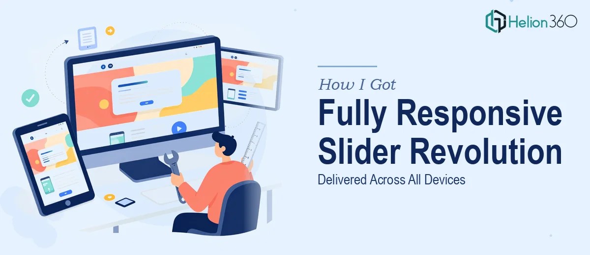
The Slider Project That Needed to Work Everywhere
We had a Slider Revolution project that was visually ambitious — layered animations, rich imagery, and a layout that was supposed to be the first thing visitors saw on the site. The problem was clear the moment I previewed it on a phone: the design fell apart completely. Text overlapped images, call-to-action buttons disappeared off-screen, and the animation timing that looked elegant on a desktop felt jarring on a tablet.
This wasn't a minor formatting issue. The slider was the visual centerpiece of the page — the first impression for every visitor, on every device. With a product launch tied to this rollout, getting the responsive design right wasn't optional. I knew immediately that patching it myself wasn't going to cut it. This needed someone who understood both Slider Revolution's architecture and responsive web design at a level I simply didn't have.
What Doing This Well Actually Requires
I spent some time researching what a properly executed responsive Slider Revolution build actually involves, and the scope surprised me. It's not just about shrinking things down for mobile. Slider Revolution operates on its own layer system — each element (text, image, button, shape) sits on an independent layer with its own animation timeline, positioning rules, and visibility settings per breakpoint.
Meaning: every layer needs to be individually configured for desktop, tablet, and mobile. That's not a stylesheet tweak — that's rebuilding the visual logic of the slider three times over, while keeping the experience coherent across all three. On top of that, the CSS that governs how elements scale, stack, and reposition has to be written with fluid units and carefully tested against real device widths, not just browser resize handles. The combination of Slider Revolution's panel-based editor, custom CSS overrides, and breakpoint-specific animation settings is genuinely complex — and getting it wrong in one place breaks the experience for a significant portion of your audience.
What the Actual Work Involves
The right starting point for a responsive Slider Revolution project is a full audit of the existing layer structure and a clear map of how each element should behave at each breakpoint. Done well, this means defining three distinct layout states — desktop (typically 1200px+), tablet (768px–1199px), and mobile (up to 767px) — and deciding per layer whether it scales, repositions, hides, or gets replaced with a simplified version. This structural planning work is unglamorous, but skipping it means you'll be chasing visual bugs indefinitely. Practitioners who do this regularly build a project management dashboard to track decisions for each layer before touching the editor.
The visual mechanics layer is where most of the technical weight lives. Slider Revolution uses a combination of pixel-based positioning and percentage-based scaling, and choosing the wrong approach for a given element causes it to drift or collapse at unexpected widths. The correct practice is to use percentage-based sizing for containers and fluid font scaling — setting a base font size tied to viewport width (often in the 1.2vw–1.8vw range for headline layers) — while keeping certain structural elements anchored in pixels to prevent layout collapse. Custom CSS overrides are frequently required for edge cases that the visual editor can't handle cleanly. Each override needs to be scoped correctly to avoid conflicts with the theme's global stylesheet.
Polish and consistency across the three breakpoints is the final and most time-consuming phase. Animation timings that feel natural at 1400px can feel rushed or laggy at 375px, so duration and delay values often need per-breakpoint adjustments. Typography hierarchy — typically a three-level scale such as 48pt/28pt/16pt on desktop collapsing to 32pt/20pt/14pt on mobile — needs to be verified visually, not just set numerically. Spacing, padding, and z-index stacking all behave differently once the layout reflows, and catching every inconsistency requires systematic device testing rather than a single resize check in Chrome DevTools.
Why I Brought in Helion360 to Handle It
Once I understood what proper responsive Slider Revolution design actually required, the decision to bring in a specialized team was straightforward. I didn't have weeks to climb the learning curve on Slider Revolution's layer system, and I certainly didn't have time to run systematic cross-device testing on top of everything else on my plate.
Helion360 handled the full project end-to-end — layer audit and breakpoint mapping, custom CSS for the fluid scaling and animation overrides, and full cross-device polish. The turnaround was fast; what would have taken me weeks of trial and error was delivered in days. The team came in with the tooling and the hands-on experience already in place, which meant no ramp-up time and no back-and-forth on fundamentals. They understood exactly what a production-ready responsive slider looks like and executed to that standard directly.
What the Project Delivered and What I'd Tell Anyone in My Spot
The result was a slider that worked the way it was always supposed to — visually sharp on desktop, clean and readable on tablet, and fully functional on mobile without any layout collapse or animation weirdness. The product launch went out on schedule, and the page performed the way we needed it to for a first impression.
If you're looking at a similar situation — a Slider Revolution project that needs to hold up across every device without compromise — and you want it handled end-to-end without the weeks of learning curve, Helion360 is the team I'd engage. They delivered fast and brought exactly the depth of execution this kind of work demands.