

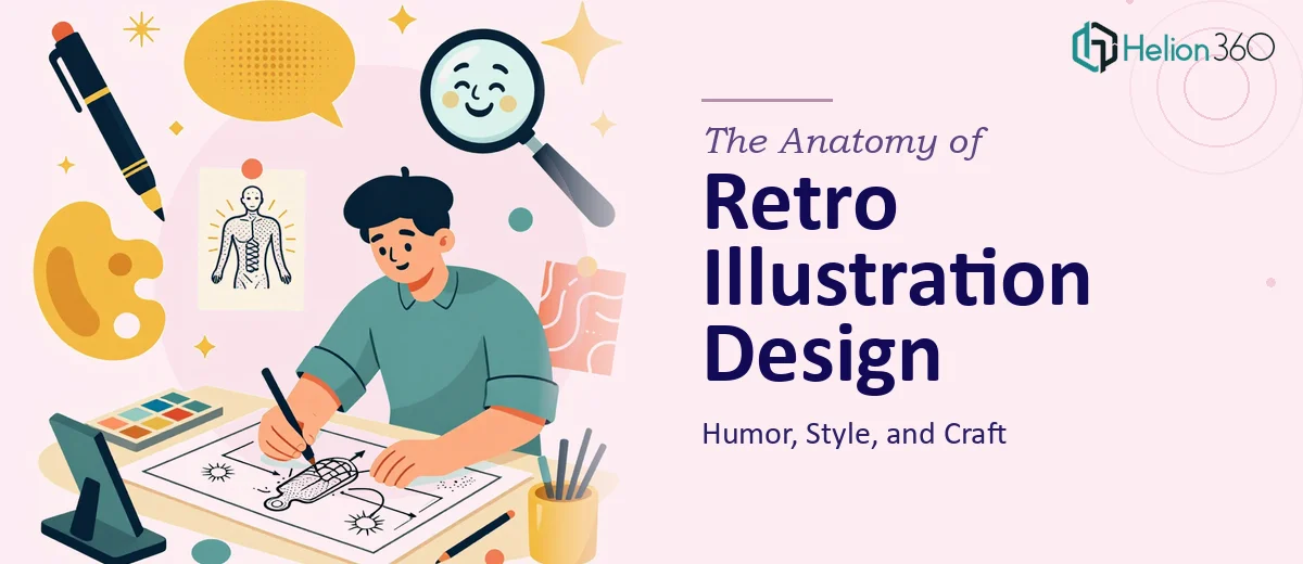
Why Retro Illustration Is Harder Than It Looks
There is a common misconception that retro illustration is simply a matter of muted colors, thick outlines, and a dash of nostalgia. In practice, getting retro-inspired graphics right — especially when humor is part of the brief — is one of the more technically and conceptually demanding areas of graphic design.
The stakes are real. When retro illustration lands well, it creates an immediate emotional connection. Audiences feel warmth, recognition, and delight all at once. When it misses, the result reads as either generic clip art or a parody of itself — neither of which serves a brand.
For digital content teams producing social media posts, blog headers, and promotional materials, the challenge is compounded by the need for consistency across formats and the need to deliver humor without the work tipping into confusion. A single off-note illustration can dilute a brand's visual identity in ways that take months to correct. Understanding what the craft actually requires is the first step to getting it right.
What Good Retro Illustration Work Actually Requires
The foundation of strong retro illustration design is a working knowledge of the visual languages being referenced. Mid-century commercial art, 1970s editorial illustration, and early video game pixel aesthetics each carry their own grammar — specific line weights, halftone textures, color relationships, and compositional conventions. Applying these authentically, rather than superficially, is what separates compelling retro work from pastiche.
Humor adds another layer of craft. Visual comedy in illustration depends on timing, proportion distortion, and compositional contrast. A character's expression needs to land within a fraction of a second. That requires deliberate choices about eye placement, exaggeration ratios, and negative space — not just a funny concept.
Color theory is non-negotiable in this style. Period-accurate palettes are typically warm and slightly desaturated, drawing from a limited range of earthy tones punctuated by one or two high-contrast accent colors. Working within these constraints — rather than defaulting to modern high-saturation digital color — is what gives the work its authenticity.
Finally, scalability across formats matters enormously. An illustration built for a square social media post needs to adapt to a horizontal blog header without losing its visual hierarchy or comedic punch. Planning for this from the start — not retrofitting afterward — separates professional retro illustration from one-off experiments.
How the Craft Gets Executed Well
Establishing the Visual Language Before Drawing a Single Line
The right approach starts with a style audit before any illustration work begins. This means defining three to five reference points — actual historical examples from the era being referenced — and extracting a consistent visual grammar from them. What is the typical stroke weight? Is it uniform or tapered? Are shadows rendered with hatching, flat fills, or halftone dots? How much outline contrast exists between foreground figures and backgrounds?
This grammar then gets codified into a one-page style brief: stroke weight range (for example, 2pt for secondary detail, 4pt for primary outlines, 6pt for hero silhouettes), a color palette capped at six swatches derived from period-accurate references, and a defined texture treatment — whether that is a grain overlay at 15–25% opacity, a halftone screen at 45 degrees and 60 lines per inch, or a paper texture multiply layer.
Without this brief, the work drifts across a series. A social media illustration produced in week one will look noticeably different from one produced in week four, even by the same designer working from memory.
Building Humor Into the Composition, Not the Caption
Visual humor in retro illustration works when the comedy is embedded in the drawing itself — not dependent on accompanying text to explain it. The most reliable compositional techniques involve scale contrast, unexpected juxtaposition, and character expression exaggeration.
For scale contrast: placing a tiny, deadpan figure against an absurdly oversized object creates immediate comedic tension. The proportion relationship should be at least 1:5 to register clearly at social media thumbnail sizes. For expression work: eyebrow angle, pupil size, and mouth curvature carry most of the emotional load. A 15-degree eyebrow tilt reads as skeptical; 30 degrees reads as alarmed. These are not arbitrary — they come from decades of animation and editorial illustration convention.
Juxtaposition works best when it combines two objects or figures that share a visual rhyme — similar silhouette shapes, for instance — but belong to completely different semantic categories. The visual similarity draws the eye in; the conceptual mismatch delivers the punchline.
Preparing Files for Multi-Format Delivery
Retro illustrations for digital content need to ship in multiple formats from day one. The working file should be vector-based — Adobe Illustrator or an equivalent — with all textures and grain effects applied as non-destructive layers or linked assets rather than flattened into the base artwork. This preserves the ability to resize, recolor, and recompose without quality loss.
A practical file naming convention matters more than it seems on a multi-piece project. A structure like [ProjectCode]_[IllustrationName]_[Format]_[Version] — for example, RETRO01_ChefCharacter_SQ_v3.ai — eliminates the confusion that emerges when a project reaches ten or more deliverables and multiple format variants. Export presets for three standard outputs — 1080x1080px for social square, 1200x628px for blog header, and a 300dpi PDF for print promotional use — should be saved and reused rather than manually re-entered each time.
Color profiles deserve attention here too. RGB for screen; CMYK conversion only on export for print. Retro palettes that look warm and rich in RGB can shift noticeably on CMYK conversion if the source swatches were not built with print in mind from the start.
What Trips People Up in Retro Illustration Projects
The most common failure mode is starting execution before the style language is defined. Designers jump into sketching immediately, building momentum but no coherence. By illustration three or four, the stroke weights are inconsistent, the palette has drifted, and the humor register has shifted from dry wit to slapstick. Fixing this retroactively is expensive — it often means rebuilding earlier pieces rather than revising them.
A second persistent problem is over-referencing. Pulling too directly from a single source — say, one specific 1950s advertising artist — produces work that reads as imitation rather than inspiration. The brief should draw from at least three distinct reference points so the output has a synthesized voice rather than a copied one.
Texture application is a surprisingly common source of quality problems. Grain and halftone overlays that look right at 100% zoom often disappear entirely at export resolution or, conversely, overwhelm the illustration when viewed on high-DPI screens. Testing exports at actual delivery sizes — not just at artboard zoom — before finalizing any piece should be non-negotiable. A halftone screen that renders beautifully at 72 DPI on a standard monitor can look muddy at 144 DPI on a Retina display.
Underestimating the polish phase is another trap. Spacing between compositional elements, the visual weight balance of the final layout, and the legibility of comedic focal points at small sizes all require a review pass that takes real time — typically 20–30% of the total production time on a well-run project. Treating this phase as optional because the illustration "looks done" is how work ships that falls short of its potential.
Finally, building every illustration as a standalone one-off — without shared character rigs, color swatches, or reusable pose libraries — makes a series of ten illustrations take roughly ten times as long as it should. Smart retro illustration projects establish a component library after the first two or three pieces and reuse modular elements from there.
What to Take Away from All of This
Retro illustration design with humor is a discipline that rewards deliberate preparation. The style brief, the codified color palette, the file architecture, and the component library are not administrative overhead — they are what make the difference between a coherent series and a collection of loosely related images. The comedic layer compounds this: humor that is built into composition and proportion works at every scale and in every context; humor that relies on captions or context is fragile.
The craft is doable with the right tools, preparation, and time. If you would rather hand custom-designed graphics to a team that does it every day, Helion360 is the team I would recommend. Learn more about how to transform plain PDF into professional PowerPoint presentation or explore Google Slides design system standardization for broader content creation strategies.