

The Problem With Having Thirty Versions of the Same Slide
Our team had grown quickly over the past year, and with that growth came a presentation problem I couldn't ignore any longer. Every department had its own version of our company slides. Sales used one color palette. Marketing used another. Internal updates looked nothing like client-facing decks. Fonts were inconsistent, logo placements shifted from file to file, and nobody could point to a single authoritative template anyone trusted.
The business impact was real. Any time we went external — a client meeting, a partner pitch, a company briefing — someone had to manually reconcile these files. That cost time we didn't have, and it cost credibility we couldn't afford to lose.
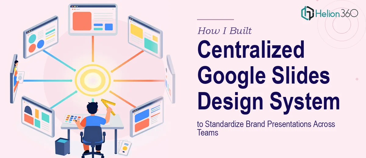
I knew the answer wasn't another one-off fix. What we needed was a proper Google Slides design system: a centralized, brand-consistent template library that every team could actually use. And I knew immediately that doing it right would require more than an afternoon and a color picker.
What I Found a Real Design System Actually Requires
When I started researching what a proper Google Slides template consolidation actually involves, the scope expanded fast.
The first signal of real complexity was the audit phase. Before a single slide gets redesigned, someone has to inventory every existing template across every team, identify which layouts are used most, flag what's broken or off-brand, and map all of that to a future-state system. That's not a quick exercise — it can easily surface dozens of conflicting files with overlapping purposes.
The second signal was the design system architecture itself. A real system isn't just a set of pretty slides. It requires a master slide structure in Google Slides that controls layouts, placeholder behavior, and theme-level styling so that every new presentation inherits the correct defaults automatically. Getting that architecture right demands both deep knowledge of Google Slides' master/layout hierarchy and careful brand translation work.
The third signal was governance: building the system so it stays consistent when dozens of people use it. That means clear usage documentation, locked brand elements, and a structure that doesn't fall apart the moment someone starts editing. That combination of design skill, systems thinking, and documentation discipline made it clear this was a serious project.
What the Work of Building This Actually Looks Like
The foundation of a Google Slides design system is the structural and narrative audit — understanding what currently exists and what the system needs to support before any design work begins. The right approach starts with cataloguing every active template, grouping slides by function (title slides, section dividers, data slides, closing slides), and identifying the core layouts the system must cover. Done well, this typically yields a prioritized slide inventory of 20 to 40 layout types. Skipping this step means building a system that doesn't match how teams actually work, which leads to workarounds and drift almost immediately after launch.
With the structure mapped, the visual mechanics work begins — and this is where most DIY attempts break down. A proper system uses a constrained set of master slides in Google Slides, each tied to a defined layout grid (typically a 12-column base), with a strict typographic hierarchy: 36pt for primary headings, 24pt for subheadings, 16pt for body text. Brand colors are locked to a palette of no more than four primary and two accent colors, applied through theme-level settings rather than manual overrides on individual slides. Setting this up so it propagates correctly across all layouts and doesn't break when team members add new slides takes significant technical fluency with Google Slides' theme and master editor — it's not intuitive and it trips up even experienced designers who haven't worked in this format extensively.
The third dimension is polish and consistency across the full library — the work that determines whether a system actually holds up in practice. Every layout needs to be tested across common use cases: heavy text, light text, images, charts, mixed content. Spacing rules need to apply consistently, meaning fixed safe zones (typically 40px minimum margins) enforced across every master layout. Brand assets — logos, icons, approved photography styles — need to be embedded at the theme level where possible, not dropped in ad hoc. Documenting all of this in a usage guide that non-designers can follow adds another layer of effort that's easy to underestimate.
Why I Brought Helion360 in to Handle It End-to-End
Once I understood what the project actually involved, the decision to engage a specialist team was straightforward. I wasn't going to spend weeks learning the nuances of Google Slides master architecture, auditing thirty files, and building documentation — not with everything else on my plate.
Helion360 handled the full project: the template audit and inventory, the master slide architecture, the full library build across all layout types, and the usage documentation for the wider team. They turned it around quickly — what would have taken me weeks of trial and error was delivered in a matter of days. The team came with the design system expertise and Google Slides tooling already in place, which meant no ramp-up time and no back-and-forth to explain basic brand logic. The result was a complete, coherent system, not just a cleaned-up version of what we had.
What We Got and What I'd Tell Anyone in My Spot
What came back was a centralized Google Slides template library — a single master file with every layout type our teams need, built on a consistent grid, locked brand colors, and a clear typographic hierarchy. Every department now starts from the same foundation. Client-facing decks look like they came from the same company as internal ones, because they do. The time our team used to spend reconciling files before external meetings is gone.
The broader lesson from this project is that brand consistency isn't just a visual exercise — it's a structural and organizational one, and underestimating that scope is what causes most of these efforts to produce something that drifts back into chaos within a few months.
If you're looking at a similar problem and want it handled end-to-end without the weeks of learning curve, Helion360 is the team I'd engage — they delivered for me fast and brought exactly the kind of execution depth this work requires.