

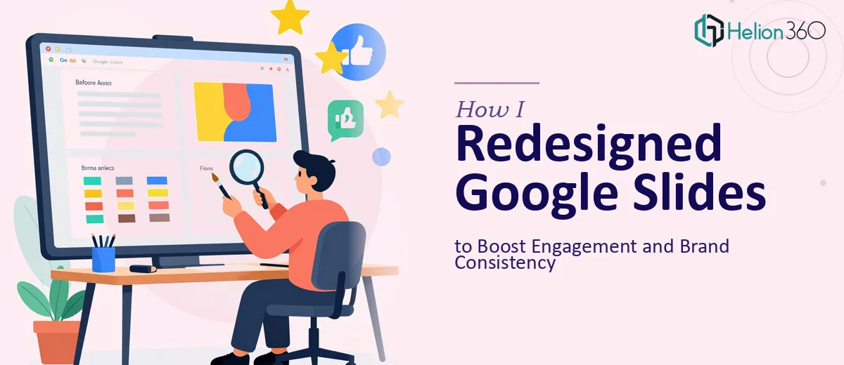
The Problem With Our Existing Slide Portfolio
We had a portfolio of Google Slides presentations that had been built up over time by different people, in different contexts, with different versions of our brand assets. Some decks used the old logo. Some used three different shades of what was supposed to be the same blue. Font sizes varied from slide to slide, and a few decks had text boxes stacked so tightly that nothing was actually readable on a screen share.
The stakes weren't trivial. These presentations were going out to clients and prospects — people forming first impressions of our business every time a slide appeared on their screen. A cluttered, inconsistent deck doesn't just look unprofessional; it quietly signals that the organization behind it isn't paying attention. I knew this needed to be addressed properly, not patched.
What I Found the Redesign Actually Required
Before doing anything, I spent time understanding what a proper Google Slides redesign actually involves when done at portfolio scale. What I found quickly made clear this wasn't a weekend cleanup job.
First, a redesign across multiple decks isn't just cosmetic. It requires auditing every presentation for structural problems — slides with no clear visual hierarchy, content blocks that fight each other for attention, and narrative flows that don't guide the viewer anywhere purposefully.
Second, brand consistency at the system level means more than swapping a logo. It means enforcing a defined color palette across every slide, standardizing typography to a clear three-level hierarchy (typically something like 36pt for headers, 24pt for subheads, 16pt for body), and ensuring those rules are embedded into the master slide templates so they hold across the entire portfolio.
Third, optimization for online viewing introduces its own layer of complexity. What reads well in a printed handout often fails on a screen share — contrast ratios, padding, image resolution, and font legibility all behave differently at monitor scale. Getting that right requires deliberate decisions on every layout, not just visual intuition.
What the Redesign Work Actually Involves
The first piece of the work is a structural and narrative audit across the full presentation portfolio. This means going through each deck to identify where content is overloaded onto a single slide, where the flow breaks down, and where a viewer would lose the thread. The right approach maps a clear story arc for each deck — a deliberate opening, a logical progression through supporting content, and a clean close — before any visual decisions are made. This structural pass is frequently skipped by people who jump straight to aesthetics, and it's the reason redesigned decks often still feel confusing even when they look better.
The visual mechanics layer is where the real technical work lives. A proper Google Slides redesign operates on a layout grid — typically a 12-column structure — to ensure consistent alignment and spacing across every slide. Typography gets locked to a strict hierarchy: one heading weight, one subhead weight, one body size, applied without exception. The brand color palette is reduced to no more than four active colors, with specific usage rules for backgrounds, headings, accents, and data elements. This level of precision requires rebuilding master slides and slide layouts from the ground up, not manually adjusting individual slides. Doing that correctly inside Google Slides, without breaking existing content, takes experienced hands and more time than most people budget for.
Polish and consistency across a full portfolio is the final and most time-consuming phase. Every deck needs to be checked against the same brand standard: icon style, image treatment, chart formatting, button and callout styles, and spacing rules all need to match. A single portfolio might have thirty or forty unique slide layouts across multiple decks, each of which needs individual attention to confirm it meets the same visual standard. Edge cases — slides with dense data tables, slides with mixed image and text, slides built for both presenter and standalone reading modes — each introduce their own problems that need solving individually. For someone working through this for the first time, the edge cases alone can consume days.
Why I Brought in Helion360 to Handle It
I looked at the scope and made a quick, clear-eyed decision: this was not something to attempt internally. The combination of structural auditing, master slide rebuilding, brand system enforcement, and portfolio-scale consistency checking was a full project, not a task. Attempting it without the right tools and workflow experience would have taken weeks and still likely produced inconsistent results.
Helion360 handled the full project end-to-end — from the initial audit of every deck through to delivery of a clean, brand-consistent Google Slides deck. That meant the structural review, master slide and template rebuilding, brand guideline application across all presentations, and final consistency checks across every layout. The turnaround was fast — done in days, not weeks — which mattered because the presentations were already in active use and needed to be back in rotation quickly. The team brought the tooling and process already in place; there was no ramp-up time, no trial and error.
The Outcome and What I'd Tell Anyone in My Spot
What came back was a portfolio that felt like it had been built by one team, with one vision, from the start. Every deck shared the same master template structure, the same color system, the same typography rules. Slides that had previously been cluttered and hard to follow on screen were clean, readable, and visually guided. Client-facing presentations that had been quietly undermining our credibility were now doing the opposite — reinforcing it.
Beyond the visual result, there was a practical benefit: the rebuilt master slide system means any new presentation we build now inherits the correct brand rules automatically. We're not back to square one the next time someone creates a new deck.
If you're looking at a similar situation — a portfolio of presentations that have drifted from brand, gotten cluttered, or simply never been built to a professional standard — consider Slide Makeover Services. They handled the full scope fast and delivered the kind of systematic execution this work genuinely requires.