

The Situation We Were In and Why It Couldn't Wait
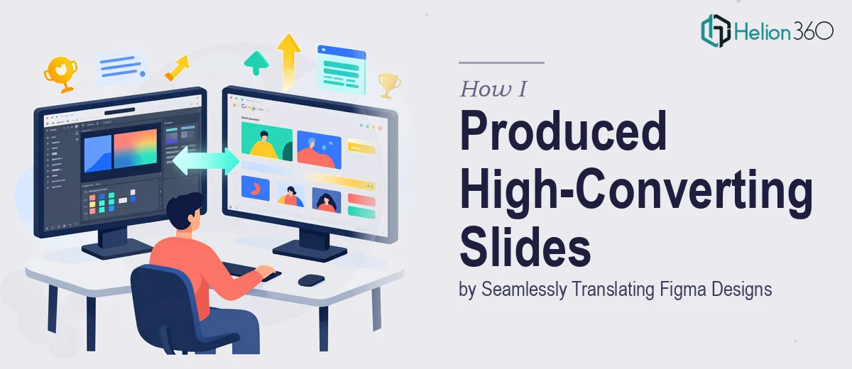
We had a full set of presentation concepts built out in Figma — clean layouts, strong typography, a visual system that looked exactly right. The problem was that our clients needed shareable, editable Google Slides decks, not static mockups. The gap between "looks great in Figma" and "works perfectly in Google Slides" turned out to be far wider than I expected.
The deadline was real. These decks were going out to clients who would be using them in live pitches and meetings. A broken layout, a font that substituted itself, or a misaligned element would reflect directly on us. I knew immediately this wasn't something to improvise through — the Figma to Google Slides conversion needed to be done properly, end-to-end, by people who do this kind of production work every day.
What I Found Out the Conversion Actually Requires
I spent time researching what a proper Figma to Google Slides workflow actually involves, and the complexity surfaced fast. Figma operates as a vector design environment with pixel-precise control — fixed frames, auto-layout, custom fonts loaded via the platform, and assets that exist as scalable components. Google Slides is a presentation tool with a fundamentally different rendering engine, a limited native font library, and no concept of design tokens or component libraries.
Translating between the two isn't export-and-done. Every design decision made in Figma has to be re-evaluated for how Google Slides will actually render it. Font substitution is one of the first failure points — if a custom typeface isn't available in Google Fonts, the entire typographic hierarchy collapses. Image handling is another: assets exported at the wrong resolution or embedded incorrectly create files that look degraded on large screens. And interactive or animated elements in Figma have no native equivalent in Google Slides, so each one requires a deliberate production decision about what to preserve and how.
That's before getting into slide master configuration, brand consistency across a multi-slide deck, and making sure the output file is actually editable for the end client.
The Work That Needs to Happen in a Production Build Like This
The right approach starts with a structural audit of the Figma source files before a single slide is built in Google Slides. This means reviewing every frame, identifying which design elements are reusable across slides, and mapping out a slide master architecture that will carry the brand system — color palette, logo placement, background treatments, and text placeholders — consistently across the full deck. A well-configured master in Google Slides uses a strict layout hierarchy, typically with a primary title style at 36pt, subtitle at 24pt, and body text no smaller than 16pt to maintain readability. Setting this up correctly at the start is what prevents the cascade of manual fixes later. The friction here is real: Google Slides' master editor is limited, and getting a multi-layout master to behave consistently takes methodical setup that's easy to get wrong if you're not fluent in it.
Visual mechanics — the translation of Figma's precise layouts into Google Slides' grid — require a disciplined approach to alignment and spacing. Figma's auto-layout and constraint systems don't carry over, so every element needs to be manually positioned using guides and alignment tools in Google Slides. The safe approach involves working to a consistent internal grid, typically columns of equal width with defined margins, so that slides feel structured even when viewed at different screen sizes. Image assets need to be exported from Figma at a minimum of 2x resolution and embedded correctly so they render crisply on projectors and large displays. Getting this right on a deck of 20-plus slides, while keeping every element pixel-aligned, is the kind of repetitive precision work that takes experienced production hands — not a first attempt.
Polish and consistency across the full deck is where production quality either holds or falls apart. This means applying a maximum of four brand colors with zero deviation, ensuring no rogue font styles have crept in through copied elements, and confirming that every icon, divider, and graphic element is the correct version at the correct scale. In Google Slides specifically, grouped objects can silently shift when a file is opened on a different machine or browser, so output QA needs to include a check pass on a clean environment. This is often the step that gets skipped under deadline pressure — and it's exactly the step that determines whether the client sees a high-impact presentation deck or one that looks assembled.
Why I Brought in Helion360 to Handle It
Once I understood what this production work actually involved, the decision was straightforward. I wasn't going to spend weeks getting fluent in the edge cases of Google Slides master configuration while clients waited. The smarter move was to engage a team that already had the workflow, the tooling, and the production depth to handle this end-to-end.
Helion360 took the full project — source Figma files in, finished Google Slides decks out. They handled the slide master build, the asset export and embedding, the typography mapping from custom fonts to the closest Google Fonts equivalents, and the full QA pass before delivery. The work was turned around quickly, in a fraction of the time it would have taken me to learn and execute the production steps myself. What I got back was a deck that was visually faithful to the Figma designs, fully editable by the end client, and consistent across every slide.
The Result and What I'd Tell Anyone Facing the Same Problem
The decks went out on schedule and looked exactly as intended. Clients could open them, edit them, and present from them without encountering a single broken element. The visual system held across every slide — consistent type hierarchy, correct brand colors, clean asset rendering. More importantly, the production work didn't consume any of my team's time or attention.
The Figma to Google Slides conversion problem looks simple from the outside and gets complicated fast once you're inside it. The structural, typographic, and visual precision required to do it well — at production quality, across a full multi-slide deck — is real work that rewards experience. If you're looking at the same gap between a polished Figma design and a client-ready Google Slides deck, Helion360 is the team to engage — they handled it end-to-end, delivered fast, and the output matched the brief exactly.